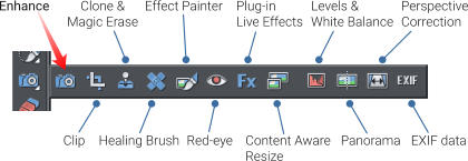
Photo Enhance Tool
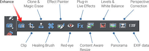
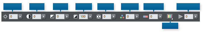
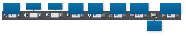
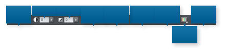
In the first part of our Guide to Photo Editing in Xara, we covered the basics of opening photos, zooming, sizing photos and saving, and a gave a brief summary of the Photo Enhance Tool. The second tutorial in the series gave a Summary of the Photo Tools on the Photo Tool fly-out menu. Note: This tutorial has been updated to include some new photo features in Photo & Graphic Designer and Designer Pro (July 2016). We have also added more detail about the options in the Enhance Tool, the workhorse controls that are used in just about every photo edit. A quick reminder to start with: When you move over the camera icon on the main toolbar, you’ll see this fly-out menu of all the Photo tools. As you select each tool on the fly-out, the icon on the left toolbar will change to reflect the tool that has now become current. In this tutorial, we’ll cover the ‘Enhance Tool’ which is the camera icon on the fly-out, and the one selected by default. When you select the Enhance Tool the InfoBar at the top of the page will look like this: We have already shown you how to use the controls on the left end of the InfoBar (rotate, next & previous, etc.), so now we’ll focus on the center set of controls, which are collectively called the ‘Enhance Controls’. Remember that your photo must be selected for these settings to apply to that photo. You can use the Selector Tool, or a quicker more direct way if you’re currently using one of the Photo Tools is just to click on it. A selected photo will show resize handles around it. Each of the above controls can accept a numeric value in the field (just click and type the required number), or you can click the right arrow and drag the slider to see the adjustment being made to your photo. Drag the slider control or enter a numeric valueWhole or Part
You can apply any of these Enhance Controls to the whole image, or part. There are two main ways to enhance just a part of the image... 1. Use the Region Painter or Mask Painter tools to select or protect a part of your photo before you use the Enhance Tools. For example use the Region Painter to paint an area on your photo. After this, the Enhance options described below, will only apply to that area. Or... 2. Use the Color Select feature to adjust only certain colors in your photo. This control is on the end of the Enhance Tool InfoBar. Color Select is described in more detail at the end of this tutorial. These two methods of selecting parts of your image can be used in combination. For instance, you can use the Region Painter tool to select one flower within a photo, and then the Color Select to select the color, and then adjust it using the Hue control (described below).Brightness Levels Histogram
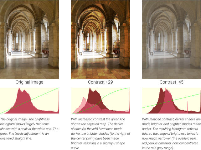
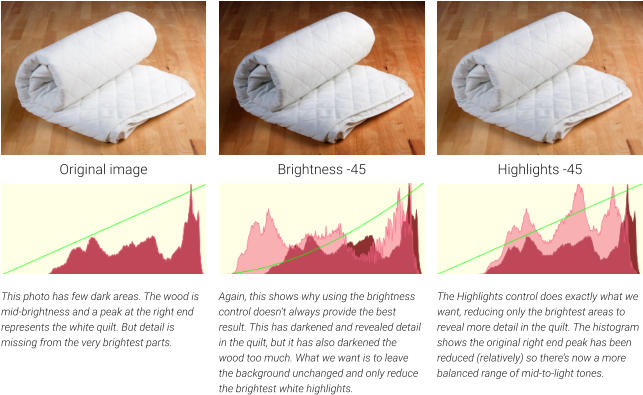
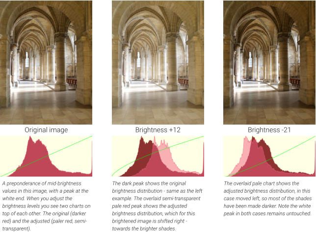
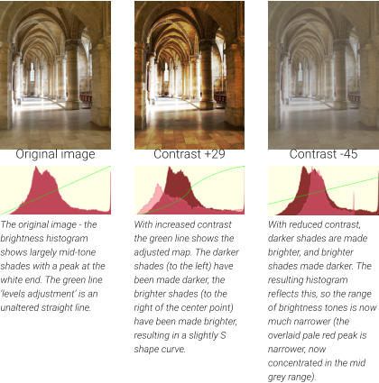
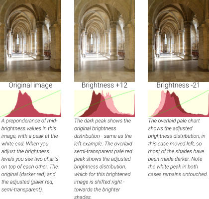
A Brightness Levels Histogram is basically a plot of the brightness levels of all the pixels in the image, from the darkest on the left to the lightest on the right. The more pixels that are a given brightness, the higher the chart value. It’s a great way to see the distribution of brightness levels of your picture, at a glance, and to see the effect of these controls on the brightness distribution. As you adjust any of the brightness controls, the histogram changes, showing you the original levels (the darker red area in the above case) and then overlaid this a lighter semi-transparent adjusted levels (the lighter pink in the above example). So this means as you adjust the controls you get instant feedback of how your brightness levels distribution is affected. In the following examples, each photo is shown with the results of the enhance operation, and under each is the histogram of the brightness levels with an explanation. Of course, you do not need to use or even see the Brightness Levels Dialog (described below on the last page of this tutorial) and the histogram - you can just adjust the controls until the picture looks right to your eyes. But it’s educational to understand and see a visual graph of the changes.Brightness Control
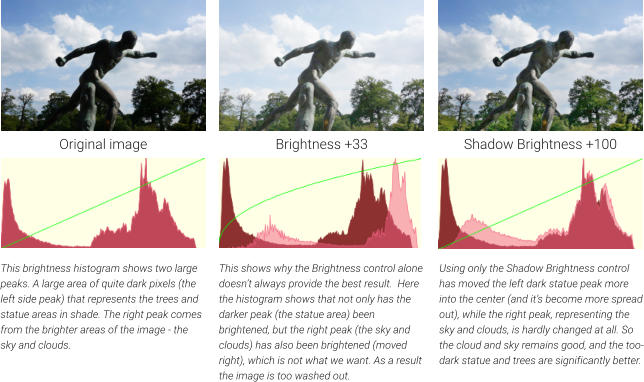
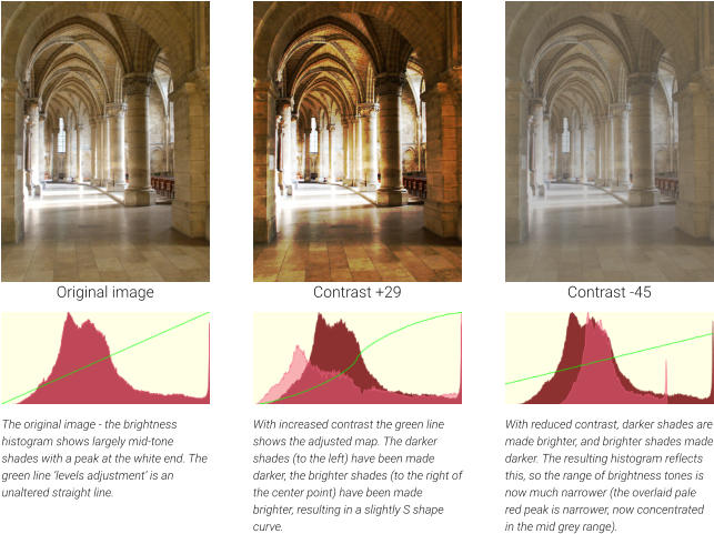
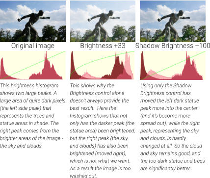
The brightness control adjusts the overall brightness of the image, but unlike the brightness control in most photo editors that brighten all values equally, this puts greater emphasis on the darker shades in your picture. The green line represents how the brightness levels are adjusted. In the initial image (left example) there is no adjustment - it’s a straight line. In the center image where the brightness value is increased you can see that the left end (darker shades) are lifted, but the brighter shades (right end of the line) are hardly changed - the line is very close to the original. In the case of the darker right-hand image, the green line curves downwards indicating that all the shades have been made darker.Contrast Control
Increased contrast means making the lighter shades lighter and the darker shades darker. Reduced contrast is the opposite. At extreme low contrast, almost all the image is mid-tone gray.Shadow Brightness
The Shadow Brightness control only affects the mid to dark shade areas, without altering brighter shades in the photo. For more information on this control see the Shadows and Highlights Brightness tutorial.Highlight Brightness
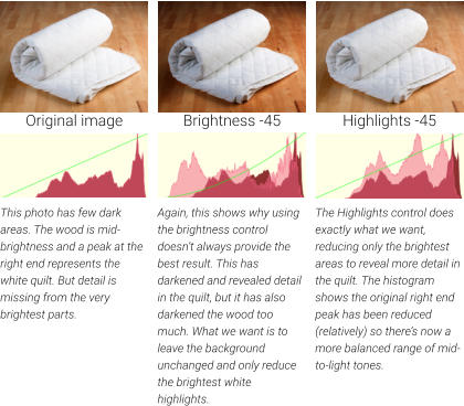
This control works at the other end of the brightness scale, and can reduce the brightest areas only. With most digital images it’s usually possible to bring out more detail of darker under-exposed areas than it is to recover detail in over-exposed areas. In other words it’s better to have under-exposed images than over-exposed ones. For more information on this control see the Shadows and Highlights Brightness tutorial.X-Process
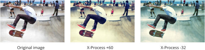
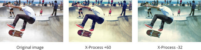
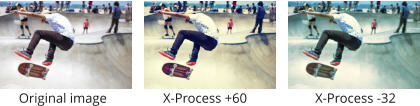
Sometimes called Cross-process, this effect simulates a photographic processing technique which historically used the ‘wrong’ chemicals to develop film - thus resulting in some dramatic or less dramatic (depends on the values you set) contrast and saturation effects. Sometimes referred to as a ‘faded old-world photo’ look. Use the slider to experiment.Color Saturation
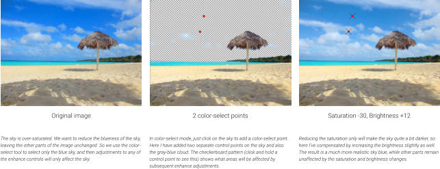
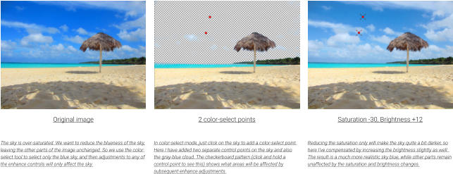
This controls the intensity of the colors. At the minimum -100 value this removes all color and is a simple way of making black and white images. Most digital images are well saturated, so it’s very unusual to have to turn this control up, i.e. to add to the color saturation. However, some cheaper digital cameras tend to over-saturate colors. In this example the sky is unrealistically over-saturated, it’s too blue. So here we use the color-select tool feature to reduce the saturation of the sky blue color only, so the sand and sea are not affected.Temperature
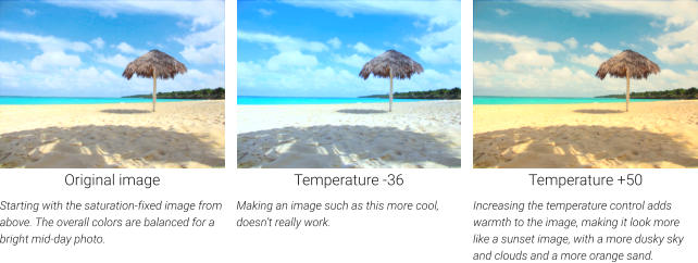
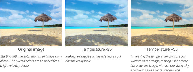
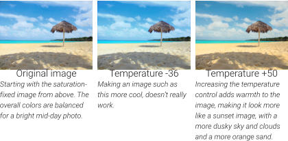
You might think it unusual to describe the temperature of a photo, but the light all around you has a temperature (and is generally created by objects such as the sun or an incandescent light that are very hot things). In fact, you can measure the temperature of hot objects by measuring their color. We tend to associate ‘warm images’ with being more red-orange, and cooler images being more blue - that’s what this control adjusts.Photo Hue
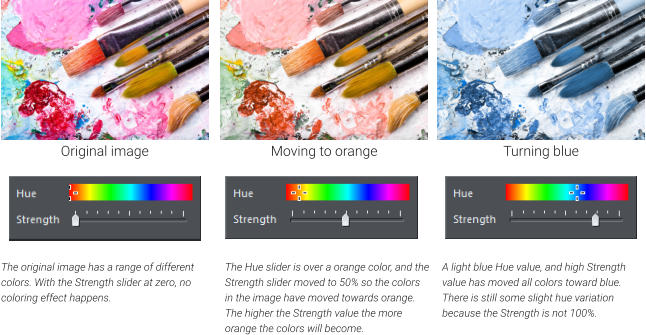
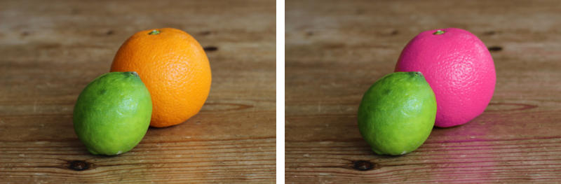
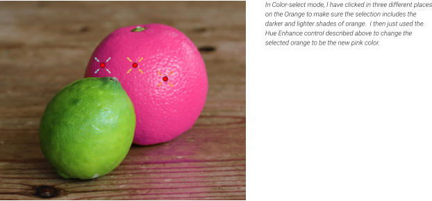
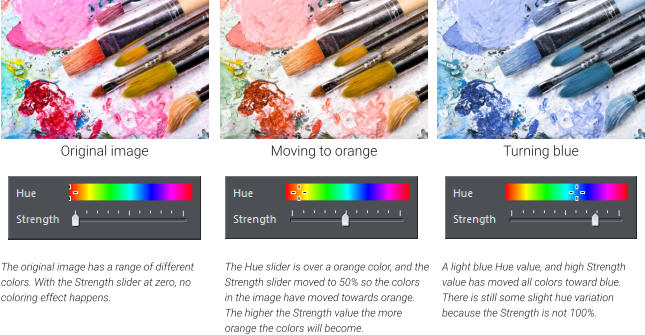
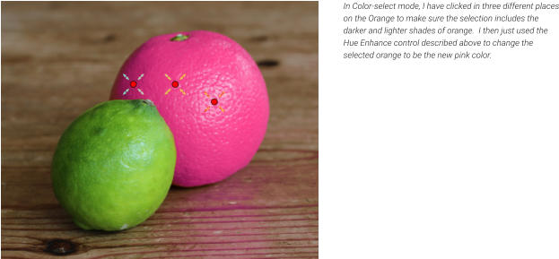
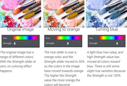
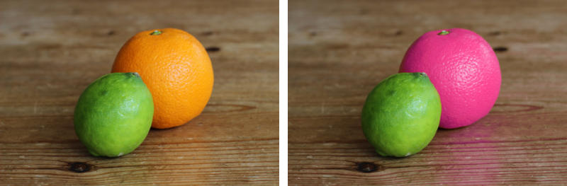
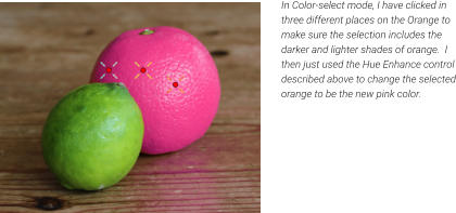
The Hue control changes the colors in your image. A strength control can adjust this from a very subtle tint towards a certain color, to a complete re-coloring where all colors are changed to be the desired color. Combine this with the color-select feature, and you can change the color of only certain colors in your photo, or part of your photo. Instead of the usual slider the Photo Hue control shows a pop-up with Hue and Strength sliders. This example uses the Color Select Tool to select the orange, and then the Hue Control to adjust only the color (I guess you can’t call this an orange any more.) Note that even the subtle reflection on the table has changed color. This whole process takes less than 30 seconds. Advanced note: Other programs sometimes include a ‘Hue shift’ facility. But typically these shift the hue of all colors in the image, which in our opinion is not useful in many, if any, cases. Instead, our version of Hue control moves all the colors towards a single defined hue, as the above examples show.Sharpen / Blur
Drag the slider to the left to blur the image and to the right to sharpen it. It’s easy to over-sharpen images so care needs to be taken. Images that are scaled down greatly (so they are higher resolution on screen) can accept more sharpening than ones displayed at normal screen resolution. Tip: the status line at the bottom of the window shows the image resolution. If you want greater blur than -100 (the limit of the slider) you can adjust the numeric value directly and enter much larger negative values. Blur can be useful for adding depth-of-field effects to backgrounds, or blurring sensitive areas of screen grabs. Use the Region Painter tool to paint over an area of a photo, then select the Blur control. You can capture a screen image using the built-in Screen Capture feature (Utilities menu)Compare
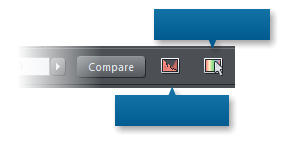
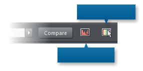
This button, on the right end of the Photo Enhance InfoBar, allows you to toggle between a ‘before’ and ‘after’ view of any changes you make using these tools. Press it once to see the original image, with all your current enhance values removed, press it again to restore your changes.Brightness Levels Dialog
This provides many advanced features, including: • A histogram of brightness, updating in real-time as you make changes to any Enhance Tool value, showing the before and after histograms • An adjustable brightness curve control allowing detailed brightness mapping • Ability to set the input and output black and white points. • White balance control • Gamma brightness control • All on combined RGB values or on individual R, G or B values only. The Levels Dialog is described in more detail in a Brightness Levels and Color Balance tutorial. Color Select The final control on the right of the Photo Enhance InfoBar is the Color Select mode control. Normally, when you select a photo and apply any enhance value described above, it changes the whole photo. But if you select this control, then click on a color in the photo - it will only change the color selected. (When you first click or drag a color-select control point around you will see a checkerboard pattern showing what is selected.) Now if you use any Enhance control it affects only those selected colors in the image. So this is a really quick and easy way to adjust only certain colors in an image. If you want to restrict the color select to a given area of an image (say you wanted to change the blue of the sky, but not other blue items in the photo), you can use the Region Painter Tool or Mask Painter Tool, before selecting colors. Tips: • When in Color-select mode, each subsequent click will add an additional color-select control point, so you can easily select a range of shades. • Just click and hold (or drag) a control point to show the checkerboard pattern that indicates which parts are selected. • You can right click on a color-select point to see more options, and there is an additional drop-down control on the tool icon when it’s selected to provide further adjustment controls. See a more detailed description the Changing Colors in Photos. This is the third part of a series of guides to editing photos in Xara. 1. Beginner’s Guide to Photo Editing in Xara The basics of opening photos, zooming, sizing photos, and saving. 2. Summary of the Photo Tools A summary of the tools on the Photo Tool fly-out menu. 3. Photo Enhance options An overview of the ‘workhorse’ range of Enhance options. 4. Changing colors in photos How to select and enhance or adjust specific colors. 5. A real-world example Combining many of the techniques described above, to transform a poor photo. In addition there are more detailed guides covering other photo tools: The Shadow and Highlight controls Intelligent Photo Rescaling and Zooming Erasing Backgrounds and Combining Photos Brightness Levels and Color Balance Panoramic Photos For more tutorials by Xara and third parties, check out our Resource index, which offers a searchable and browsable list of movies and tutorials created by Xara and third parties. Try it! If you would like to try out these photo tools and you don’t already own Xara Photo & Graphic Designer or Xara Designer Pro, you can download the trial version from our website and try it now.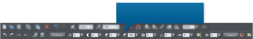

Copyright © 2016 Xara Group Limited.
Page created with Xara Designer Pro

Color Select Mode
Levels Histogram
Brightness
Contrast
Shadows
Highlights
Saturation
Warm / Cold
Sharpen / Blur
Color Tint
X-Process
The InfoBar at the top of the window shows
the controls for the selected tool. In this case
it’s showing the main photo enhance controls


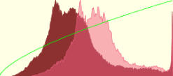


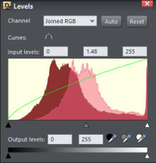


Photo Enhance Tool
In the first part of our Guide to Photo Editing in Xara, we covered the basics of opening photos, zooming, sizing photos and saving, and a gave a brief summary of the Photo Enhance Tool. The second tutorial in the series gave a Summary of the Photo Tools on the Photo Tool fly-out menu. Note: This tutorial has been updated to include some new photo features in Photo & Graphic Designer and Designer Pro (July 2016). We have also added more detail about the options in the Enhance Tool, the workhorse controls that are used in just about every photo edit. A quick reminder to start with: When you move over the camera icon on the main toolbar, you’ll see this fly- out menu of all the Photo tools. As you select each tool on the fly-out, the icon on the left toolbar will change to reflect the tool that has now become current. In this tutorial, we’ll cover the ‘Enhance Tool’ which is the camera icon on the fly-out, and the one selected by default. When you select the Enhance Tool the InfoBar at the top of the page will look like this: We have already shown you how to use the controls on the left end of the InfoBar (rotate, next & previous, etc.), so now we’ll focus on the center set of controls, which are collectively called the ‘Enhance Controls’. Remember that your photo must be selected for these settings to apply to that photo. You can use the Selector Tool, or a quicker more direct way if you’re currently using one of the Photo Tools is just to click on it. A selected photo will show resize handles around it. Each of the above controls can accept a numeric value in the field (just click and type the required number), or you can click the right arrow and drag the slider to see the adjustment being made to your photo. Drag the slider control or enter a numeric valueWhole or Part
You can apply any of these Enhance Controls to the whole image, or part. There are two main ways to enhance just a part of the image... 1. Use the Region Painter or Mask Painter tools to select or protect a part of your photo before you use the Enhance Tools. For example use the Region Painter to paint an area on your photo. After this, the Enhance options described below, will only apply to that area. Or... 2. Use the Color Select feature to adjust only certain colors in your photo. This control is on the end of the Enhance Tool InfoBar. Color Select is described in more detail at the end of this tutorial. These two methods of selecting parts of your image can be used in combination. For instance, you can use the Region Painter tool to select one flower within a photo, and then the Color Select to select the color, and then adjust it using the Hue control (described below).Brightness Levels Histogram
A Brightness Levels Histogram is basically a plot of the brightness levels of all the pixels in the image, from the darkest on the left to the lightest on the right. The more pixels that are a given brightness, the higher the chart value. It’s a great way to see the distribution of brightness levels of your picture, at a glance, and to see the effect of these controls on the brightness distribution. As you adjust any of the brightness controls, the histogram changes, showing you the original levels (the darker red area in the above case) and then overlaid this a lighter semi-transparent adjusted levels (the lighter pink in the above example). So this means as you adjust the controls you get instant feedback of how your brightness levels distribution is affected. In the following examples, each photo is shown with the results of the enhance operation, and under each is the histogram of the brightness levels with an explanation. Of course, you do not need to use or even see the Brightness Levels Dialog (described below on the last page of this tutorial) and the histogram - you can just adjust the controls until the picture looks right to your eyes. But it’s educational to understand and see a visual graph of the changes.Brightness Control
The brightness control adjusts the overall brightness of the image, but unlike the brightness control in most photo editors that brighten all values equally, this puts greater emphasis on the darker shades in your picture. The green line represents how the brightness levels are adjusted. In the initial image (left example) there is no adjustment - it’s a straight line. In the center image where the brightness value is increased you can see that the left end (darker shades) are lifted, but the brighter shades (right end of the line) are hardly changed - the line is very close to the original. In the case of the darker right-hand image, the green line curves downwards indicating that all the shades have been made darker.Contrast Control
Increased contrast means making the lighter shades lighter and the darker shades darker. Reduced contrast is the opposite. At extreme low contrast, almost all the image is mid-tone gray.Shadow Brightness
The Shadow Brightness control only affects the mid to dark shade areas, without altering brighter shades in the photo. For more information on this control see the Shadows and Highlights Brightness tutorial.Highlight Brightness
This control works at the other end of the brightness scale, and can reduce the brightest areas only. With most digital images it’s usually possible to bring out more detail of darker under-exposed areas than it is to recover detail in over-exposed areas. In other words it’s better to have under-exposed images than over- exposed ones. For more information on this control see the Shadows and Highlights Brightness tutorial.X-Process
Sometimes called Cross-process, this effect simulates a photographic processing technique which historically used the ‘wrong’ chemicals to develop film - thus resulting in some dramatic or less dramatic (depends on the values you set) contrast and saturation effects. Sometimes referred to as a ‘faded old- world photo’ look. Use the slider to experiment.Color Saturation
This controls the intensity of the colors. At the minimum -100 value this removes all color and is a simple way of making black and white images. Most digital images are well saturated, so it’s very unusual to have to turn this control up, i.e. to add to the color saturation. However, some cheaper digital cameras tend to over-saturate colors. In this example the sky is unrealistically over-saturated, it’s too blue. So here we use the color-select tool feature to reduce the saturation of the sky blue color only, so the sand and sea are not affected.Temperature
You might think it unusual to describe the temperature of a photo, but the light all around you has a temperature (and is generally created by objects such as the sun or an incandescent light that are very hot things). In fact, you can measure the temperature of hot objects by measuring their color. We tend to associate ‘warm images’ with being more red-orange, and cooler images being more blue - that’s what this control adjusts.Photo Hue
The Hue control changes the colors in your image. A strength control can adjust this from a very subtle tint towards a certain color, to a complete re-coloring where all colors are changed to be the desired color. Combine this with the color-select feature, and you can change the color of only certain colors in your photo, or part of your photo. Instead of the usual slider the Photo Hue control shows a pop-up with Hue and Strength sliders. This example uses the Color Select Tool to select the orange, and then the Hue Control to adjust only the color (I guess you can’t call this an orange any more.) Note that even the subtle reflection on the table has changed color. This whole process takes less than 30 seconds. Advanced note: Other programs sometimes include a ‘Hue shift’ facility. But typically these shift the hue of all colors in the image, which in our opinion is not useful in many, if any, cases. Instead, our version of Hue control moves all the colors towards a single defined hue, as the above examples show.Sharpen / Blur
Drag the slider to the left to blur the image and to the right to sharpen it. It’s easy to over-sharpen images so care needs to be taken. Images that are scaled down greatly (so they are higher resolution on screen) can accept more sharpening than ones displayed at normal screen resolution. Tip: the status line at the bottom of the window shows the image resolution. If you want greater blur than -100 (the limit of the slider) you can adjust the numeric value directly and enter much larger negative values. Blur can be useful for adding depth-of-field effects to backgrounds, or blurring sensitive areas of screen grabs. Use the Region Painter tool to paint over an area of a photo, then select the Blur control. You can capture a screen image using the built-in Screen Capture feature (Utilities menu)Compare
This button, on the right end of the Photo Enhance InfoBar, allows you to toggle between a ‘before’ and ‘after’ view of any changes you make using these tools. Press it once to see the original image, with all your current enhance values removed, press it again to restore your changes.Brightness Levels Dialog
This provides many advanced features, including: • A histogram of brightness, updating in real-time as you make changes to any Enhance Tool value, showing the before and after histograms • An adjustable brightness curve control allowing detailed brightness mapping • Ability to set the input and output black and white points. • White balance control • Gamma brightness control • All on combined RGB values or on individual R, G or B values only. The Levels Dialog is described in more detail in a Brightness Levels and Color Balance tutorial. Color Select The final control on the right of the Photo Enhance InfoBar is the Color Select mode control. Normally, when you select a photo and apply any enhance value described above, it changes the whole photo. But if you select this control, then click on a color in the photo - it will only change the color selected. (When you first click or drag a color-select control point around you will see a checkerboard pattern showing what is selected.) Now if you use any Enhance control it affects only those selected colors in the image. So this is a really quick and easy way to adjust only certain colors in an image. If you want to restrict the color select to a given area of an image (say you wanted to change the blue of the sky, but not other blue items in the photo), you can use the Region Painter Tool or Mask Painter Tool, before selecting colors. Tips: • When in Color-select mode, each subsequent click will add an additional color-select control point, so you can easily select a range of shades. • Just click and hold (or drag) a control point to show the checkerboard pattern that indicates which parts are selected. • You can right click on a color-select point to see more options, and there is an additional drop-down control on the tool icon when it’s selected to provide further adjustment controls. See a more detailed description the Changing Colors in Photos. This is the third part of a series of guides to editing photos in Xara. 1. Beginner’s Guide to Photo Editing in Xara The basics of opening photos, zooming, sizing photos, and saving. 2. Summary of the Photo Tools A summary of the tools on the Photo Tool fly-out menu. 3. Photo Enhance options An overview of the ‘workhorse’ range of Enhance options. 4. Changing colors in photos How to select and enhance or adjust specific colors. 5. A real-world example Combining many of the techniques described above, to transform a poor photo. In addition there are more detailed guides covering other photo tools: The Shadow and Highlight controls Intelligent Photo Rescaling and Zooming Erasing Backgrounds and Combining Photos Brightness Levels and Color Balance Panoramic Photos For more tutorials by Xara and third parties, check out our Resource index, which offers a searchable and browsable list of movies and tutorials created by Xara and third parties. Try it! If you would like to try out these photo tools and you don’t already own Xara Photo & Graphic Designer or Xara Designer Pro, you can download the trial version from our website and try it now.


Color Select Mode
Levels Histogram
Brightnes
s
Contrast
Shadows
Highlight
s
Saturatio
n
Warm /
Cold
Sharpen /
Blur
Color
Tint
X-
Process
The InfoBar at the top of the window
shows the controls for the selected
tool. In this case it’s showing the
main photo enhance controls
Copyright © 2016 Xara Group Limited.
Page created with Xara Designer Pro
Photo Enhance Tool
In the first part of our Guide to Photo Editing in Xara, we covered the basics of opening photos, zooming, sizing photos and saving, and a gave a brief summary of the Photo Enhance Tool. The second tutorial in the series gave a Summary of the Photo Tools on the Photo Tool fly-out menu. Note: This tutorial has been updated to include some new photo features in Photo & Graphic Designer and Designer Pro (July 2016). We have also added more detail about the options in the Enhance Tool, the workhorse controls that are used in just about every photo edit. A quick reminder to start with: When you move over the camera icon on the main toolbar, you’ll see this fly-out menu of all the Photo tools. As you select each tool on the fly-out, the icon on the left toolbar will change to reflect the tool that has now become current. In this tutorial, we’ll cover the ‘Enhance Tool’ which is the camera icon on the fly-out, and the one selected by default. When you select the Enhance Tool the InfoBar at the top of the page will look like this: We have already shown you how to use the controls on the left end of the InfoBar (rotate, next & previous, etc.), so now we’ll focus on the center set of controls, which are collectively called the ‘Enhance Controls’. Remember that your photo must be selected for these settings to apply to that photo. You can use the Selector Tool, or a quicker more direct way if you’re currently using one of the Photo Tools is just to click on it. A selected photo will show resize handles around it. Each of the above controls can accept a numeric value in the field (just click and type the required number), or you can click the right arrow and drag the slider to see the adjustment being made to your photo. Drag the slider control or enter a numeric valueWhole or Part
You can apply any of these Enhance Controls to the whole image, or part. There are two main ways to enhance just a part of the image... 1. Use the Region Painter or Mask Painter tools to select or protect a part of your photo before you use the Enhance Tools. For example use the Region Painter to paint an area on your photo. After this, the Enhance options described below, will only apply to that area. Or... 2. Use the Color Select feature to adjust only certain colors in your photo. This control is on the end of the Enhance Tool InfoBar. Color Select is described in more detail at the end of this tutorial. These two methods of selecting parts of your image can be used in combination. For instance, you can use the Region Painter tool to select one flower within a photo, and then the Color Select to select the color, and then adjust it using the Hue control (described below).Brightness Levels Histogram
A Brightness Levels Histogram is basically a plot of the brightness levels of all the pixels in the image, from the darkest on the left to the lightest on the right. The more pixels that are a given brightness, the higher the chart value. It’s a great way to see the distribution of brightness levels of your picture, at a glance, and to see the effect of these controls on the brightness distribution. As you adjust any of the brightness controls, the histogram changes, showing you the original levels (the darker red area in the above case) and then overlaid this a lighter semi-transparent adjusted levels (the lighter pink in the above example). So this means as you adjust the controls you get instant feedback of how your brightness levels distribution is affected. In the following examples, each photo is shown with the results of the enhance operation, and under each is the histogram of the brightness levels with an explanation. Of course, you do not need to use or even see the Brightness Levels Dialog (described below on the last page of this tutorial) and the histogram - you can just adjust the controls until the picture looks right to your eyes. But it’s educational to understand and see a visual graph of the changes.Brightness Control
The brightness control adjusts the overall brightness of the image, but unlike the brightness control in most photo editors that brighten all values equally, this puts greater emphasis on the darker shades in your picture. The green line represents how the brightness levels are adjusted. In the initial image (left example) there is no adjustment - it’s a straight line. In the center image where the brightness value is increased you can see that the left end (darker shades) are lifted, but the brighter shades (right end of the line) are hardly changed - the line is very close to the original. In the case of the darker right-hand image, the green line curves downwards indicating that all the shades have been made darker.Contrast Control
Increased contrast means making the lighter shades lighter and the darker shades darker. Reduced contrast is the opposite. At extreme low contrast, almost all the image is mid-tone gray.Shadow Brightness
The Shadow Brightness control only affects the mid to dark shade areas, without altering brighter shades in the photo. For more information on this control see the Shadows and Highlights Brightness tutorial.Highlight Brightness
This control works at the other end of the brightness scale, and can reduce the brightest areas only. With most digital images it’s usually possible to bring out more detail of darker under-exposed areas than it is to recover detail in over-exposed areas. In other words it’s better to have under-exposed images than over-exposed ones. For more information on this control see the Shadows and Highlights Brightness tutorial.X-Process
Sometimes called Cross-process, this effect simulates a photographic processing technique which historically used the ‘wrong’ chemicals to develop film - thus resulting in some dramatic or less dramatic (depends on the values you set) contrast and saturation effects. Sometimes referred to as a ‘faded old-world photo’ look. Use the slider to experiment.Color Saturation
This controls the intensity of the colors. At the minimum -100 value this removes all color and is a simple way of making black and white images. Most digital images are well saturated, so it’s very unusual to have to turn this control up, i.e. to add to the color saturation. However, some cheaper digital cameras tend to over-saturate colors. In this example the sky is unrealistically over-saturated, it’s too blue. So here we use the color-select tool feature to reduce the saturation of the sky blue color only, so the sand and sea are not affected.Temperature
You might think it unusual to describe the temperature of a photo, but the light all around you has a temperature (and is generally created by objects such as the sun or an incandescent light that are very hot things). In fact, you can measure the temperature of hot objects by measuring their color. We tend to associate ‘warm images’ with being more red-orange, and cooler images being more blue - that’s what this control adjusts.Photo Hue
The Hue control changes the colors in your image. A strength control can adjust this from a very subtle tint towards a certain color, to a complete re-coloring where all colors are changed to be the desired color. Combine this with the color-select feature, and you can change the color of only certain colors in your photo, or part of your photo. Instead of the usual slider the Photo Hue control shows a pop-up with Hue and Strength sliders. This example uses the Color Select Tool to select the orange, and then the Hue Control to adjust only the color (I guess you can’t call this an orange any more.) Note that even the subtle reflection on the table has changed color. This whole process takes less than 30 seconds. Advanced note: Other programs sometimes include a ‘Hue shift’ facility. But typically these shift the hue of all colors in the image, which in our opinion is not useful in many, if any, cases. Instead, our version of Hue control moves all the colors towards a single defined hue, as the above examples show.Sharpen / Blur
Drag the slider to the left to blur the image and to the right to sharpen it. It’s easy to over-sharpen images so care needs to be taken. Images that are scaled down greatly (so they are higher resolution on screen) can accept more sharpening than ones displayed at normal screen resolution. Tip: the status line at the bottom of the window shows the image resolution. If you want greater blur than -100 (the limit of the slider) you can adjust the numeric value directly and enter much larger negative values. Blur can be useful for adding depth-of-field effects to backgrounds, or blurring sensitive areas of screen grabs. Use the Region Painter tool to paint over an area of a photo, then select the Blur control. You can capture a screen image using the built-in Screen Capture feature (Utilities menu)Compare
This button, on the right end of the Photo Enhance InfoBar, allows you to toggle between a ‘before’ and ‘after’ view of any changes you make using these tools. Press it once to see the original image, with all your current enhance values removed, press it again to restore your changes.Brightness Levels Dialog
This provides many advanced features, including: • A histogram of brightness, updating in real-time as you make changes to any Enhance Tool value, showing the before and after histograms • An adjustable brightness curve control allowing detailed brightness mapping • Ability to set the input and output black and white points. • White balance control • Gamma brightness control • All on combined RGB values or on individual R, G or B values only. The Levels Dialog is described in more detail in a Brightness Levels and Color Balance tutorial. Color Select The final control on the right of the Photo Enhance InfoBar is the Color Select mode control. Normally, when you select a photo and apply any enhance value described above, it changes the whole photo. But if you select this control, then click on a color in the photo - it will only change the color selected. (When you first click or drag a color-select control point around you will see a checkerboard pattern showing what is selected.) Now if you use any Enhance control it affects only those selected colors in the image. So this is a really quick and easy way to adjust only certain colors in an image. If you want to restrict the color select to a given area of an image (say you wanted to change the blue of the sky, but not other blue items in the photo), you can use the Region Painter Tool or Mask Painter Tool, before selecting colors. Tips: • When in Color-select mode, each subsequent click will add an additional color-select control point, so you can easily select a range of shades. • Just click and hold (or drag) a control point to show the checkerboard pattern that indicates which parts are selected. • You can right click on a color-select point to see more options, and there is an additional drop-down control on the tool icon when it’s selected to provide further adjustment controls. See a more detailed description the Changing Colors in Photos. This is the third part of a series of guides to editing photos in Xara. 1. Beginner’s Guide to Photo Editing in Xara The basics of opening photos, zooming, sizing photos, and saving. 2. Summary of the Photo Tools A summary of the tools on the Photo Tool fly-out menu. 3. Photo Enhance options An overview of the ‘workhorse’ range of Enhance options. 4. Changing colors in photos How to select and enhance or adjust specific colors. 5. A real-world example Combining many of the techniques described above, to transform a poor photo. In addition there are more detailed guides covering other photo tools: The Shadow and Highlight controls Intelligent Photo Rescaling and Zooming Erasing Backgrounds and Combining Photos Brightness Levels and Color Balance Panoramic Photos For more tutorials by Xara and third parties, check out our Resource index, which offers a searchable and browsable list of movies and tutorials created by Xara and third parties. Try it! If you would like to try out these photo tools and you don’t already own Xara Photo & Graphic Designer or Xara Designer Pro, you can download the trial version from our website and try it now.


Color Select Mode
Levels Histogram
Brightne
ss
Contrast
Shadows
Highlight
s
Saturati
on
Warm /
Cold
Sharpen
/ Blur
Color
Tint
X-
Process
The InfoBar at the top
of the window shows
the controls for the
selected tool. In this
case it’s showing the
main photo enhance
controls
Copyright © 2016 Xara Group Limited.
Page created with Xara Designer Pro
PHOTO EDITING PT3: THE ENHANCE OPTIONS
PHOTO EDITING PT3: THE ENHANCE OPTIONS
PHOTO EDITING PT3: THE ENHANCE OPTIONS