We all strive to take the perfect photos but very often we manage to get the incorrect exposure resulting in our photo being too light or too
dark. Often, a photo will look fine on the viewer in your camera but when you download it to your computer or into your photo gallery, the flaws
reveal themselves. A common fault in photos is an incorrect white balance resulting in photos being too yellow, orange or blue.
The original image and the corrected image showing its histogram
In this tutorial we’re going to show you how easy it is to use photo editing tools that can help you to color correct your photos in Photo &
Graphic Designer or Designer Pro If you don’t already own a copy you can simply download a free, fully working trial version and try it!
Before you start you might want to refer to Part 1 & 2 of the tutorials in this photo editing series; Photo Editing Basics Part 1 is an intro to photo
terminology and concepts, and you will find an intro to all of the photo tools in Photo Editing Basics Part 2.
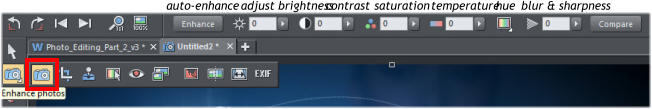
This tutorial will focus on editing the whole picture - a later tutorial will show you how to make regional changes. Below is the Photo tool with
its fly out menu. We'll start with the easy slider controls in the Photo Enhance tool, so click the camera icon.
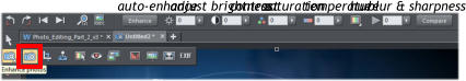
From here you can adjust the brightness and contrast, as well as the color saturation, color temperature, hue and blur or sharpness. Simply
enter a value or click on the arrow alongside the function to open up the slider control. For example, if you increase the contrast, the brighter
parts are brighter and the darker parts are darker and vice versa.
At any time you can click the 'Compare' button on the Photo tool InfoBar to compare your changes with the original. Click it again to revert back
to the current settings (this toggles between the original and current). Don't forget you can use the undo to remove the last settings, so
experiment as much as you wish.
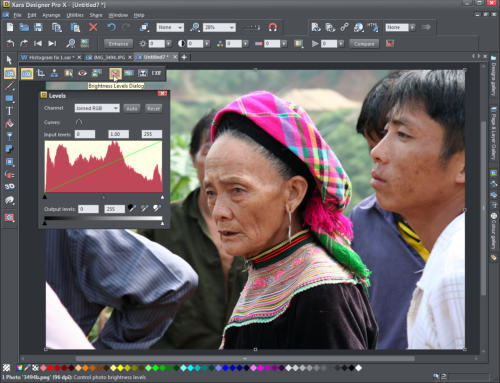
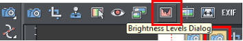
However, there is a much more powerful way of viewing and manipulating brightness levels by using the Histogram and Levels feature. Select
the Levels tool to open the Brightness Levels Dialog and you will see a histogram for your photo. The histogram counts the brightness levels of
every pixel in the picture and draws a graph to tell you where those pixels are on the scale of dark to light. The graph looks like mountain peaks
and gives you an 'at a glance' overview of the brightness levels of your picture. The left side of the histogram is dark, the right side is light, and
the middle is the mid-tones.
The aim is to get a histogram with a good range of shades from dark to light that matches the scene you are shooting, so a night-time shot
would be heavier on the left, a landscape would be in the middle and a snowy scene heavier on the right. You also want the 'mountain' slopes to
go to 'sea level' on each of the far ends of the graph. The Levels dialog works in conjunction with the brightness and contrast sliders, so you
can use both sets of controls together or separately. The best way to see how this works is to look at some examples so you can see what we
are aiming for.
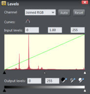
This is a good example, you can see that the histogram has a well dispersed range of peaks touching the ground at both the black and the
white ends, ie over the entire brightness range of 0 to 255.
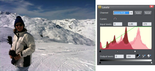
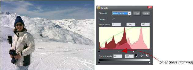
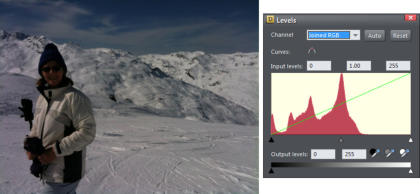
This is a classic example of a camera doing what it thinks is right - trying to expose the large area of white so it's approximately in the middle of
the brightness levels. Instead of the brightness levels being spread over a 0 to 255 brightness range they are compressed, with almost no
bright pixels at all. However, this is snow and it should be much lighter than this.
For this reason, some cameras have a special 'snow' pre-set where they compensate. When you are not using the pre-set, despite being
counter-intuitive, it's better to over-expose snow pictures, rather than under-expose them. You might be thinking there's so much bright white
that you should under-expose, but that's wrong. By over-exposing, you compensate for the camera's tendency to over-darken large areas of
bright whites.
We can fix this picture by adjusting the histogram. Firstly, I dragged the white point input (small white triangle under the histogram) to the right
end of the histogram (new value 173). What this does is re-distribute the brightness levels that go from 0 to 173, right across the whole
brightness range.
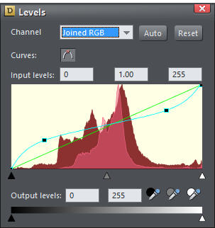
The snow is now significantly more realistic, but the result still has too much contrast, and the subject's face is too much in shade. So I will
now adjust the center brightness control (which is actually a gamma control) in this case, to a value of 1.60, which further lightens the dark to
mid-tones. Note that this causes a bulge in the green levels curve (the bulge at the left end means it’s only brightening the darker shades, and
not the lighter shades).
This is the finished result. The histogram now shows both the original (dark red) and the new histogram (pale red overlay) with the peak on the
chart moved to the right end, which is exactly what you'd expect of a picture that's predominantly snow. The resulting picture is dramatically
better. Clicking the Compare button on the Photo tool InfoBar allows you to rapidly toggle between the before and after comparison.
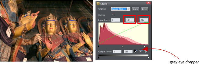
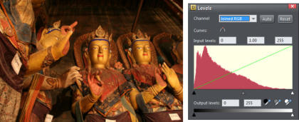
This image below is dark and the histogram reflects that. It doesn't mean it's under-exposed, just that the image contains a lot of dark areas. It
still has a good distribution of brightness levels because you can see that there are shades covering the whole range, albeit very slight on the
light end. The white balance is perhaps questionable - it's a very orange image - but that's because they are gold painted Buddhas in a dark
temple, lit with incandescent lights and candles.
There's not much that can be done to improve this image. However, I have adjusted the white point down to 236, and also given it some slight
brightening of the low to mid shades by dragging the gamma to 1.14. Finally, I have adjusted the white balance by dragging the grey 'eye
dropper' icon from the histogram dialog over a grey part of the image (the room background). You can see this has improved the detail and
colors of the garments.
White balance
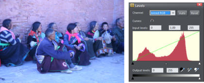
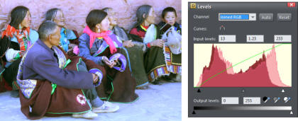
White balance is the process of getting the colors in your images as accurate as possible. All cameras have some basic white balance settings such as Auto, Tungsten, Fluorescent, Daylight/Sunny, Cloudy and Flash, but many amateur photographers do not use them or, quite commonly, forget to change them back when moving from one scene to another, resulting in images that are too yellow, orange or blue. The levels dialog allows you to adjust the overall color balance, in particular, the white balance so you can improve the photos that have been taken with the wrong settings on your camera. The white balance for this image was incorrectly set for interior incandescent light as it was not reset to daylight when returning outside - the result is a strong blue cast to the whole image. The histogram show a good range of shades, but lacking at both ends, with not many really dark or really light shades, which corresponds to a lack of contrast. I've moved the black and white points to the ends of the histogram to re-distribute the shades. The largest change is achieved from adjusting the white balance by dragging the grey 'eye dropper' onto a grey object (I used the man's hair). As you drag the dropper over your picture you can see it changing, sometimes dramatically, as it looks at the pixels under the mouse pointer and tries to adjust the balance of the whole picture so that the pixels under the pointer are grey. You can see that the garment and face colors are slightly better, but it's probably impossible to get a perfect color balance when the photo is so wrong in the first place. I've also cropped it to try and improve the composition and I've sharpened it. The resultant image is a significant improvement, even if it's far from perfect.The Curves Control
Some software has a separate 'Brightness Curves' dialog that also lets you adjust the brightness levels. Xara combines this 'curve' control into the same dialog - it's the green line you can see drawn across the histogram. This green line represents a mapping of input shades to output shades. So a straight line, from bottom left to top right, means that there's a 1:1 mapping. In other words, blacks convert to black and whites to white, and a brightness level of 128 is 128 ie. no change. As you adjust the brightness slider on the InfoBar (or the middle grey small triangle under the histogram, which does the same thing) you will see that the green line bulges. (You can see this in the above screen shot). What this means is that the darker shades are being lifted slightly. If you adjust the contrast or the black or white points you can see the green curve change to reflect the new mapping curve. But it goes further than just showing the curve as a green line - you can drag on the curve to create any brightness mapping curve you like. This is an immensely powerful way of adjusting the brightness levels of pictures. As a simple example here's one where I have dragged on the curve in two places to create a new mapping curve (the pale blue line). You don't need to see the picture to understand what this does. By lifting the dark end, and dropping the bright end, I have in effect reduced the contrast of the image and you can see this reflected in the histogram. Actually, there was nothing wrong with the original brightness levels - they were well centered and with a good distribution, but you can see the new histogram (the pale overlay) results in less contrast - that is fewer dark and fewer light shades. In this second histogram, I've done the opposite - moved the dark end down (made the darker shades darker), and moved the lighter end of the curve up. The new histogram is now more spread over the brightness range giving brighter whites and darker blacks, in other words a high contrast image. You can see this degree of manual control allows you to adjust any part of the brightness range without affecting other parts. So you could, for instance, darken really bright parts of the picture, but leave all dark and mid-tones as they are. I've only touched on some of the capabilities of the Histogram Levels and Curves tool, but it's worth mastering as it’s a very powerful, fast and interactive way to adjust image brightness, contrast and white balance levels, all in one dialog. For more information on the photo tool in Photo & Graphic Designer and Designer Pro see the two earlier tutorials in this photo editing series: Photo Editing Basics, Part 1 - an intro to the terminology, formats & sizing Photo Editing Basics, Part 2 - an overview of all the photo tools Xara's unique non-destructive nature maintains the high quality of your original photo regardless of how many times you open-edit-save it. As a result many people use Xara Photo or Graphic Designer 2013 as their primary, general purpose image and document composition tool. Check out our Resource index, which offers a searchable and browsable list of movies and tutorials created by Xara and third parties.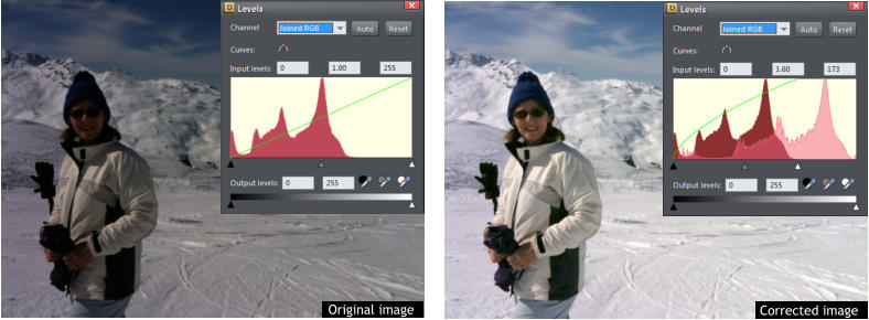


Copyright © 2013 Xara Group Limited.
Page created with Xara Designer Pro


We all strive to take the perfect photos but very often we manage to get the incorrect exposure resulting in
our photo being too light or too dark. Often, a photo will look fine on the viewer in your camera but when
you download it to your computer or into your photo gallery, the flaws reveal themselves. A common fault
in photos is an incorrect white balance resulting in photos being too yellow, orange or blue.
The original image and the corrected image showing its histogram
In this tutorial we’re going to show you how easy it is to use photo editing tools that can help you to color
correct your photos in Photo & Graphic Designer or Designer Pro If you don’t already own a copy you can
simply download a free, fully working trial version and try it!
Before you start you might want to refer to Part 1 & 2 of the tutorials in this photo editing series; Photo
Editing Basics Part 1 is an intro to photo terminology and concepts, and you will find an intro to all of the
photo tools in Photo Editing Basics Part 2.
This tutorial will focus on editing the whole picture - a later tutorial will show you how to make regional
changes. Below is the Photo tool with its fly out menu. We'll start with the easy slider controls in the Photo
Enhance tool, so click the camera icon.
From here you can adjust the brightness and contrast, as well as the color saturation, color temperature,
hue and blur or sharpness. Simply enter a value or click on the arrow alongside the function to open up the
slider control. For example, if you increase the contrast, the brighter parts are brighter and the darker parts
are darker and vice versa.
At any time you can click the 'Compare' button on the Photo tool InfoBar to compare your changes with the
original. Click it again to revert back to the current settings (this toggles between the original and current).
Don't forget you can use the undo to remove the last settings, so experiment as much as you wish.
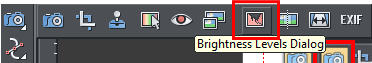
However, there is a much more powerful way of viewing and manipulating brightness levels by using the
Histogram and Levels feature. Select the Levels tool to open the Brightness Levels Dialog and you will see a
histogram for your photo. The histogram counts the brightness levels of every pixel in the picture and
draws a graph to tell you where those pixels are on the scale of dark to light. The graph looks like mountain
peaks and gives you an 'at a glance' overview of the brightness levels of your picture. The left side of the
histogram is dark, the right side is light, and the middle is the mid-tones.
The aim is to get a histogram with a good range of shades from dark to light that matches the scene you
are shooting, so a night-time shot would be heavier on the left, a landscape would be in the middle and a
snowy scene heavier on the right. You also want the 'mountain' slopes to go to 'sea level' on each of the far
ends of the graph. The Levels dialog works in conjunction with the brightness and contrast sliders, so you
can use both sets of controls together or separately. The best way to see how this works is to look at some
examples so you can see what we are aiming for.
This is a good example, you can see that the histogram has a well dispersed range of peaks touching the
ground at both the black and the white ends, ie over the entire brightness range of 0 to 255.
This is a classic example of a camera doing what it thinks is right - trying to expose the large area of white
so it's approximately in the middle of the brightness levels. Instead of the brightness levels being spread
over a 0 to 255 brightness range they are compressed, with almost no bright pixels at all. However, this is
snow and it should be much lighter than this.
For this reason, some cameras have a special 'snow' pre-set where they compensate. When you are not
using the pre-set, despite being counter-intuitive, it's better to over-expose snow pictures, rather than under-
expose them. You might be thinking there's so much bright white that you should under-expose, but that's
wrong. By over-exposing, you compensate for the camera's tendency to over-darken large areas of bright
whites.
We can fix this picture by adjusting the histogram. Firstly, I dragged the white point input (small white
triangle under the histogram) to the right end of the histogram (new value 173). What this does is re-
distribute the brightness levels that go from 0 to 173, right across the whole brightness range.
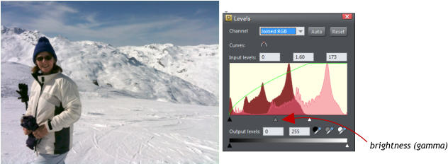
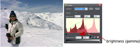
The snow is now significantly more realistic, but the result still has too much contrast, and the subject's
face is too much in shade. So I will now adjust the center brightness control (which is actually a gamma
control) in this case, to a value of 1.60, which further lightens the dark to mid-tones. Note that this causes a
bulge in the green levels curve (the bulge at the left end means it’s only brightening the darker shades, and
not the lighter shades).
This is the finished result. The histogram now shows both the original (dark red) and the new histogram
(pale red overlay) with the peak on the chart moved to the right end, which is exactly what you'd expect of a
picture that's predominantly snow. The resulting picture is dramatically better. Clicking the Compare button
on the Photo tool InfoBar allows you to rapidly toggle between the before and after comparison.
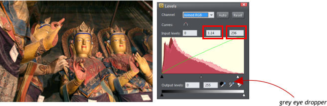
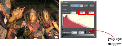
This image below is dark and the histogram reflects that. It doesn't mean it's under-exposed, just that the
image contains a lot of dark areas. It still has a good distribution of brightness levels because you can see
that there are shades covering the whole range, albeit very slight on the light end. The white balance is
perhaps questionable - it's a very orange image - but that's because they are gold painted Buddhas in a
dark temple, lit with incandescent lights and candles.
There's not much that can be done to improve this image. However, I have adjusted the white point down
to 236, and also given it some slight brightening of the low to mid shades by dragging the gamma to 1.14.
Finally, I have adjusted the white balance by dragging the grey 'eye dropper' icon from the histogram dialog
over a grey part of the image (the room background). You can see this has improved the detail and colors
of the garments.
White balance
White balance is the process of getting the colors in your images as accurate as possible. All cameras have some basic white balance settings such as Auto, Tungsten, Fluorescent, Daylight/Sunny, Cloudy and Flash, but many amateur photographers do not use them or, quite commonly, forget to change them back when moving from one scene to another, resulting in images that are too yellow, orange or blue. The levels dialog allows you to adjust the overall color balance, in particular, the white balance so you can improve the photos that have been taken with the wrong settings on your camera. The white balance for this image was incorrectly set for interior incandescent light as it was not reset to daylight when returning outside - the result is a strong blue cast to the whole image. The histogram show a good range of shades, but lacking at both ends, with not many really dark or really light shades, which corresponds to a lack of contrast. I've moved the black and white points to the ends of the histogram to re-distribute the shades. The largest change is achieved from adjusting the white balance by dragging the grey 'eye dropper' onto a grey object (I used the man's hair). As you drag the dropper over your picture you can see it changing, sometimes dramatically, as it looks at the pixels under the mouse pointer and tries to adjust the balance of the whole picture so that the pixels under the pointer are grey. You can see that the garment and face colors are slightly better, but it's probably impossible to get a perfect color balance when the photo is so wrong in the first place. I've also cropped it to try and improve the composition and I've sharpened it. The resultant image is a significant improvement, even if it's far from perfect.The Curves Control
Some software has a separate 'Brightness Curves' dialog that also lets you adjust the brightness levels. Xara combines this 'curve' control into the same dialog - it's the green line you can see drawn across the histogram. This green line represents a mapping of input shades to output shades. So a straight line, from bottom left to top right, means that there's a 1:1 mapping. In other words, blacks convert to black and whites to white, and a brightness level of 128 is 128 ie. no change. As you adjust the brightness slider on the InfoBar (or the middle grey small triangle under the histogram, which does the same thing) you will see that the green line bulges. (You can see this in the above screen shot). What this means is that the darker shades are being lifted slightly. If you adjust the contrast or the black or white points you can see the green curve change to reflect the new mapping curve. But it goes further than just showing the curve as a green line - you can drag on the curve to create any brightness mapping curve you like. This is an immensely powerful way of adjusting the brightness levels of pictures. As a simple example here's one where I have dragged on the curve in two places to create a new mapping curve (the pale blue line). You don't need to see the picture to understand what this does. By lifting the dark end, and dropping the bright end, I have in effect reduced the contrast of the image and you can see this reflected in the histogram. Actually, there was nothing wrong with the original brightness levels - they were well centered and with a good distribution, but you can see the new histogram (the pale overlay) results in less contrast - that is fewer dark and fewer light shades. In this second histogram, I've done the opposite - moved the dark end down (made the darker shades darker), and moved the lighter end of the curve up. The new histogram is now more spread over the brightness range giving brighter whites and darker blacks, in other words a high contrast image. You can see this degree of manual control allows you to adjust any part of the brightness range without affecting other parts. So you could, for instance, darken really bright parts of the picture, but leave all dark and mid-tones as they are. I've only touched on some of the capabilities of the Histogram Levels and Curves tool, but it's worth mastering as it’s a very powerful, fast and interactive way to adjust image brightness, contrast and white balance levels, all in one dialog. For more information on the photo tool in Photo & Graphic Designer and Designer Pro see the two earlier tutorials in this photo editing series: Photo Editing Basics, Part 1 - an intro to the terminology, formats & sizing Photo Editing Basics, Part 2 - an overview of all the photo tools Xara's unique non-destructive nature maintains the high quality of your original photo regardless of how many times you open-edit-save it. As a result many people use Xara Photo or Graphic Designer 2013 as their primary, general purpose image and document composition tool. Check out our Resource index, which offers a searchable and browsable list of movies and tutorials created by Xara and third parties.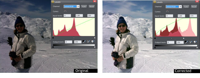


Copyright © 2013 Xara Group Limited.
Page created with Xara Designer Pro

We all strive to take the perfect photos but very often we manage to
get the incorrect exposure resulting in our photo being too light or
too dark. Often, a photo will look fine on the viewer in your camera
but when you download it to your computer or into your photo
gallery, the flaws reveal themselves. A common fault in photos is an
incorrect white balance resulting in photos being too yellow, orange
or blue.
The original image and the corrected image showing its histogram
In this tutorial we’re going to show you how easy it is to use photo
editing tools that can help you to color correct your photos in Photo
& Graphic Designer or Designer Pro If you don’t already own a copy
you can simply download a free, fully working trial version and try it!
Before you start you might want to refer to Part 1 & 2 of the tutorials
in this photo editing series; Photo Editing Basics Part 1 is an intro to
photo terminology and concepts, and you will find an intro to all of
the photo tools in Photo Editing Basics Part 2.
This tutorial will focus on editing the whole picture - a later tutorial
will show you how to make regional changes. Below is the Photo tool
with its fly out menu. We'll start with the easy slider controls in the
Photo Enhance tool, so click the camera icon.
From here you can adjust the brightness and contrast, as well as the
color saturation, color temperature, hue and blur or sharpness.
Simply enter a value or click on the arrow alongside the function to
open up the slider control. For example, if you increase the contrast,
the brighter parts are brighter and the darker parts are darker and
vice versa.
At any time you can click the 'Compare' button on the Photo tool
InfoBar to compare your changes with the original. Click it again to
revert back to the current settings (this toggles between the original
and current). Don't forget you can use the undo to remove the last
settings, so experiment as much as you wish.
However, there is a much more powerful way of viewing and
manipulating brightness levels by using the Histogram and Levels
feature. Select the Levels tool to open the Brightness Levels Dialog
and you will see a histogram for your photo. The histogram counts
the brightness levels of every pixel in the picture and draws a graph
to tell you where those pixels are on the scale of dark to light. The
graph looks like mountain peaks and gives you an 'at a glance'
overview of the brightness levels of your picture. The left side of the
histogram is dark, the right side is light, and the middle is the mid-
tones.
The aim is to get a histogram with a good range of shades from dark
to light that matches the scene you are shooting, so a night-time
shot would be heavier on the left, a landscape would be in the middle
and a snowy scene heavier on the right. You also want the 'mountain'
slopes to go to 'sea level' on each of the far ends of the graph. The
Levels dialog works in conjunction with the brightness and contrast
sliders, so you can use both sets of controls together or separately.
The best way to see how this works is to look at some examples so
you can see what we are aiming for.
This is a good example, you can see that the histogram has a well
dispersed range of peaks touching the ground at both the black and
the white ends, ie over the entire brightness range of 0 to 255.
This is a classic example of a camera doing what it thinks is right -
trying to expose the large area of white so it's approximately in the
middle of the brightness levels. Instead of the brightness levels being
spread over a 0 to 255 brightness range they are compressed, with
almost no bright pixels at all. However, this is snow and it should be
much lighter than this.
For this reason, some cameras have a special 'snow' pre-set where
they compensate. When you are not using the pre-set, despite being
counter-intuitive, it's better to over-expose snow pictures, rather than
under-expose them. You might be thinking there's so much bright
white that you should under-expose, but that's wrong. By over-
exposing, you compensate for the camera's tendency to over-darken
large areas of bright whites.
We can fix this picture by adjusting the histogram. Firstly, I dragged
the white point input (small white triangle under the histogram) to
the right end of the histogram (new value 173). What this does is re-
distribute the brightness levels that go from 0 to 173, right across
the whole brightness range.
The snow is now significantly more realistic, but the result still has
too much contrast, and the subject's face is too much in shade. So I
will now adjust the center brightness control (which is actually a
gamma control) in this case, to a value of 1.60, which further
lightens the dark to mid-tones. Note that this causes a bulge in the
green levels curve (the bulge at the left end means it’s only
brightening the darker shades, and not the lighter shades).
This is the finished result. The histogram now shows both the
original (dark red) and the new histogram (pale red overlay) with the
peak on the chart moved to the right end, which is exactly what you'd
expect of a picture that's predominantly snow. The resulting picture
is dramatically better. Clicking the Compare button on the Photo tool
InfoBar allows you to rapidly toggle between the before and after
comparison.
This image below is dark and the histogram reflects that. It doesn't
mean it's under-exposed, just that the image contains a lot of dark
areas. It still has a good distribution of brightness levels because you
can see that there are shades covering the whole range, albeit very
slight on the light end. The white balance is perhaps questionable -
it's a very orange image - but that's because they are gold painted
Buddhas in a dark temple, lit with incandescent lights and candles.
There's not much that can be done to improve this image. However, I
have adjusted the white point down to 236, and also given it some
slight brightening of the low to mid shades by dragging the gamma
to 1.14. Finally, I have adjusted the white balance by dragging the
grey 'eye dropper' icon from the histogram dialog over a grey part of
the image (the room background). You can see this has improved
the detail and colors of the garments.
White balance
White balance is the process of getting the colors in your images as accurate as possible. All cameras have some basic white balance settings such as Auto, Tungsten, Fluorescent, Daylight/Sunny, Cloudy and Flash, but many amateur photographers do not use them or, quite commonly, forget to change them back when moving from one scene to another, resulting in images that are too yellow, orange or blue. The levels dialog allows you to adjust the overall color balance, in particular, the white balance so you can improve the photos that have been taken with the wrong settings on your camera. The white balance for this image was incorrectly set for interior incandescent light as it was not reset to daylight when returning outside - the result is a strong blue cast to the whole image. The histogram show a good range of shades, but lacking at both ends, with not many really dark or really light shades, which corresponds to a lack of contrast. I've moved the black and white points to the ends of the histogram to re-distribute the shades. The largest change is achieved from adjusting the white balance by dragging the grey 'eye dropper' onto a grey object (I used the man's hair). As you drag the dropper over your picture you can see it changing, sometimes dramatically, as it looks at the pixels under the mouse pointer and tries to adjust the balance of the whole picture so that the pixels under the pointer are grey. You can see that the garment and face colors are slightly better, but it's probably impossible to get a perfect color balance when the photo is so wrong in the first place. I've also cropped it to try and improve the composition and I've sharpened it. The resultant image is a significant improvement, even if it's far from perfect.The Curves Control
Some software has a separate 'Brightness Curves' dialog that also lets you adjust the brightness levels. Xara combines this 'curve' control into the same dialog - it's the green line you can see drawn across the histogram. This green line represents a mapping of input shades to output shades. So a straight line, from bottom left to top right, means that there's a 1:1 mapping. In other words, blacks convert to black and whites to white, and a brightness level of 128 is 128 ie. no change. As you adjust the brightness slider on the InfoBar (or the middle grey small triangle under the histogram, which does the same thing) you will see that the green line bulges. (You can see this in the above screen shot). What this means is that the darker shades are being lifted slightly. If you adjust the contrast or the black or white points you can see the green curve change to reflect the new mapping curve. But it goes further than just showing the curve as a green line - you can drag on the curve to create any brightness mapping curve you like. This is an immensely powerful way of adjusting the brightness levels of pictures. As a simple example here's one where I have dragged on the curve in two places to create a new mapping curve (the pale blue line). You don't need to see the picture to understand what this does. By lifting the dark end, and dropping the bright end, I have in effect reduced the contrast of the image and you can see this reflected in the histogram. Actually, there was nothing wrong with the original brightness levels - they were well centered and with a good distribution, but you can see the new histogram (the pale overlay) results in less contrast - that is fewer dark and fewer light shades. In this second histogram, I've done the opposite - moved the dark end down (made the darker shades darker), and moved the lighter end of the curve up. The new histogram is now more spread over the brightness range giving brighter whites and darker blacks, in other words a high contrast image. You can see this degree of manual control allows you to adjust any part of the brightness range without affecting other parts. So you could, for instance, darken really bright parts of the picture, but leave all dark and mid-tones as they are. I've only touched on some of the capabilities of the Histogram Levels and Curves tool, but it's worth mastering as it’s a very powerful, fast and interactive way to adjust image brightness, contrast and white balance levels, all in one dialog. For more information on the photo tool in Photo & Graphic Designer and Designer Pro see the two earlier tutorials in this photo editing series: Photo Editing Basics, Part 1 - an intro to the terminology, formats & sizing Photo Editing Basics, Part 2 - an overview of all the photo tools Xara's unique non-destructive nature maintains the high quality of your original photo regardless of how many times you open-edit- save it. As a result many people use Xara Photo or Graphic Designer 2013 as their primary, general purpose image and document composition tool. Check out our Resource index, which offers a searchable and browsable list of movies and tutorials created by Xara and third parties.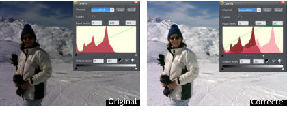


Copyright © 2013 Xara Group Limited.
Page created with Xara Designer Pro
PHOTO EDITING BASICS PT3: BRIGHTNESS LEVELS & COLOR BALANCE
PT 3: BRIGHTNESS LEVELS & COLOR BALANCE
PT3: BRIGHTNESS LEVELS & COLOR BALANCE