thinking outside the box


XARA TUTORIAL
Text here...


It’s becoming increasingly popular in web page design to have interesting animations, items that stick at the same place on screen as you
scroll, and items that stretch to fill the browser window width.
Here’s an example of a ‘new style’ web design that uses all these effects http://xaragroup.magix.net/hipster/. In this example, the NavBar
sticks to the top of the screen so it’s always available – you can’t scroll it off the top of the page. The social icon links also stay permanently
on screen, which is becoming very popular. Lastly, parts of the page animate into view after the page is first revealed, or when you scroll
down.
The new v11 Web Designer Premium and Design Pro add super-easy ways to do all these things. It literally takes a few clicks to apply these
effects. I’m going to show you how to add these to an existing page design.
This is what the original page looks like and this is the finished version after making all the changes in this tutorial. Experiment with this to
see:
•
The NavBar remains on screen, you can’t scroll it off (it’s sticky)
•
The NavBar and all the Buy buttons have various mouse-over animations
•
The photo stretches dynamically to fill the browser width
•
The NavBar background, and rule lines are also full browser width
•
The ‘social’ icons animate in from the side, are semi-transparent and also sticky, and have a subtle mouse-over fade effect
•
The small photos animate in from the side as they are revealed.
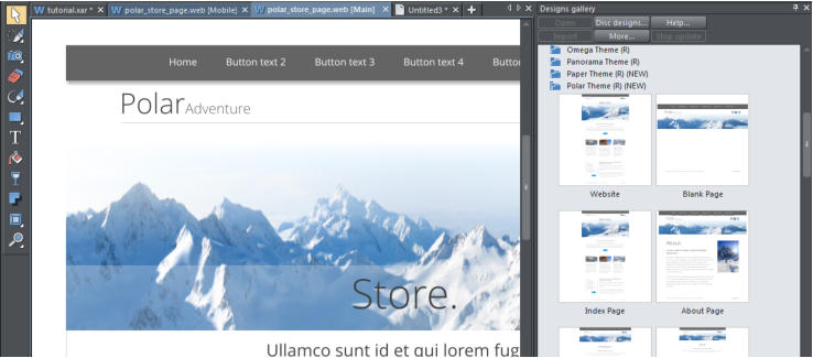
I shall use a page from one of our templates (the Polar theme) that is available with the full (non-trial) version of Web Designer Premium and
Designer Pro. If you don’t have either, you can download the free trial version and experiment with these new features on an existing
template or your own design.
Open the Designs Gallery and select a design
Click the ‘Designs Gallery’ tab on the right side of the window and click on the Website Themes (General Mobile Ready) to see the many designs and template layouts (alternatively, go to File >New from Content Catalog). The ‘Mobile Ready’ template sets are designs that have two versions of the same design, one for narrow screen mobile devices, and a wider ‘normal’ website version (see the Responsive Web Design tutorial to discover how to create your own mobile versions). For this demonstration I chose the Polar theme, and I’m going to use just one page from this website design - the ‘store’ page. Open the Polar folder and double click on the Store page to load it. Select your theme from the Designs Gallery

Stretchy, Sticky and Animated Objects on your Website