
 © Gary Priester 2010


 Navigation: Menu Style
If you prefer your fly out menus to have the same color scheme as the main buttons, that is very straightforward as well. Select the
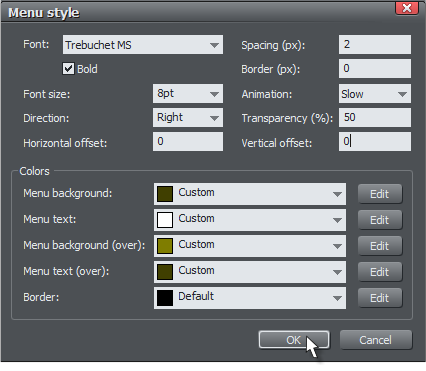
Menu Style... button and you can customize the font, size, style and colors.
The Menu Style dialog lets you specify a font and style, spacing and the direction in which the sub-menus appear. You can adjust the
speed of the fly out menus, though as of my pre-release version, the difference between slow and instant is not all that apparent.
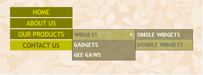
Sub-menus can have their own colors as well as transparency. In the example above, I have added borders. As you can see, this is a
very effective way to create and add sophisticated and custom menus to your website. If you still need more options, you can always
build a menu from scratch using layers.
Below is a real time functioning navigation bar. Give it a test.
The navigation bar shown above contains both links to internal and external pages. You can also link to pop up layers, Flash files and
as of this new version, PDF and Microsoft Word DOC files. More on this later.
TIP: Once you have created a navigation bar, you can open the Navigation Bar dialog by double clicking on it.
With one click, my horizontal navigation bar becomes a vertical navigation bar. Web Designer 6 does all the heavy lifting. And as you
can see in this example, the navigation bar is also repelling the text. How cool is that? And if you’ll notice, the bar is also repelling
this text. How hard would this be in Dreamweaver, I ask you!
If you don’t plan to use drop down or fly out menus, then let your creativity flow. Design one button however you like and then let
Web Designer 6 automatically create a navigation bar. The all type bar on the left is actually text on a white rectangle.
NOTE: My two button bars above have text that is left justified. This was not intentional. But it brings up an important point. If you
want your text centered on your button, then center justify the text when you create your first button.


 © Gary Priester 2010


 Navigation: Menu Style
If you prefer your fly out menus to have the same color scheme as the main buttons, that is very straightforward as well. Select the
Menu Style... button and you can customize the font, size, style and colors.
The Menu Style dialog lets you specify a font and style, spacing and the direction in which the sub-menus appear. You can adjust the
speed of the fly out menus, though as of my pre-release version, the difference between slow and instant is not all that apparent.
Sub-menus can have their own colors as well as transparency. In the example above, I have added borders. As you can see, this is a
very effective way to create and add sophisticated and custom menus to your website. If you still need more options, you can always
build a menu from scratch using layers.
Below is a real time functioning navigation bar. Give it a test.
The navigation bar shown above contains both links to internal and external pages. You can also link to pop up layers, Flash files and
as of this new version, PDF and Microsoft Word DOC files. More on this later.
TIP: Once you have created a navigation bar, you can open the Navigation Bar dialog by double clicking on it.
With one click, my horizontal navigation bar becomes a vertical navigation bar. Web Designer 6 does all the heavy lifting. And as you
can see in this example, the navigation bar is also repelling the text. How cool is that? And if you’ll notice, the bar is also repelling
this text. How hard would this be in Dreamweaver, I ask you!
If you don’t plan to use drop down or fly out menus, then let your creativity flow. Design one button however you like and then let
Web Designer 6 automatically create a navigation bar. The all type bar on the left is actually text on a white rectangle.
NOTE: My two button bars above have text that is left justified. This was not intentional. But it brings up an important point. If you
want your text centered on your button, then center justify the text when you create your first button.


