Create your own web story
It’s becoming increasingly popular to create a website that is just an article or story about a
single subject, perhaps a journal, a report, a holiday or a product review. These are not
really like regular blogs - but just a single column of text, presented in a nicely designed
layout intended to focus your attention on the content - with little superfluous clutter or
advertising.
I’m going to show you how easy this is to create using Xara Web Designer Premium or Xara
Designer Pro. What’s more this is a responsive website, so it works on narrow mobile
screens such as phones, and includes a few fancy effects such as a fading heading and
parallax scroll effects.
This article is itself an example of such a design.
The ‘Make it Easy’ Shortcut!
This tutorial takes you through the process of creating the website from scratch, but to save
you time, you can download this ready-made template if you wish, and just replace it with
your content. Download the template and (if you don’t already own it) download the Web
Designer Premium trial version. Simply drag the template into Web Designer to open it.
Line Length & Font
For maximum readability it’s often recommended that lines should not have more than
around 15 words per line - longer than that and the eye has more difficulty moving from
the end of one line to the start of the next. So this column width, in combination with the
font and font size, is the upper end of that recommendation. I would not have the column
width any wider than this.
The Font I’m using here is a Google font called Droid Serif, 16px size (which is the equival-
ent of 12pt in print terms), so quite large, using a generous 125% line spacing. Some studies
suggest using serif fonts improve readability. Certainly it’s more common for longer text
stories, such as most novels, to use a Serif font like this.
Expanding Pages
This design is based on a 960px wide blank web template: File > New > Web page 960 px.
The column width is only 700px so I could have used a 760px blank template, but it’s better
to have a larger photo (explained below), so I have gone with the wider page size.
By default, web page documents are a fixed height - you usually have to drag the bottom
edge of the page down to adjust the vertical page size, but for documents like this you can
set the page size to automatically stretch to accommodate any column height - so it expands
as you add more text. To do this, select the text column in the Selector Tool (not in the Text
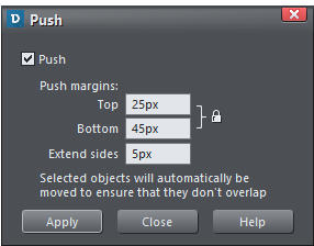
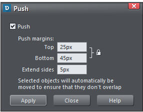
Tool), and use the context menu options (right click) Position on page > Push... This brings
up the following dialog.
By setting the text column to Push, it makes the page
expand (and would push anything else below the
column that also had the Push attribute set).
As you can see I have set a Bottom margin of 45px -
the other values do not matter. Which means there’s
a nice margin below the bottom of the text and the
bottom edge of the page.
So now as you add or remove text the page expands
or shrinks to accommodate the text.
Header Photo
A large eye-catching photo is common at the top of web stories. The image used here is set
to stretch to the full width of the browser window - try adjusting the window width to see
what I mean.
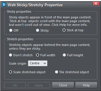
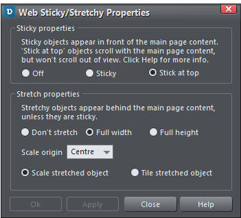
It’s really easy to make any photo behave like this. Select the photo (or other object such as
a rectangle) and use the right click context menu, or the main menu: Utilities > Web
Sticky/Stretchy... which shows this dialog.
Select the ‘Full width’ option as shown here.
The ‘Scale origin’ setting affects how the
photo enlarges as you make the window
wider.
Below the photo I’ve drawn a thin rectangle
which is also set to be full width stretchy,
and I’ve also set it to ‘stick at top’, so that
when it reaches the top, as the page is
scrolled it sticks (I’ve done the same for the
buttons, see below).
Replace the header photo
If you’re using the ready-made template, you can just drag and drop to replace it with any
picture file from your Windows File Explorer.
If you have already imported the photo, say from the free Stock Photos category of the
Content Catalog, you can swap the photo by dragging the appropriate image from the
Bitmap Gallery (the tab on right edge of the window). Swapping the image this way retains
the current proportions and keeps its parallax scroll setting.
Parallax Scrolling
You might have noticed that as you scroll the page up the photo at the top doesn’t scroll
quite as fast as the rest of the text. This is a parallax effect. You can control the scroll speed
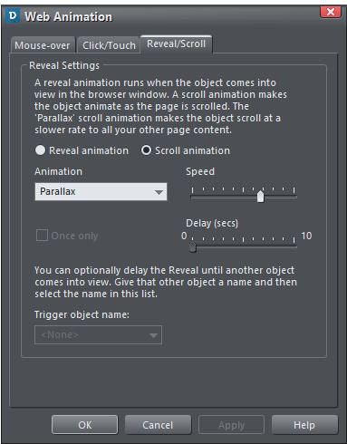
of anything on the page via the Web Animation dialog. So select Utilities > Web Animation
to display this dialog:
For the photo at the top of the page I have selected the Reveal / Scroll tab, the Scroll
animation option (not Reveal) and chosen the Parallax option from the drop-down list with
the speed set as shown. There’s a huge list of other reveal and scroll options you can
experiment with if you wish. But note most scroll options are intended to control how
objects appear as they are scrolled into the visible area.
Reveal Animation
Just as a comparison, I set this Web Animation dialog to have a Reveal Animation of
Zoom/fade in. Scroll this text off screen and back on again to see the effect repeated (I
would not recommend you set it to repeat every time like this - there’s a check box ‘Once
only’ that makes the animation happen only the first time it’s scrolled on screen).
Add Your Photos
Replacing the top photo with your own is described above. But it’s easy to add your own
photos inline in this document. Firstly, import the photo (drag ’n’ drop a photo onto the
page, or choose Insert > Image menu). To put it inline, so the photo moves with the text,
just copy or cut the photo, place the text cursor where you want the photo to go, and paste -
the image now becomes an inline image.
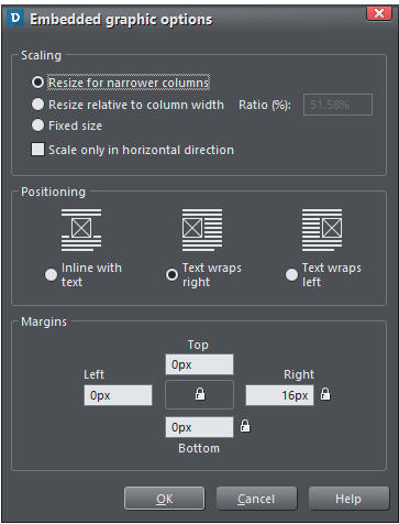
With the recent 365 releases we added a new way to adjust the wrapping of text around a
photo. Just right click any inline image and select Embedded graphic options, which
displays this dialog.
Most of the images in this document have
text wrapping around the right or left
side. There’s usually no need to adjust the
margins as it automatically gives a small
margin in the appropriate place, so the
text does not abut the image, as here.
If you insert large images they are resized
to fit within the column. This is important
for mobile screens - see the Responsive
Website section below to find out more
about that.
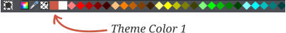
Set Your Theme Color
A really good trick to instantly make your website look more attractive and ‘designed’ is to
repeat a predominant color from your main photo throughout the design. So in this case I
have a picture of predominately beige and browns (picture from the completely free Stock
Photos section of the Content Catalog). So I have used a reddish brown color for all the
graphics and headings throughout the document.
All the Xara Designer titles support color styles. These are named colors (a bit like text
styles), that you can use anywhere you like. If you change the definition of the named color,
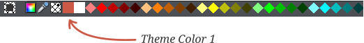
all corresponding parts of your document are instantly updated. So in this document the
color is named ‘Theme Color 1’. You can see the color patch on the left end of the color line.
It’s very easy to change the Theme Color 1, just right click on the color patch on the color
line and select Edit Theme Color 1.
Here’s another example of a website, based on this template, where I’ve used a different
header photo and picked a color for Theme Color 1 that matches it.
Buttons and Links
The two links under the top photos are simply web buttons, manually placed under the thin
rectangle below the photo. Like the rectangle I’ve set them to ‘stick at top’ by right clicking
on them and selecting Web Sticky/Stretchy... and checking Stick At Top.
To add more buttons, it’s probably easiest to copy one of the existing ones, and just edit the
text and link as required. But you can add different designs from the Content Catalog; Select
Insert > From Content Catalog, then choose Components > Web & Print Components >
Buttons. Make sure you choose ‘Match styles’ when prompted to ensure the button color
matches your Theme Color 1. By the way, the buttons have a subtle mouse-over highlighting
effect when published. Here’s an example.
Just click on the button text to edit it. You will probably need to re-position the button
afterwards as its width will change according to the text.
This is a Responsive Website
More people now read websites on mobile narrow-screen devices than large screen desktop
screens. And this trend is only set to continue, so creating a website that’s optimized for
mobile screens is increasingly important.
Web Designer and Designer Pro have the ability to create mobile friendly versions of your
website - we call them variants. So when creating this design I’ve set up a mobile variant
which means I have two versions of the document, and two document tabs.
The WebStory document has two tabs, one for each variant.
The key point is that all the content is shared across both variants - when I edit the text, or
add a picture, it’s added to both variants, but I also get the option to re-arrange the layout
for the mobile variant to be more appropriate for narrow screens.
I have made some changes to the layout of the mobile variant - reduce your browser width,
or view the page on a mobile to see these. The mobile version is fully justified, and auto-
matic hyphenation is turned on, to better fill out the column. So as you can see it’s possible
to have different Styles for the presentation of the same content in the mobile version.
Also where you wrap text to the left or right of embedded images it’s usually better to just
have the image inline on the narrow screen. So using the Embedded graphics options
menu (right click on the image) you can change this for the mobile variant only, as well as
the margins if any change is required.
That’s it. So easy that anyone can do it!
To use more of the advanced layout controls, e.g. to adjust the fonts or styles, or to change
the animation options, you currently have to use the desktop version of Web Designer or
Designer Pro - although if you save the file in your cloud drive, then you can edit the same
file in Online Designer and the desktop Designer.
Xara Web Designer
Xara Web Designer is unlike any web design software you will have seen before; it’s an easy
template based solution that gives you total page design freedom, no HTML skills required.
It comes in 2 versions, Web Designer and Web Designer Premium that offers advanced web
design features. More information.
Give it a try! Download Web Designer trial version and the Web Story template.


Create your own web story
It’s
becoming
increasingly
popular
to
create
a
website
that
is
just
an
article
or
story
about
a
single
subject,
perhaps
a
journal,
a
report,
a
holiday
or
a
product
review.
These
are
not
really
like
regular
blogs
-
but
just
a
single
column
of
text,
presented
in
a
nicely
designed
layout
intended
to
focus
your
attention
on
the
content
-
with
little
superfluous
clutter
or
advertising.
I’m
going
to
show
you
how
easy
this
is
to
create
using
Xara
Web
Designer
Premium
or
Xara
Designer
Pro.
What’s
more
this
is
a
responsive
website,
so
it
works
on
narrow
mobile
screens
such
as
phones,
and
includes
a
few
fancy
effects
such as a fading heading and parallax scroll effects.
This article is itself an example of such a design.
The ‘Make it Easy’ Shortcut!
This
tutorial
takes
you
through
the
process
of
creating
the
website
from
scratch,
but
to
save
you
time,
you
can
down
-
load
this
ready-made
template
if
you
wish,
and
just
replace
it
with
your
content.
Download
the
template
and
(if
you
don’t
already
own
it)
download
the
Web
Designer
Premium
trial
version
.
Simply
drag
the
template
into
Web
Designer
to
open it.
Line Length & Font
For
maximum
readability
it’s
often
recommended
that
lines
should
not
have
more
than
around
15
words
per
line
-
longer
than
that
and
the
eye
has
more
difficulty
moving
from
the
end
of
one
line
to
the
start
of
the
next.
So
this
column
width,
in
combination
with
the
font
and
font
size,
is
the
upper
end
of
that
recommendation.
I
would
not
have
the
column width any wider than this.
The
Font
I’m
using
here
is
a
Google
font
called
Droid
Serif,
16px
size
(which
is
the
equivalent
of
12pt
in
print
terms),
so
quite
large,
using
a
generous
125%
line
spacing.
Some
stud
-
ies
suggest
using
serif
fonts
improve
readability.
Certainly
it’s
more
common
for
longer
text
stories,
such
as
most
nov
-
els, to use a Serif font like this.
Expanding Pages
This
design
is
based
on
a
960px
wide
blank
web
template:
File
>
New
>
Web
page
960
px.
The
column
width
is
only
700px
so
I
could
have
used
a
760px
blank
template,
but
it’s
better
to
have
a
larger
photo
(explained
below),
so
I
have
gone with the wider page size.
By
default,
web
page
documents
are
a
fixed
height
-
you
usually
have
to
drag
the
bottom
edge
of
the
page
down
to
adjust
the
vertical
page
size,
but
for
documents
like
this
you
can
set
the
page
size
to
automatically
stretch
to
accommod
-
ate
any
column
height
-
so
it
expands
as
you
add
more
text.
To
do
this,
select
the
text
column
in
the
Selector
Tool
(not
in
the
Text
Tool),
and
use
the
context
menu
options
(right
click)
Position
on
page
>
Push...
This
brings
up
the
following
dialog.
By
setting
the
text
column
to
Push,
it
makes
the
page
ex
-
pand
(and
would
push
anything
else
below
the
column
that
also
had
the
Push attribute set).
As
you
can
see
I
have
set
a
Bottom
margin
of
45px
-
the
other
values
do
not
matter.
Which
means
there’s
a
nice
margin
below
the
bottom
of
the
text and the bottom edge of the page.
So
now
as
you
add
or
remove
text
the
page
expands
or
shrinks to accommodate the text.
Header Photo
A
large
eye-catching
photo
is
common
at
the
top
of
web
stories.
The
image
used
here
is
set
to
stretch
to
the
full
width
of
the
browser
window
-
try
adjusting
the
window
width
to
see what I mean.
It’s
really
easy
to
make
any
photo
behave
like
this.
Select
the
photo
(or
other
object
such
as
a
rectangle)
and
use
the
right
click
context
menu,
or
the
main
menu:
Utilities
>
Web
Sticky/Stretchy...
which shows this dialog.
Select
the
‘Full
width’
option
as
shown
here.
The
‘Scale
ori
-
gin’
setting
affects
how
the
photo
enlarges
as
you
make
the
window wider.
Below
the
photo
I’ve
drawn
a
thin
rectangle
which
is
also
set
to
be
full
width
stretchy,
and
I’ve
also
set
it
to
‘stick
at
top’,
so
that
when
it
reaches
the
top,
as
the
page
is
scrolled
it
sticks
(I’ve done the same for the buttons, see below).
Replace the header photo
If
you’re
using
the
ready-made
template,
you
can
just
drag
and
drop
to
replace
it
with
any
picture
file
from
your
Win
-
dows File Explorer.
If
you
have
already
imported
the
photo,
say
from
the
free
Stock
Photos
category
of
the
Content
Catalog
,
you
can
swap
the
photo
by
dragging
the
appropriate
image
from
the
Bitmap
Gallery
(the
tab
on
right
edge
of
the
window).
Swapping
the
image
this
way
retains
the
current
propor
-
tions and keeps its parallax scroll setting.
Parallax Scrolling
You
might
have
noticed
that
as
you
scroll
the
page
up
the
photo
at
the
top
doesn’t
scroll
quite
as
fast
as
the
rest
of
the
text.
This
is
a
parallax
effect.
You
can
control
the
scroll
speed
of
anything
on
the
page
via
the
Web
Animation
dialog.
So
select
Utilities
>
Web Animation
to display this dialog:
For
the
photo
at
the
top
of
the
page
I
have
selected
the
Re
-
veal
/
Scroll
tab,
the
Scroll
animation
option
(not
Reveal)
and
chosen
the
Parallax
option
from
the
drop-down
list
with
the
speed
set
as
shown.
There’s
a
huge
list
of
other
reveal
and
scroll
options
you
can
experiment
with
if
you
wish.
But
note
most
scroll
options
are
intended
to
control
how
objects
appear as they are scrolled into the visible area.
Reveal Animation
Just
as
a
comparison,
I
set
this
Web
Animation
dialog
to
have
a
Reveal
Animation
of
Zoom/fade
in.
Scroll
this
text
off
screen
and
back
on
again
to
see
the
effect
repeated
(I
would
not
recommend
you
set
it
to
repeat
every
time
like
this
-
there’s
a
check
box
‘Once
only’
that
makes
the
animation
happen only the first time it’s scrolled on screen).
Add Your Photos
Replacing
the
top
photo
with
your
own
is
described
above.
But
it’s
easy
to
add
your
own
photos
inline
in
this
document.
Firstly,
import
the
photo
(drag
’n’
drop
a
photo
onto
the
page,
or
choose
Insert
>
Image
menu).
To
put
it
inline,
so
the
photo
moves
with
the
text,
just
copy
or
cut
the
photo,
place
the
text
cursor
where
you
want
the
photo
to
go,
and
paste - the image now becomes an inline image.
With
the
recent
365
releases
we
added
a
new
way
to
adjust
the
wrapping
of
text
around
a
photo.
Just
right
click
any
inline
image
and
select
Embedded
graphic
options
,
which
displays this dialog.
Most
of
the
images
in
this
document
have
text
wrapping
around
the
right
or
left
side.
There’s
usually
no
need
to
adjust
the
margins
as
it
automatically
gives
a
small
margin
in
the
appropriate
place,
so
the
text
does
not
abut
the
image,
as here.
If
you
insert
large
images
they
are
resized
to
fit
within
the
column.
This
is
important
for
mobile
screens
-
see
the
Re
-
sponsive Website section below to find out more about that.
Set Your Theme Color
A
really
good
trick
to
instantly
make
your
website
look
more
attractive
and
‘designed’
is
to
repeat
a
predominant
color
from
your
main
photo
throughout
the
design.
So
in
this
case
I
have
a
picture
of
predominately
beige
and
browns
(picture
from
the
completely
free
Stock
Photos
section
of
the
Con
-
tent
Catalog
).
So
I
have
used
a
reddish
brown
color
for
all
the graphics and headings throughout the document.
All
the
Xara
Designer
titles
support
color
styles.
These
are
named
colors
(a
bit
like
text
styles),
that
you
can
use
any
-
where
you
like.
If
you
change
the
definition
of
the
named
color,
all
corresponding
parts
of
your
document
are
in
-
stantly
updated.
So
in
this
document
the
color
is
named
‘Theme
Color
1’.
You
can
see
the
color
patch
on
the
left
end
of the color line.
It’s
very
easy
to
change
the
Theme
Color
1,
just
right
click
on
the
color
patch
on
the
color
line
and
select
Edit
Theme
Color 1
.
Here’s
another
example
of
a
website,
based
on
this
template,
where
I’ve
used
a
different
header
photo
and
picked
a
color
for Theme Color 1 that matches it.
Buttons and Links
The
two
links
under
the
top
photos
are
simply
web
buttons,
manually
placed
under
the
thin
rectangle
below
the
photo.
Like
the
rectangle
I’ve
set
them
to
‘stick
at
top’
by
right
click
-
ing
on
them
and
selecting
Web
Sticky/Stretchy...
and
checking Stick At Top.
To
add
more
buttons,
it’s
probably
easiest
to
copy
one
of
the
existing
ones,
and
just
edit
the
text
and
link
as
required.
But
you
can
add
different
designs
from
the
Content
Catalog;
Select
Insert
>
From
Content
Catalog
,
then
choose
Com
-
ponents
>
Web
&
Print
Components
>
Buttons
.
Make
sure
you
choose
‘Match
styles’
when
prompted
to
ensure
the
button
color
matches
your
Theme
Color
1.
By
the
way,
the
buttons
have
a
subtle
mouse-over
highlighting
effect
when
published. Here’s an example.
Just
click
on
the
button
text
to
edit
it.
You
will
probably
need
to
re-position
the
button
afterwards
as
its
width
will
change
according to the text.
This is a Responsive Website
More
people
now
read
websites
on
mobile
narrow-screen
devices
than
large
screen
desktop
screens.
And
this
trend
is
only
set
to
continue,
so
creating
a
website
that’s
optimized
for mobile screens is increasingly important.
Web
Designer
and
Designer
Pro
have
the
ability
to
create
mobile
friendly
versions
of
your
website
-
we
call
them
variants.
So
when
creating
this
design
I’ve
set
up
a
mobile
variant
which
means
I
have
two
versions
of
the
document,
and two document tabs.
The WebStory document has two tabs, one for each variant.
The
key
point
is
that
all
the
content
is
shared
across
both
variants
-
when
I
edit
the
text,
or
add
a
picture,
it’s
added
to
both
variants,
but
I
also
get
the
option
to
re-arrange
the
layout
for
the
mobile
variant
to
be
more
appropriate
for
narrow screens.
I
have
made
some
changes
to
the
layout
of
the
mobile
vari
-
ant
-
reduce
your
browser
width,
or
view
the
page
on
a
mobile
to
see
these.
The
mobile
version
is
fully
justified,
and
automatic
hyphenation
is
turned
on,
to
better
fill
out
the
column.
So
as
you
can
see
it’s
possible
to
have
different
Styles
for
the
presentation
of
the
same
content
in
the
mobile
version.
Also
where
you
wrap
text
to
the
left
or
right
of
embedded
images
it’s
usually
better
to
just
have
the
image
inline
on
the
narrow
screen.
So
using
the
Embedded
graphics
options
menu
(right
click
on
the
image)
you
can
change
this
for
the
mobile
variant
only,
as
well
as
the
margins
if
any
change
is
required.
That’s it. So easy that anyone can do it!
To
use
more
of
the
advanced
layout
controls,
e.g.
to
adjust
the
fonts
or
styles,
or
to
change
the
animation
options,
you
currently
have
to
use
the
desktop
version
of
Web
Designer
or
Designer
Pro
-
although
if
you
save
the
file
in
your
cloud
drive,
then
you
can
edit
the
same
file
in
Online
Designer
and
the desktop Designer.
Xara Web Designer
Xara
Web
Designer
is
unlike
any
web
design
software
you
will
have
seen
before;
it’s
an
easy
template
based
solution
that
gives
you
total
page
design
freedom,
no
HTML
skills
required.
It
comes
in
2
versions,
Web
Designer
and
Web
Designer
Premium
that
offers
advanced
web
design
fea
-
tures.
More information.
Give
it
a
try!
Download
Web
Designer
trial
version
and
the
Web Story template
.