
Xara provides a range of ready-made customizable shapes that you can add to your document or web page. But they are more than simple
static shapes - we call them SmartShapes.
Although SmartShapes include a range of everyday shapes that you can drop into your documents and websites, the system also supports
objects that are much more complex than simple shapes. Choose from Arrows, Text panels, Photo text panels, Speech Bubbles, Spirals,
charts, Timelines and many other shapes.
What’s cool about SmartShapes is that the editing functions are built into the shape. There are no special tools - you just click on the shape and
a set of control handles appear that can be dragged to adjust and customize the shape.
The other innovative aspect of SmartShapes is that most are available and work exactly the same way in the Xara web-based Xara Online
Designer.
This tutorial, Part 2 of 3 on SmartShapes, covers the SmartShapes that incorporate text and photos, ie text panels, photo text panels and
speech bubbles.
To try it, download the trial version of Xara Photo & Graphic Designer or Xara Web Designer or Designer Pro X.
Example Text panels, Photo text panel and Speech bubbles
Text Panels
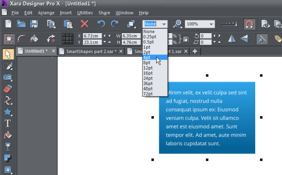
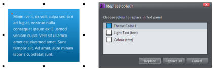
One of the most common design elements in many document types is to have a block of text placed on top of a colored rectangle. It’s always been pretty easy to create this using the normal tools - just draw a rectangle and place a text column or text frame on top of the rectangle, and then group them. But the problem with that is that each time you change the text, you would need to adjust the background rectangle. The Xara Text Panel SmartShape solves this problem - it makes creating a wide variety of text panels, such as the above examples, really easy. The background rectangle automatically expands or contracts as you edit the text. What’s more you can directly adjust the panel width and height, rounded corners and the padding (margin) space between the text and outer rectangle. We’ve also made a recent improvement that you can now vertically center text in the panel. There are many styles of Text panel but we’ll start with a simple one. To quickly insert a simple Text Panel SmartShape, select the menu option Insert > Shape > Text Panel or use the short-cut of Shift + C (not whilst you have the text cursor in some text). This will insert a default text panel that uses Theme Color 1, but if your document uses a named color, you’ll be asked whether you want the item to be recolored to match your Theme Colors. The handles on the 4 sides enable you to resize the sides independently. If you hold down the shift key and drag on the handle on the right side it will do a symmetrical resize, ie. stretch both left and right sides equally. The handle in the bottom right will resize the complete rectangle. If you hold down the Ctrl key and drag the bottom right handle, it will enable you to change the aspect ratio of the rectangle. Drag inward on the yellow handle in the top left to curve the corners. Drag diagonally inward or outward on the handle in the top right of the text to adjust the margin between the text and the edge of the panel. Lastly, drag the top right handle to rotate the panel. When rotating the panel it will ‘snap’ to positions of 0, 45, 90 degrees, etc. This may make it difficult to set it to, for example, 1 degree. However, you can select the Ctrl key and the rotate handle which will disable the auto snap and make it easier to find the exact angle required. A simple Text Panel SmartShape showing its edit handles You can edit the text as normal including setting text styles, fonts, links to web or email addresses.Changing Colors
There are several ways you can change the color used in the Text Panel. With the Text Panel selected in the Selector Tool, either just click a color on the color line, or drag and drop a color from the color line onto the panel. The ‘Color Replace’ dialog appears so you can select which color to replace. Text Panel selected showing the ‘Color Replace’ dialog Alternatively, using the Selector Tool, you can select the background shape inside the SmartShape using the Ctrl+click method of selecting things inside groups. With the background shape selected, you can also use the Fill Tool control to set the color and fill style. You can even change the background to be a bitmap; perhaps a texture.To Add an Outline to the Panel
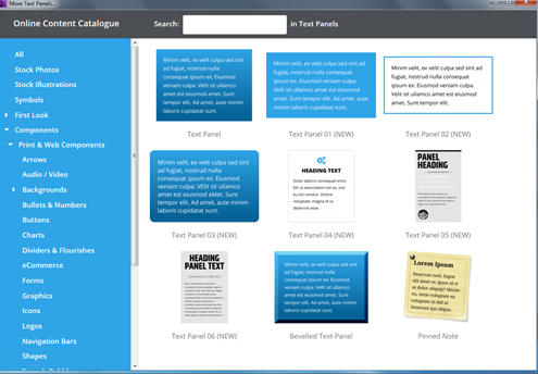
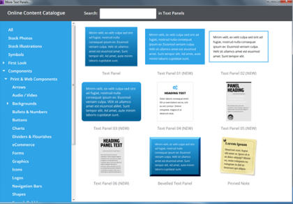
Select the Text Panel using the Selector Tool, and then select a Line Width from the top drop-down menu, like this: Selecting a Line Width will create an outline around the text panel background. You can then edit its color as required. There is a range of other styles that can be found by selecting the menu option Insert > Shape > More Text Panels. A range of Text Panels to choose fromPhoto Text Panels
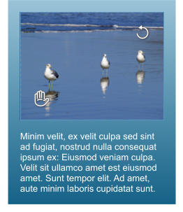
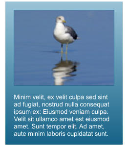
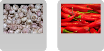
Photo text panels are often used as a photo with caption on a background panel. As the text can be linked to another web address it can be really useful for purposes such as e-commerce, where you could have a page of photo text panels with the captions linking out to individual pages that contain much more information about the product. Example use of a photo panels for e-commerce Select the menu option Insert > Shape > Photo Text Panel. A Photo text panel is similar to a text panel except that it also includes a photo at the top. The edit handles behave in the same manner. However, if you increase the height of the panel then there’s an additional handle under the photo that can be dragged to adjust the height of the photo. The Photo Text Panel, showing the additional handle under the photo which can be used to change the photo height. The photo is a Smart Photo so, if you select the Photo tool and click on the photo you will see 2 handles that enable you to manipulate the photo. The rotate handle in the top right enables you to rotate and scale the photo inside the frame - simply drag out to enlarge the photo within the frame. Drag the ‘hand’ handle in the bottom left to reposition the photo within the frame. Of course, you can do the normal photo edits using the Photo Enhance Tool to enhance the photo. The edit handles of the Photo editor The photo enlarged and repositionedSpeech Bubbles
Speech bubbles are generally used in documents and on websites for comments, cartoons and annotations. The edit handles allow you to change the dimensions of the bubble, control the text area, tweak the size and orientation of the bubble's arrow, and its curvature. You can edit the text using the Text Tool and change the colors using the color editor. Select the menu option Insert > Shape > Speech Bubble. A fully configurable speech bubble - just drag the circular handles to adjust the size, shape and spike. As with the other SmartShapes, the side, top and bottom handles can be dragged to change the width or height of the Speech Bubble. The bottom right ‘cross’ will resize the speech bubble and the top right handle will rotate it. Drag the top left handle to change the curvature of the Speech Bubble – dragging it outward will create a rectangle with straight sides and dragging it inward will increase the curvature of the four ‘corners’. The edit handle at the top right of the text will change the margin between the text and the outer edge of the Speech Bubble.The Speech Bubble ‘Spike’
Now, to the orientation of the bubble’s arrow. You’ll notice there are three edit points on the arrow. Click & drag on the outer edit point of the arrow to change its length and direction. The mid point will give the spike a bend - don’t over do it though! The inner control handle allows you to drag the spike around the edge of the speech bubble so it can be above, below, left or right side. Select the Text Tool to use any of the text functions. The Speech Bubble will automatically enlarge to accommodate any new text. Speech bubbles showing different spike positions and styles. It’s so easy to make your document or website look as if it has been created by a professional designer. Try it now - download the latest trial version of Xara Photo & Graphic Designer or Xara Web Designer or Designer Pro X. See last month’s SmartShapes Part 1 to learn how to quickly create great looking Arrows, Rectangles, Ovals, Pie Shapes and Spirals. And in Part 3 next month we will cover how to create charts and percentage rings.


Copyright © 2017 Xara Group Limited.
Page created with Xara Designer Pro

Minim velit, ex velit
culpa sed sint ad fugiat,
nostrud nulla
consequat ipsum ex:
Eiusmod veniam culpa.
PANEL
HEADING
--- Some kind of credit text -
“ Quote something
Dolor laboris con
sequat enim gottcha.”
Elit ut exercion est ex, sint eu est
consectetur. Dolore voluptate, magna id ut
deserunt esse. Sunt minim qui magna


Minim velit, ex velit culpa sed sint ad fugiat,
nostrud nulla consequat ipsum ex: Eiusmod
veniam culpa. Velit sit ullamco amet est
eiusmod amet. Sunt tempor elit. Ad amet, aute
minim laboris cupidatat sunt.
Minim velit, ex velit culpa sed sint
ad fugiat, nostrud nulla consequat
ipsum ex: Eiusmod veniam culpa.
Velit sit ullamco amet est eiusmod
amet. Sunt tempor elit. Ad amet,
aute minim laboris cupidatat sunt.

Minim velit, ex velit culpa
sed sint ad fugiat, nostrud
nulla consequat ipsum ex:
Eiusmod veniam culpa.
Velit sit ullamco amet est
eiusmod amet. Sunt
tempor elit.

Minim velit, ex velit culpa sed sint ad fugiat,
nostrud nulla consequat ipsum ex: Eiusmod
veniam culpa. Velit sit ullamco amet est
eiusmod amet. Sunt tempor elit. Ad amet,
aute minim laboris cupidatat sunt.

Minim velit, ex velit culpa sed
sint ad fugiat, nostrud nulla
consequat ipsum ex:
Eiusmod veniam culpa. Velit
sit ullamco amet est
eiusmoD amet. Sunt tempor
elit. Ad amet, aute minim
laboris cupidatat sunt.
This South East Asian garlic has a
nutty flavour. more info
Carolina Reaper chlly from the
USA - a small fiery chilly. more info
Minim velit, ex velit culpa sed sint
ad fugiat, nostrud nulla consequat
ipsum ex: Eiusmod veniam culpa.
Velit sit ullamco amet est eiusmod
amet. Sunt tempor elit. Ad amet,
aute minim laboris cupidatat sunt.
Minim velit, ex velit culpa sed sint ad fugiat, nostrud
nulla consequat ipsum ex: Eiusmod veniam culpa. Velit
sit ullamco amet est eiusmod amet. Sunt tempor elit. Ad
amet, aute minim laboris cupidatat sunt.
Minim velit, ex velit culpa sed sint
ad fugiat, nostrud nulla consequat
ipsum ex: Eiusmod veniam culpa.
Velit sit ullamco amet est eiusmod
amet. Sunt tempor elit. Ad amet,
aute minim laboris cupidatat
suntVelit sit ullamco amet est
eiusmod amet. Sunt tempor elit. Ad
amet, aute minim laboris cupidatat
sunt.Velit sit ullamco amet est
eiusmod amet. Sunt tempor elit. Ad
amet, aute minim laboris cupidatat
sunt..

Xara provides a range of ready-made customizable shapes that you can add to your document or web
page. But they are more than simple static shapes - we call them SmartShapes.
Although SmartShapes include a range of everyday shapes that you can drop into your documents and
websites, the system also supports objects that are much more complex than simple shapes. Choose
from Arrows, Text panels, Photo text panels, Speech Bubbles, Spirals, charts, Timelines and many other
shapes.
What’s cool about SmartShapes is that the editing functions are built into the shape. There are no special
tools - you just click on the shape and a set of control handles appear that can be dragged to adjust and
customise the shape.
The other innovative aspect of SmartShapes is that most are available and work exactly the same way in
the Xara web-based Xara Online Designer.
This tutorial, Part 2 of 3 on SmartShapes, covers the SmartShapes that incorporate text and photos, ie text
panels, photo text panels and speech bubbles.
To try it, download the trial version of Xara Photo & Graphic Designer or Xara Web Designer.
Example Text panels, Photo text panel and Speech bubbles
Text Panels
One of the most common design elements in many document types is to have a block of text placed on top of a colored rectangle. Although it’s always been pretty easy to create this using the normal tools - just draw a rectangle and place a text column or text frame on top of the rectangle, and then group them.The problem with that is that each time you change the text, you would need to adjust the background rectangle. The Xara Text Panel Smartshape solves this problem - it makes creating a wide variety of text panels, such as the above examples really easy. The background rectangle automatically expands or contracts as you edit the text. You can directly adjust the panel width and height, rounded corners and the padding (margin) space between the text and outer rectangle. We’ve also made a recent improvement that you can now vertically center text in the panel. There are many styles of Text panels but we’ll start with a simple one. To quckly insert a simple Text Panel SmartShape, select the menu option Insert > Shape > Text Panel or use the short-cut of Shift + C (not whilst you have the text cursor in some text). This will insert a default text panel that uses Theme Color 1, but if your document uses a named colour, you’ll be asked whether you want the item to be recolored to match your Theme Colors. The handles on the 4 sides enable you to resize the sides independently. If you hold down the shift key and drag on the handle on the right side it will do a symetrical resize, ie. stretch both left and right sides equally. The handle in the bottom right will resize the complete rectangle. If you hold down the ctrl key and drag the bottom right handle it will enable you to change the aspect ratio of the rectangle. Drag inward on the yellow handle in the top left to curve the corners. Drag diagonally inward or outward on the handle in the top right of the text to adjust the margin between the text and the edge of the panel. Lastly, drag the top right handle to rotate the panel. When rotating the panel it will ‘snap’ to positions of 0, 45, 90 degrees, etc. This may make it difficult to set it to, for example, 1 degree. However, you can select the Ctrl key and the rotate handle which will disable the auto snap and make it easier to find the exact angle required. A simple Text panel SmartShape showing its edit handles You can edit the text as normal including setting text styles, fonts, links to web or email addresses.Changing Colors
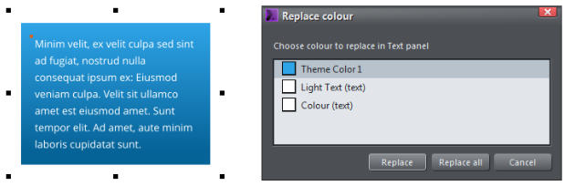
There are several ways you can change the colour used in the Text Panel. With the Text Panel selected in the Selector tool, either just click a color on the color line, or drag and drop a color from the color line onto the panel. The ‘Color Replace’ dialog appears so you can select which colour to replace. Text Panel selected showing the ‘Color Replace’ dialog Alternatively, using the Selector Tool, you can select the background shape inside the SmartShape using the Ctrl+click method of selecting things inside groups. With the background shape selected, you can also use the Fill Tool control to set the color and fill style. You can even change the background to be a bitmap; perhaps a texture.To Add an outline to the panel
Select the Text Panel using the Selector Tool, and then select a Line Width from the top drop-down menu, like this: Selecting a Line Width will create an outline around the text panel background. You can then edit it’s color as required. There is a range of other styles that can be found by selecting the menu option Insert > Shape > More Text Panels. A range of Text panels to choose fromPhoto Text Panels
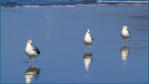
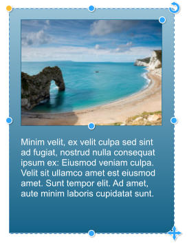
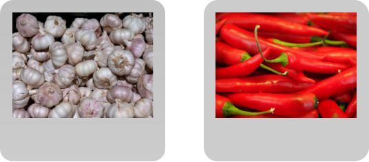
Photo text panels are often used as a photo with caption on a background panel. As the text can be linked to another web address it can be really useful for purposes such as e-commerce, where you could have a page of photo text panels with the captions linking out to individual pages that contain much more information about the product. Example use of a photo panels for e-commerce Select the menu option Insert > Shape > Photo Text Panel. A Photo text panel is similar to a text panel except that it also includes a photo at the top.. The edit handles behave in the same manner. However, if you increase the height of the panel then there’s an additional handle under the photo that can be dragged to adjust the height of the photo. The Photo Text Panel, showing the additional handle under the photo which can be used to change the photo height. The photo is a SmartPhoto so, if you select the Photo tool and click on the photo you will see 2 handles that enable you to manipulate the photo. The rotate handle in the top right enables you to rotate and scale the photo inside the frame - simply drag out to enlarge the photo within the frame. Drag the ‘hand’ handle in the bottom left to reposition the photo within the frame. Of course, you can do the normal photo edits using the Photo Enhance Tool to enhance the photo. The edit handles of the Photo editor The photo enlarged and repositionedSpeech Bubbles
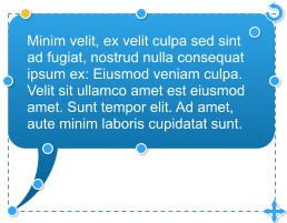
Speech bubbles are generally used in documents and on websites for comments, cartoons and annotations. The edit handles allow you to change the dimensions of the bubble, control the text area, tweak the size and orientation of the bubble's arrow, and its curvature. You can edit the text using the Text Tool and change the colors using the color editor. Select the menu option Insert > Shape > Speech Bubble. A fully configurable speech bubble - just drag the circular handles to adjust the size, shape and spike. As with the other SmartShapes, the side, top and bottom handles can be dragged to change the width or height of the Speech Bubble. The bottom right ‘cross’ will resize the speech bubble and the top right handle will rotate it. Drag the top left handle to change the curvature of the Speech Bubble – dragging it outward will create a rectangle with straight sides and dragging it inward will increase the curvature of the four ‘corners’. The edit handle at the top right of the text will change the margin between the text and the outer edge of the Speech Bubble.The Speech Bubble ‘Spike’
Now, to the orientation of the bubble’s arrow. You’ll notice there are three edit points on the arrow. Click & drag on the outer edit point of the arrow to change its length and direction. The mid point will give the spike a bend - don’t over do it through. The inner control handle allows you to drag the spike around the edge of the speech bubble so it can be abve, below, left or right side. Select the Text Tool to use any of the text functions. The Speech Bubble will automatically enlarge to accommodate any new text. Speech bubbles showing different spike positions and styles. It’s so easy to make your document or website look as if it has been created by a professional designer. Try it now - download the latest trial version of Xara Photo & Graphic Designer or Xara Web Designer. In the next tutorial you can learn how to create charts and timelines. See Smartshapes Part 1 to learn how to quickly create great looking Arrows, Rectangles, Ovals, Pie Shapes and Spirals.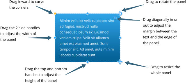

Minim velit, ex velit culpa sed sint
ad fugiat, nostrud nulla consequat
ipsum ex: Eiusmod veniam culpa.
Velit sit ullamco amet est eiusmod
amet. Sunt tempor elit. Ad amet,
aute minim laboris cupidatat sunt.
Minim velit, ex velit culpa sed sint ad fugiat, nostrud
nulla consequat ipsum ex: Eiusmod veniam culpa. Velit
sit ullamco amet est eiusmod amet. Sunt tempor elit. Ad
amet, aute minim laboris cupidatat sunt.
Minim velit, ex velit culpa sed sint
ad fugiat, nostrud nulla consequat
ipsum ex: Eiusmod veniam culpa.
Velit sit ullamco amet est eiusmod
amet. Sunt tempor elit. Ad amet,
aute minim laboris cupidatat
suntVelit sit ullamco amet est
eiusmod amet. Sunt tempor elit. Ad
amet, aute minim laboris cupidatat
sunt.Velit sit ullamco amet est
eiusmod amet. Sunt tempor elit. Ad
amet, aute minim laboris cupidatat
sunt..
This South East Asian garlic has a
nutty flavour. more info
Carolina Reaper chlly from the
USA - a small fiery chilly. more info

Minim velit, ex velit
culpa sed sint ad fugiat,
nostrud nulla
consequat ipsum ex:
Eiusmod veniam culpa.
PANEL
HEADING
--- Some kind of credit text -
“ Quote something
Dolor laboris con
sequat enim gottcha.”
Elit ut exercion est ex, sint eu est
consectetur. Dolore voluptate, magna id ut
deserunt esse. Sunt minim qui magna


Minim velit, ex velit culpa sed sint ad fugiat,
nostrud nulla consequat ipsum ex: Eiusmod
veniam culpa. Velit sit ullamco amet est
eiusmod amet. Sunt tempor elit. Ad amet, aute
minim laboris cupidatat sunt.
Minim velit, ex velit culpa sed sint
ad fugiat, nostrud nulla consequat
ipsum ex: Eiusmod veniam culpa.
Velit sit ullamco amet est eiusmod
amet. Sunt tempor elit. Ad amet,
aute minim laboris cupidatat sunt.

Minim velit, ex velit culpa
sed sint ad fugiat, nostrud
nulla consequat ipsum ex:
Eiusmod veniam culpa.
Velit sit ullamco amet est
eiusmod amet. Sunt
tempor elit.

Minim velit, ex velit culpa sed sint ad fugiat,
nostrud nulla consequat ipsum ex: Eiusmod
veniam culpa. Velit sit ullamco amet est
eiusmod amet. Sunt tempor elit. Ad amet,
aute minim laboris cupidatat sunt.

Minim velit, ex velit culpa sed
sint ad fugiat, nostrud nulla
consequat ipsum ex:
Eiusmod veniam culpa. Velit
sit ullamco amet est
eiusmoD amet. Sunt tempor
elit. Ad amet, aute minim
laboris cupidatat sunt.
Copyright © 2017 Xara Group Limited.
Page created with Xara Designer Pro

Xara provides a range of ready-made customizable shapes that you
can add to your document or web page. But they are more than
simple static shapes - we call them SmartShapes.
Although SmartShapes include a range of everyday shapes that you
can drop into your documents and websites, the system also
supports objects that are much more complex than simple shapes.
Choose from Arrows, Text panels, Photo text panels, Speech
Bubbles, Spirals, charts, Timelines and many other shapes.
What’s cool about SmartShapes is that the editing functions are built
into the shape. There are no special tools - you just click on the
shape and a set of control handles appear that can be dragged to
adjust and customise the shape.
The other innovative aspect of SmartShapes is that most are
available and work exactly the same way in the Xara web-based Xara
Online Designer.
This tutorial, Part 2 of 3 on SmartShapes, covers the SmartShapes
that incorporate text and photos, ie text panels, photo text panels
and speech bubbles.
To try it, download the trial version of Xara Photo & Graphic Designer
or Xara Web Designer.
Example Text panels, Photo text panel and Speech bubbles
Text Panels
One of the most common design elements in many document types is to have a block of text placed on top of a colored rectangle. Although it’s always been pretty easy to create this using the normal tools - just draw a rectangle and place a text column or text frame on top of the rectangle, and then group them.The problem with that is that each time you change the text, you would need to adjust the background rectangle. The Xara Text Panel Smartshape solves this problem - it makes creating a wide variety of text panels, such as the above examples really easy. The background rectangle automatically expands or contracts as you edit the text. You can directly adjust the panel width and height, rounded corners and the padding (margin) space between the text and outer rectangle. We’ve also made a recent improvement that you can now vertically center text in the panel. There are many styles of Text panels but we’ll start with a simple one. To quckly insert a simple Text Panel SmartShape, select the menu option Insert > Shape > Text Panel or use the short-cut of Shift + C (not whilst you have the text cursor in some text). This will insert a default text panel that uses Theme Color 1, but if your document uses a named colour, you’ll be asked whether you want the item to be recolored to match your Theme Colors. The handles on the 4 sides enable you to resize the sides independently. If you hold down the shift key and drag on the handle on the right side it will do a symetrical resize, ie. stretch both left and right sides equally. The handle in the bottom right will resize the complete rectangle. If you hold down the ctrl key and drag the bottom right handle it will enable you to change the aspect ratio of the rectangle. Drag inward on the yellow handle in the top left to curve the corners. Drag diagonally inward or outward on the handle in the top right of the text to adjust the margin between the text and the edge of the panel. Lastly, drag the top right handle to rotate the panel. When rotating the panel it will ‘snap’ to positions of 0, 45, 90 degrees, etc. This may make it difficult to set it to, for example, 1 degree. However, you can select the Ctrl key and the rotate handle which will disable the auto snap and make it easier to find the exact angle required. A simple Text panel SmartShape showing its edit handles You can edit the text as normal including setting text styles, fonts, links to web or email addresses.Changing Colors
There are several ways you can change the colour used in the Text Panel. With the Text Panel selected in the Selector tool, either just click a color on the color line, or drag and drop a color from the color line onto the panel. The ‘Color Replace’ dialog appears so you can select which colour to replace. Text Panel selected showing the ‘Color Replace’ dialog Alternatively, using the Selector Tool, you can select the background shape inside the SmartShape using the Ctrl+click method of selecting things inside groups. With the background shape selected, you can also use the Fill Tool control to set the color and fill style. You can even change the background to be a bitmap; perhaps a texture.To Add an outline to the panel
Select the Text Panel using the Selector Tool, and then select a Line Width from the top drop-down menu, like this: Selecting a Line Width will create an outline around the text panel background. You can then edit it’s color as required. There is a range of other styles that can be found by selecting the menu option Insert > Shape > More Text Panels. A range of Text panels to choose fromPhoto Text Panels
Photo text panels are often used as a photo with caption on a background panel. As the text can be linked to another web address it can be really useful for purposes such as e-commerce, where you could have a page of photo text panels with the captions linking out to individual pages that contain much more information about the product. Example use of a photo panels for e-commerce Select the menu option Insert > Shape > Photo Text Panel. A Photo text panel is similar to a text panel except that it also includes a photo at the top.. The edit handles behave in the same manner. However, if you increase the height of the panel then there’s an additional handle under the photo that can be dragged to adjust the height of the photo. The Photo Text Panel, showing the additional handle under the photo which can be used to change the photo height. The photo is a SmartPhoto so, if you select the Photo tool and click on the photo you will see 2 handles that enable you to manipulate the photo. The rotate handle in the top right enables you to rotate and scale the photo inside the frame - simply drag out to enlarge the photo within the frame. Drag the ‘hand’ handle in the bottom left to reposition the photo within the frame. Of course, you can do the normal photo edits using the Photo Enhance Tool to enhance the photo. The edit handles of the Photo editor The photo enlarged and repositionedSpeech Bubbles
Speech bubbles are generally used in documents and on websites for comments, cartoons and annotations. The edit handles allow you to change the dimensions of the bubble, control the text area, tweak the size and orientation of the bubble's arrow, and its curvature. You can edit the text using the Text Tool and change the colors using the color editor. Select the menu option Insert > Shape > Speech Bubble. A fully configurable speech bubble - just drag the circular handles to adjust the size, shape and spike. As with the other SmartShapes, the side, top and bottom handles can be dragged to change the width or height of the Speech Bubble. The bottom right ‘cross’ will resize the speech bubble and the top right handle will rotate it. Drag the top left handle to change the curvature of the Speech Bubble – dragging it outward will create a rectangle with straight sides and dragging it inward will increase the curvature of the four ‘corners’. The edit handle at the top right of the text will change the margin between the text and the outer edge of the Speech Bubble.The Speech Bubble ‘Spike’
Now, to the orientation of the bubble’s arrow. You’ll notice there are three edit points on the arrow. Click & drag on the outer edit point of the arrow to change its length and direction. The mid point will give the spike a bend - don’t over do it through. The inner control handle allows you to drag the spike around the edge of the speech bubble so it can be abve, below, left or right side. Select the Text Tool to use any of the text functions. The Speech Bubble will automatically enlarge to accommodate any new text. Speech bubbles showing different spike positions and styles. It’s so easy to make your document or website look as if it has been created by a professional designer. Try it now - download the latest trial version of Xara Photo & Graphic Designer or Xara Web Designer. In the next tutorial you can learn how to create charts and timelines. See Smartshapes Part 1 to learn how to quickly create great looking Arrows, Rectangles, Ovals, Pie Shapes and Spirals.

Minim velit, ex velit culpa sed sint
ad fugiat, nostrud nulla consequat
ipsum ex: Eiusmod veniam culpa.
Velit sit ullamco amet est eiusmod
amet. Sunt tempor elit. Ad amet,
aute minim laboris cupidatat sunt.
Minim velit, ex velit culpa sed sint ad fugiat, nostrud
nulla consequat ipsum ex: Eiusmod veniam culpa. Velit
sit ullamco amet est eiusmod amet. Sunt tempor elit. Ad
amet, aute minim laboris cupidatat sunt.
Minim velit, ex velit culpa sed sint
ad fugiat, nostrud nulla consequat
ipsum ex: Eiusmod veniam culpa.
Velit sit ullamco amet est eiusmod
amet. Sunt tempor elit. Ad amet,
aute minim laboris cupidatat
suntVelit sit ullamco amet est
eiusmod amet. Sunt tempor elit. Ad
amet, aute minim laboris cupidatat
sunt.Velit sit ullamco amet est
eiusmod amet. Sunt tempor elit. Ad
amet, aute minim laboris cupidatat
sunt..


Minim velit, ex velit
culpa sed sint ad fugiat,
nostrud nulla
consequat ipsum ex:
Eiusmod veniam culpa.
PANEL
HEADING
--- Some kind of credit text -
“ Quote something
Dolor laboris con
sequat enim gottcha.”
Elit ut exercion est ex, sint eu est
consectetur. Dolore voluptate, magna id ut
deserunt esse. Sunt minim qui magna


Minim velit, ex velit culpa sed sint ad fugiat,
nostrud nulla consequat ipsum ex: Eiusmod
veniam culpa. Velit sit ullamco amet est
eiusmod amet. Sunt tempor elit. Ad amet, aute
minim laboris cupidatat sunt.
Minim velit, ex velit culpa sed sint
ad fugiat, nostrud nulla consequat
ipsum ex: Eiusmod veniam culpa.
Velit sit ullamco amet est eiusmod
amet. Sunt tempor elit. Ad amet,
aute minim laboris cupidatat sunt.


Minim velit, ex velit culpa
sed sint ad fugiat, nostrud
nulla consequat ipsum ex:
Eiusmod veniam culpa.
Velit sit ullamco amet est
eiusmod amet. Sunt
tempor elit.

Minim velit, ex velit culpa sed sint ad fugiat,
nostrud nulla consequat ipsum ex: Eiusmod
veniam culpa. Velit sit ullamco amet est
eiusmod amet. Sunt tempor elit. Ad amet,
aute minim laboris cupidatat sunt.

Minim velit, ex velit culpa sed
sint ad fugiat, nostrud nulla
consequat ipsum ex:
Eiusmod veniam culpa. Velit
sit ullamco amet est
eiusmoD amet. Sunt tempor
elit. Ad amet, aute minim
laboris cupidatat sunt.
Copyright © 2017 Xara Group Limited.
Page created with Xara Designer Pro
WORK SMARTER WITH THE XARA SMARTSHAPES - PART 2
WORK SMARTER WITH THE XARA SMARTSHAPES - PART 2
WORK SMARTER WITH THE XARA
SMARTSHAPES - PART 2