
The Xara designer software - Photo & Graphic Designer, Page & Layout Designer, Web Designer and Designer Pro - provide a wide control over applying, creating and altering
the colors of objects. For simple documents, you can just choose colors from the Color Line or the on-screen color palette. For more advanced color editing there's named
colors, graduated color, tints, shades, linked colors and contoning. Many documents and web templates are based on one theme color and several other colors that work well
together to form a complete color scheme.
Last month we looked at the Color Line, the Color Line Context menu and the Color Editor. This month we’ll explore local, theme and named colors, creating tints, shades and
linked colors, creating your own color schemes and contoning photos.
To try it, download the trial version of Xara Photo & Graphic Designer
Local, Named and Theme colors
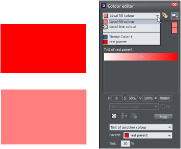
Local colors are used in only one place in the document. Each object has a separate color and nothing is shared. This is useful if you want to change the color of an object
without affecting other objects. Local colors are the easiest and best method for simple documents that use relatively few colors.
Named and Theme colors can be used repeatedly in the document (they are like styles in a word processor). Any edits you make to a Named or Themed color are immediately reflected on all objects and parts of the document that use that color. You can also copy Theme colors between documents. The Theme colors in most templates are consistently named so when you import elements from different themes colors are matched perfectly.Identifying Markers on The Color Line
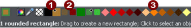
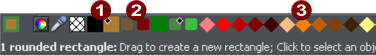
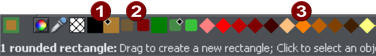
Let’s revisit the Color Line and look at the identifying markers that tell us the color attributes on the current document. 1. The Named (Theme) Colors (if present in the document). Named colors are used to give templates and designs theme colors, so that the color scheme of a design can easily be changed without editing every object in it individually. 2. Linked Colors are represented differently on the color line by smaller rounded rectangles, so it's much easier to distinguish which are normal independent Named Colors and which are linked to a parent. 3. Palette colors: The 46 pre-defined palette colors comprise 5 shades of 7 standard hues and 10 shades of gray, black and white. Palette colors are not editable (i.e they are not Named Colors) and are designed as a simple, limited selection of colors to apply to objects (either by dragging on to the object or clicking). If your document contains spot colors, they appear on the Color Line (and in the Color Gallery) as circles. Little markers in the color icons show which of the named colors (if any) or palette colors have been applied to the selected object(s). Diamond markers show the colors used by the selected objects. A diamond in the top-left corner indicates the fill color, in the top-right corner indicates the line color. Cross-shaped markers show the current color attributes if there are no objects selected. A cross in the top-left corner indicates the fill color, in the top-right corner indicates the line color. Triangular markers show the colors of a fill type if you have applied one (linear, circular, elliptical, etc). This works also when using the eye-dropper color picker. The color line markers update immediately and indicate the color of the object under the eye-dropper as you're dragging around.Creating New Named colors
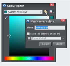
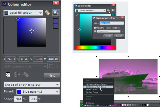
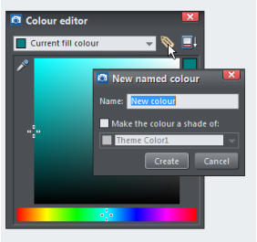
It's recommended to create a named color if you want to use the same color in different parts of your document and it’s especially useful, if there's a chance you might want to change that color in future. When you edit a named color, all objects that use this color are automatically and immediately updated to show the new color across all pages of your document. To do this, select an object whose color you want to use and then open the Color Editor ('Ctrl + E') and click the New named color icon (the label icon as shown below). Then give the color a suitable name and click ‘Create’. You will see the new color added to the Color Line. Creating a new Named color You can now apply this color to any object in the usual way, by drag-dropping it from the Color Line or just clicking (or right clicking to use it as a line color) to apply as the fill color.Tints, Shades and Linked Colors
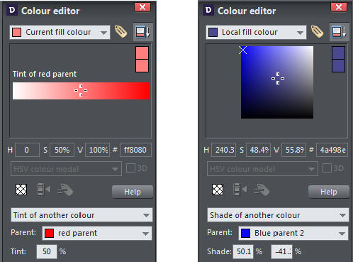
In addition to the normal stand-alone colors that you apply to objects, you can also define colors that are linked to another color, so that, when the parent color changes the linked color will change as well. There are three ways you can link a color to its parent - Tints, Shades, and Linked colors. These are very powerful techniques that allow, for example, single-click re-coloring of complex shaded drawings.Tints
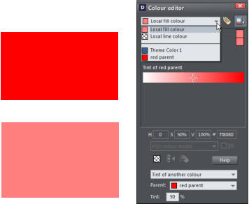
Tints are based on other colors (called the parent color) and are always a paler version of the parent. They have two main uses: • Where you have paler shades of a parent color and you may want to change the parent color in future with the tints automatically updating. • If you are printing with a limited range of colors (it's usually cheaper to print one or two color, instead of full or four color printing). For example, if just using black ink printing, it's often useful to be able to use tints to create various shades of gray. A tint can be based on any type of color, including another tint. Any changes you make to the parent color also change tints based on it. For example, you might define the color pink as 50% of a red parent color. Changing the parent color to orange automatically changes pink to light orange. Creating a tint - see belowShades
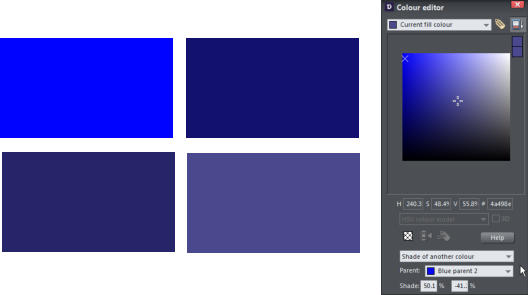
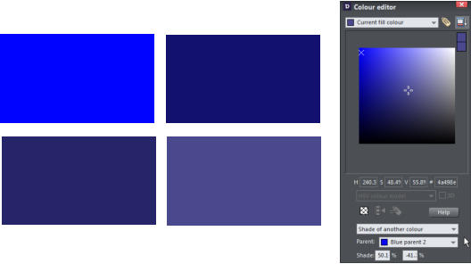
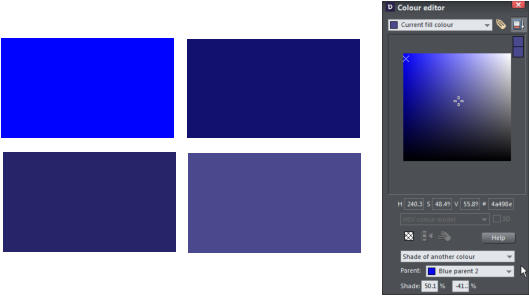
These allow both lighter and darker colors to be created all based on a parent color. Changing the color of the parent changes all associated shades. For example, a drawing of a car might use shades for the highlight and shaded regions of the car body. A single edit to the parent changes all the colors of the entire body but keeps the shading correct. Setting up shades this way is more time consuming but it is a very powerful way of altering colors. For best results, the parent color should be a "pure" saturated color so when it is viewed in the Color Editor the cross should be in the top left-hand corner. When using the HSV color mode, saturation and value should ideally be 100%. Creating a shade - see belowLinked colors
Linked colors are similar to shades but give greater flexibility. These are also based on a parent color but you define which attributes you want the linked color to share with its parent. For example, you can create a linked color that is a more or less saturated version of the parent, but the hue and lightness / darkness follow the parentCreating a Tint, Shade or Linked Color
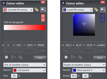
The parent color of tints, shades and linked colors needs to be a named color, so that when you change the parent color, the tint will change as well. So, if necessary, first create a named color. Select the object or objects to which you want to apply the new color and open the Color Editor with the advanced options showing. Select the 'normal color' drop-down menu and select the Tint, Shade, or Linked option. From the Parent dropdown menu, select the named color that you want this color to be linked to then adjust the Tint, Shade or Linked color on the top section of the color editor. On the left the new color is a tint so the editor provides only paler tints of the parent color. On the right, the new color is a shade, so you can choose any lighter or darker shades of the parent color. If you want to use this color in many places in the document it's recommended that you also make this a Named Color, so it appears on the Color Line, for easy picking. Just click on the New Named Color label icon on the top of the Color Editor and give it a name. It will now appear on the Color Line where you can pick it for use on other objects.Test by editing the parent color
The key point of using tints, shades and linked colors is that they track any changes to the parent color. To see this working try editing the Named color that is the parent (drag it from the Color Line to the Color Editor and alter the color). You will see the objects with the tint, shade or linked color change in sync with the parent. Tip: Be careful not to edit the color of objects on the page to which you've applied Named, Tints, Shades, or Linked colors as this will change them to Local colors.Website Theme Color Schemes
Many of the web themes offered in the Designs Gallery of Xara Web Designer and Xara Designer Pro include alternative color schemes which can easily be applied to websites that use the same theme, to transform the color scheme instantly. The color schemes are in the Designs Gallery in each theme folder, after all the page layouts and separate graphic elements that make up the theme. They all have 'Color scheme' in their titles, so are easily identified. To apply a new color scheme to your website, simply drag the scheme from the Designs Gallery and drop it on your web page. One of the color schemes matches the default colors used by that theme which allows you to easily return to the original colors if you prefer, after experimenting with the alternate schemes. Of course, you don't need to use the provided color schemes to re-color your website. You can customize the theme colors yourself and choose a combination of colors that you think work well together.Coloring Photos and Bitmaps (graphics composed of many tiny pixels)
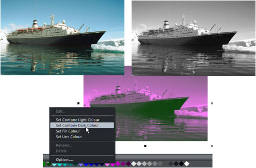
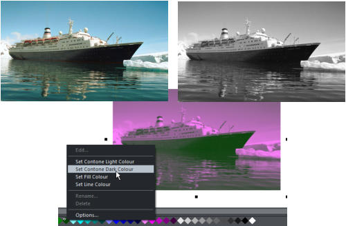
With a photo or bitmap selected click on the white color patch to convert the image to grayscale (black and white). This is called a 'contone' - a continuous tone from black to white, or sometimes called a 'duotone'. You can also right click on the image then select 'Contone' > Make black and white. To add a color just click on a color on the Color Line to apply that color to the photo or bitmap. You can set both contone colors via the Color Line context menu - right click on the Color Line to display the context menu then apply the selected color as either the light or dark color. You can also use the color editor to select any color as either the light or dark contone colour. Right click the photo and choose Contone > Light to display the color editor ('Ctrl + E'). Select the light or dark contone from the dropdown menu at the top of the color editor. Black and white Image and image with the light color set to pink and the dark color set to green Restore the original color of a photo by clicking the cross-hatched 'no color' patch on the left of the Color Line, or right clicking on it and selecting the 'Restore color' option.The Color Gallery
The Color Gallery displays all the named colors used in the current, and other open documents. It also lets you create, edit, copy and delete named colors. This is not available in Xara Web Designer. To access the Color Gallery, click on the Color Gallery tab on the right-hand galleries bar. Or select Utilities > Galleries > Color Gallery (or click ‘F9’). The Color GalleryXara Designer
Xara Photo and Graphic Designer is a high-powered general purpose graphics creation tool, able to create graphic designs of all types, from web graphics to page layouts such as posters and flyers, cartoons, and the most complex illustrations. Xara Web Designer is an ideal choice for novices as well as professional designers, infact, anyone wanting a high quality website, without the need to know HTML coding, scripting or the usual technical jargon. Xara Designer Pro is the ultimate all-in-one creative software, that provides powerful vector illustration, photo editing, page layout and website design, in one unrivalled WYSIWYG design tool. Download the free trial of Xara Photo & Graphic Designer and/or Xara Web Designer or Xara Designer Pro and give it a go!
Copyright © 2016 Xara Group Limited, a MAGIX company.
Page created with Xara Designer Pro


The Xara designer software - Photo & Graphic Designer, Page & Layout Designer, Web Designer and Designer Pro - provide a wide control over
applying, creating and altering the colors of objects. For simple documents, you can just choose colors from the Color Line or the on-screen
color palette. For more advanced color editing there's named colors, graduated color, tints, shades, linked colors and contoning. Many
documents and web templates are based on one theme color and several other colors that work well together to form a complete color
scheme.
Last month we looked at the Color Line, the Color Line Context menu and the Color Editor. This month we’ll explore local, theme and named
colors, creating tints, shades and linked colors, creating your own color schemes and contoning photos.
To try it, download the trial version of Xara Photo & Graphic Designer
Local, Named and Theme colors
Local colors are used in only one place in the document. Each object has a separate color and nothing is shared. This is useful if you want to
change the color of an object without affecting other objects. Local colors are the easiest and best method for simple documents that use
relatively few colors.
Named and Theme colors can be used repeatedly in the document (they are like styles in a word processor). Any edits you make to a Named or Themed color are immediately reflected on all objects and parts of the document that use that color. You can also copy Theme colors between documents. The Theme colors in most templates are consistently named so when you import elements from different themes colors are matched perfectly.Identifying Markers on The Color Line
Let’s revisit the Color Line and look at the identifying markers that tell us the color attributes on the current document. 1. The Named (Theme) Colors (if present in the document). Named colors are used to give templates and designs theme colors, so that the color scheme of a design can easily be changed without editing every object in it individually. 2. Linked Colors are represented differently on the color line by smaller rounded rectangles, so it's much easier to distinguish which are normal independent Named Colors and which are linked to a parent. 3. Palette colors: The 46 pre-defined palette colors comprise 5 shades of 7 standard hues and 10 shades of gray, black and white. Palette colors are not editable (i.e they are not Named Colors) and are designed as a simple, limited selection of colors to apply to objects (either by dragging on to the object or clicking). If your document contains spot colors, they appear on the Color Line (and in the Color Gallery) as circles. Little markers in the color icons show which of the named colors (if any) or palette colors have been applied to the selected object(s). Diamond markers show the colors used by the selected objects. A diamond in the top-left corner indicates the fill color, in the top- right corner indicates the line color. Cross-shaped markers show the current color attributes if there are no objects selected. A cross in the top-left corner indicates the fill color, in the top-right corner indicates the line color. Triangular markers show the colors of a fill type if you have applied one (linear, circular, elliptical, etc). This works also when using the eye-dropper color picker. The color line markers update immediately and indicate the color of the object under the eye-dropper as you're dragging around.Creating New Named colors
It's recommended to create a named color if you want to use the same color in different parts of your document and it’s especially useful, if there's a chance you might want to change that color in future. When you edit a named color, all objects that use this color are automatically and immediately updated to show the new color across all pages of your document. To do this, select an object whose color you want to use and then open the Color Editor ('Ctrl + E') and click the New named color icon (the label icon as shown below). Then give the color a suitable name and click ‘Create’. You will see the new color added to the Color Line. Creating a new Named color You can now apply this color to any object in the usual way, by drag-dropping it from the Color Line or just clicking (or right clicking to use it as a line color) to apply as the fill color.Tints, Shades and Linked Colors
In addition to the normal stand-alone colors that you apply to objects, you can also define colors that are linked to another color, so that, when the parent color changes the linked color will change as well. There are three ways you can link a color to its parent - Tints, Shades, and Linked colors. These are very powerful techniques that allow, for example, single-click re-coloring of complex shaded drawings.Tints
Tints are based on other colors (called the parent color) and are always a paler version of the parent. They have two main uses: • Where you have paler shades of a parent color and you may want to change the parent color in future with the tints automatically updating. • If you are printing with a limited range of colors (it's usually cheaper to print one or two color, instead of full or four color printing). For example, if just using black ink printing, it's often useful to be able to use tints to create various shades of gray. A tint can be based on any type of color, including another tint. Any changes you make to the parent color also change tints based on it. For example, you might define the color pink as 50% of a red parent color. Changing the parent color to orange automatically changes pink to light orange. Creating a tint - see belowShades
These allow both lighter and darker colors to be created all based on a parent color. Changing the color of the parent changes all associated shades. For example, a drawing of a car might use shades for the highlight and shaded regions of the car body. A single edit to the parent changes all the colors of the entire body but keeps the shading correct. Setting up shades this way is more time consuming but it is a very powerful way of altering colors. For best results, the parent color should be a "pure" saturated color so when it is viewed in the Color Editor the cross should be in the top left- hand corner. When using the HSV color mode, saturation and value should ideally be 100%. Creating a shade - see belowLinked colors
Linked colors are similar to shades but give greater flexibility. These are also based on a parent color but you define which attributes you want the linked color to share with its parent. For example, you can create a linked color that is a more or less saturated version of the parent, but the hue and lightness / darkness follow the parentCreating a Tint, Shade or Linked Color
The parent color of tints, shades and linked colors needs to be a named color, so that when you change the parent color, the tint will change as well. So, if necessary, first create a named color. Select the object or objects to which you want to apply the new color and open the Color Editor with the advanced options showing. Select the 'normal color' drop-down menu and select the Tint, Shade, or Linked option. From the Parent dropdown menu, select the named color that you want this color to be linked to then adjust the Tint, Shade or Linked color on the top section of the color editor. On the left the new color is a tint so the editor provides only paler tints of the parent color. On the right, the new color is a shade, so you can choose any lighter or darker shades of the parent color. If you want to use this color in many places in the document it's recommended that you also make this a Named Color, so it appears on the Color Line, for easy picking. Just click on the New Named Color label icon on the top of the Color Editor and give it a name. It will now appear on the Color Line where you can pick it for use on other objects.Test by editing the parent color
The key point of using tints, shades and linked colors is that they track any changes to the parent color. To see this working try editing the Named color that is the parent (drag it from the Color Line to the Color Editor and alter the color). You will see the objects with the tint, shade or linked color change in sync with the parent. Tip: Be careful not to edit the color of objects on the page to which you've applied Named, Tints, Shades, or Linked colors as this will change them to Local colors.Website Theme Color Schemes
Many of the web themes offered in the Designs Gallery of Xara Web Designer and Xara Designer Pro include alternative color schemes which can easily be applied to websites that use the same theme, to transform the color scheme instantly. The color schemes are in the Designs Gallery in each theme folder, after all the page layouts and separate graphic elements that make up the theme. They all have 'Color scheme' in their titles, so are easily identified. To apply a new color scheme to your website, simply drag the scheme from the Designs Gallery and drop it on your web page. One of the color schemes matches the default colors used by that theme which allows you to easily return to the original colors if you prefer, after experimenting with the alternate schemes. Of course, you don't need to use the provided color schemes to re-color your website. You can customize the theme colors yourself and choose a combination of colors that you think work well together.Coloring Photos and Bitmaps (graphics composed of many tiny pixels)
With a photo or bitmap selected click on the white color patch to convert the image to grayscale (black and white). This is called a 'contone' - a continuous tone from black to white, or sometimes called a 'duotone'. You can also right click on the image then select 'Contone' > Make black and white. To add a color just click on a color on the Color Line to apply that color to the photo or bitmap. You can set both contone colors via the Color Line context menu - right click on the Color Line to display the context menu then apply the selected color as either the light or dark color. You can also use the color editor to select any color as either the light or dark contone colour. Right click the photo and choose Contone > Light to display the color editor ('Ctrl + E'). Select the light or dark contone from the dropdown menu at the top of the color editor. Black and white Image and image with the light color set to pink and the dark color set to green Restore the original color of a photo by clicking the cross-hatched 'no color' patch on the left of the Color Line, or right clicking on it and selecting the 'Restore color' option.The Color Gallery
The Color Gallery displays all the named colors used in the current, and other open documents. It also lets you create, edit, copy and delete named colors. This is not available in Xara Web Designer. To access the Color Gallery, click on the Color Gallery tab on the right-hand galleries bar. Or select Utilities > Galleries > Color Gallery (or click ‘F9’). The Color GalleryXara Designer
Xara Photo and Graphic Designer is a high-powered general purpose graphics creation tool, able to create graphic designs of all types, from web graphics to page layouts such as posters and flyers, cartoons, and the most complex illustrations. Xara Web Designer is an ideal choice for novices as well as professional designers, infact, anyone wanting a high quality website, without the need to know HTML coding, scripting or the usual technical jargon. Xara Designer Pro is the ultimate all-in-one creative software, that provides powerful vector illustration, photo editing, page layout and website design, in one unrivalled WYSIWYG design tool. Download the free trial of Xara Photo & Graphic Designer and/or Xara Web Designer or Xara Designer Pro and give it a go!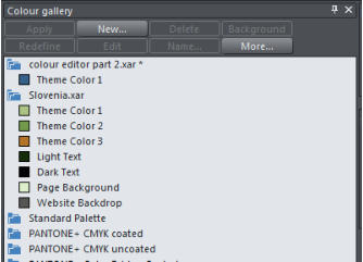


Copyright © 2015 Xara Group Limited, a MAGIX company.
Page created with Xara Designer Pro

The Xara designer software - Photo & Graphic Designer, Page & Layout Designer, Web Designer and
Designer Pro - provide a wide control over applying, creating and altering the colors of objects. For simple
documents, you can just choose colors from the Color Line or the on-screen color palette. For more
advanced color editing there's named colors, graduated color, tints, shades, linked colors and contoning.
Many documents and web templates are based on one theme color and several other colors that work well
together to form a complete color scheme.
Last month we looked at the Color Line, the Color Line Context menu and the Color Editor. This month we’ll
explore local, theme and named colors, creating tints, shades and linked colors, creating your own color
schemes and contoning photos.
To try it, download the trial version of Xara Photo & Graphic Designer
Local, Named and Theme colors
Local colors are used in only one place in the document. Each object has a separate color and nothing is
shared. This is useful if you want to change the color of an object without affecting other objects. Local
colors are the easiest and best method for simple documents that use relatively few colors.
Named and Theme colors can be used repeatedly in the document (they are like styles in a word processor). Any edits you make to a Named or Themed color are immediately reflected on all objects and parts of the document that use that color. You can also copy Theme colors between documents. The Theme colors in most templates are consistently named so when you import elements from different themes colors are matched perfectly.Identifying Markers on The Color Line
Let’s revisit the Color Line and look at the identifying markers that tell us the color attributes on the current document. 1. The Named (Theme) Colors (if present in the document). Named colors are used to give templates and designs theme colors, so that the color scheme of a design can easily be changed without editing every object in it individually. 2. Linked Colors are represented differently on the color line by smaller rounded rectangles, so it's much easier to distinguish which are normal independent Named Colors and which are linked to a parent. 3. Palette colors: The 46 pre-defined palette colors comprise 5 shades of 7 standard hues and 10 shades of gray, black and white. Palette colors are not editable (i.e they are not Named Colors) and are designed as a simple, limited selection of colors to apply to objects (either by dragging on to the object or clicking). If your document contains spot colors, they appear on the Color Line (and in the Color Gallery) as circles. Little markers in the color icons show which of the named colors (if any) or palette colors have been applied to the selected object(s). Diamond markers show the colors used by the selected objects. A diamond in the top-left corner indicates the fill color, in the top-right corner indicates the line color. Cross-shaped markers show the current color attributes if there are no objects selected. A cross in the top-left corner indicates the fill color, in the top-right corner indicates the line color. Triangular markers show the colors of a fill type if you have applied one (linear, circular, elliptical, etc). This works also when using the eye-dropper color picker. The color line markers update immediately and indicate the color of the object under the eye-dropper as you're dragging around.Creating New Named colors
It's recommended to create a named color if you want to use the same color in different parts of your document and it’s especially useful, if there's a chance you might want to change that color in future. When you edit a named color, all objects that use this color are automatically and immediately updated to show the new color across all pages of your document. To do this, select an object whose color you want to use and then open the Color Editor ('Ctrl + E') and click the New named color icon (the label icon as shown below). Then give the color a suitable name and click ‘Create’. You will see the new color added to the Color Line. Creating a new Named color You can now apply this color to any object in the usual way, by drag-dropping it from the Color Line or just clicking (or right clicking to use it as a line color) to apply as the fill color.Tints, Shades and Linked Colors
In addition to the normal stand-alone colors that you apply to objects, you can also define colors that are linked to another color, so that, when the parent color changes the linked color will change as well. There are three ways you can link a color to its parent - Tints, Shades, and Linked colors. These are very powerful techniques that allow, for example, single-click re-coloring of complex shaded drawings.Tints
Tints are based on other colors (called the parent color) and are always a paler version of the parent. They have two main uses: • Where you have paler shades of a parent color and you may want to change the parent color in future with the tints automatically updating. • If you are printing with a limited range of colors (it's usually cheaper to print one or two color, instead of full or four color printing). For example, if just using black ink printing, it's often useful to be able to use tints to create various shades of gray. A tint can be based on any type of color, including another tint. Any changes you make to the parent color also change tints based on it. For example, you might define the color pink as 50% of a red parent color. Changing the parent color to orange automatically changes pink to light orange. Creating a tint - see belowShades
These allow both lighter and darker colors to be created all based on a parent color. Changing the color of the parent changes all associated shades. For example, a drawing of a car might use shades for the highlight and shaded regions of the car body. A single edit to the parent changes all the colors of the entire body but keeps the shading correct. Setting up shades this way is more time consuming but it is a very powerful way of altering colors. For best results, the parent color should be a "pure" saturated color so when it is viewed in the Color Editor the cross should be in the top left-hand corner. When using the HSV color mode, saturation and value should ideally be 100%. Creating a shade - see belowLinked colors
Linked colors are similar to shades but give greater flexibility. These are also based on a parent color but you define which attributes you want the linked color to share with its parent. For example, you can create a linked color that is a more or less saturated version of the parent, but the hue and lightness / darkness follow the parentCreating a Tint, Shade or Linked Color
The parent color of tints, shades and linked colors needs to be a named color, so that when you change the parent color, the tint will change as well. So, if necessary, first create a named color. Select the object or objects to which you want to apply the new color and open the Color Editor with the advanced options showing. Select the 'normal color' drop-down menu and select the Tint, Shade, or Linked option. From the Parent dropdown menu, select the named color that you want this color to be linked to then adjust the Tint, Shade or Linked color on the top section of the color editor. On the left the new color is a tint so the editor provides only paler tints of the parent color. On the right, the new color is a shade, so you can choose any lighter or darker shades of the parent color. If you want to use this color in many places in the document it's recommended that you also make this a Named Color, so it appears on the Color Line, for easy picking. Just click on the New Named Color label icon on the top of the Color Editor and give it a name. It will now appear on the Color Line where you can pick it for use on other objects.Test by editing the parent color
The key point of using tints, shades and linked colors is that they track any changes to the parent color. To see this working try editing the Named color that is the parent (drag it from the Color Line to the Color Editor and alter the color). You will see the objects with the tint, shade or linked color change in sync with the parent. Tip: Be careful not to edit the color of objects on the page to which you've applied Named, Tints, Shades, or Linked colors as this will change them to Local colors.Website Theme Color Schemes
Many of the web themes offered in the Designs Gallery of Xara Web Designer and Xara Designer Pro include alternative color schemes which can easily be applied to websites that use the same theme, to transform the color scheme instantly. The color schemes are in the Designs Gallery in each theme folder, after all the page layouts and separate graphic elements that make up the theme. They all have 'Color scheme' in their titles, so are easily identified. To apply a new color scheme to your website, simply drag the scheme from the Designs Gallery and drop it on your web page. One of the color schemes matches the default colors used by that theme which allows you to easily return to the original colors if you prefer, after experimenting with the alternate schemes. Of course, you don't need to use the provided color schemes to re-color your website. You can customize the theme colors yourself and choose a combination of colors that you think work well together.Coloring Photos and Bitmaps (graphics composed of many
tiny pixels)
With a photo or bitmap selected click on the white color patch to convert the image to grayscale (black and white). This is called a 'contone' - a continuous tone from black to white, or sometimes called a 'duotone'. You can also right click on the image then select 'Contone' > Make black and white. To add a color just click on a color on the Color Line to apply that color to the photo or bitmap. You can set both contone colors via the Color Line context menu - right click on the Color Line to display the context menu then apply the selected color as either the light or dark color. You can also use the color editor to select any color as either the light or dark contone colour. Right click the photo and choose Contone > Light to display the color editor ('Ctrl + E'). Select the light or dark contone from the dropdown menu at the top of the color editor. Black and white Image and image with the light color set to pink and the dark color set to green Restore the original color of a photo by clicking the cross-hatched 'no color' patch on the left of the Color Line, or right clicking on it and selecting the 'Restore color' option.The Color Gallery
The Color Gallery displays all the named colors used in the current, and other open documents. It also lets you create, edit, copy and delete named colors. This is not available in Xara Web Designer. To access the Color Gallery, click on the Color Gallery tab on the right-hand galleries bar. Or select Utilities > Galleries > Color Gallery (or click ‘F9’). The Color GalleryXara Designer
Xara Photo and Graphic Designer is a high-powered general purpose graphics creation tool, able to create graphic designs of all types, from web graphics to page layouts such as posters and flyers, cartoons, and the most complex illustrations. Xara Web Designer is an ideal choice for novices as well as professional designers, infact, anyone wanting a high quality website, without the need to know HTML coding, scripting or the usual technical jargon. Xara Designer Pro is the ultimate all-in-one creative software, that provides powerful vector illustration, photo editing, page layout and website design, in one unrivalled WYSIWYG design tool. Download the free trial of Xara Photo & Graphic Designer and/or Xara Web Designer or Xara Designer Pro and give it a go!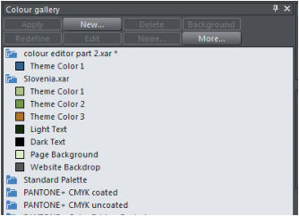


Copyright © 2015 Xara Group Limited, a MAGIX company.
Page created with Xara Designer Pro

The Xara designer software - Photo & Graphic Designer, Page &
Layout Designer, Web Designer and Designer Pro - provide a wide
control over applying, creating and altering the colors of objects. For
simple documents, you can just choose colors from the Color Line or
the on-screen color palette. For more advanced color editing there's
named colors, graduated color, tints, shades, linked colors and
contoning. Many documents and web templates are based on one
theme color and several other colors that work well together to form
a complete color scheme.
Last month we looked at the Color Line, the Color Line Context menu
and the Color Editor. This month we’ll explore local, theme and
named colors, creating tints, shades and linked colors, creating your
own color schemes and contoning photos.
To try it, download the trial version of Xara Photo & Graphic Designer
Local, Named and Theme colors
Local colors are used in only one place in the document. Each object
has a separate color and nothing is shared. This is useful if you want
to change the color of an object without affecting other objects.
Local colors are the easiest and best method for simple documents
that use relatively few colors.
Named and Theme colors can be used repeatedly in the document (they are like styles in a word processor). Any edits you make to a Named or Themed color are immediately reflected on all objects and parts of the document that use that color. You can also copy Theme colors between documents. The Theme colors in most templates are consistently named so when you import elements from different themes colors are matched perfectly.Identifying Markers on The Color Line
Let’s revisit the Color Line and look at the identifying markers that tell us the color attributes on the current document. 1. The Named (Theme) Colors (if present in the document). Named colors are used to give templates and designs theme colors, so that the color scheme of a design can easily be changed without editing every object in it individually. 2. Linked Colors are represented differently on the color line by smaller rounded rectangles, so it's much easier to distinguish which are normal independent Named Colors and which are linked to a parent. 3. Palette colors: The 46 pre-defined palette colors comprise 5 shades of 7 standard hues and 10 shades of gray, black and white. Palette colors are not editable (i.e they are not Named Colors) and are designed as a simple, limited selection of colors to apply to objects (either by dragging on to the object or clicking). If your document contains spot colors, they appear on the Color Line (and in the Color Gallery) as circles. Little markers in the color icons show which of the named colors (if any) or palette colors have been applied to the selected object(s). Diamond markers show the colors used by the selected objects. A diamond in the top-left corner indicates the fill color, in the top-right corner indicates the line color. Cross-shaped markers show the current color attributes if there are no objects selected. A cross in the top-left corner indicates the fill color, in the top-right corner indicates the line color. Triangular markers show the colors of a fill type if you have applied one (linear, circular, elliptical, etc). This works also when using the eye-dropper color picker. The color line markers update immediately and indicate the color of the object under the eye-dropper as you're dragging around.Creating New Named colors
It's recommended to create a named color if you want to use the same color in different parts of your document and it’s especially useful, if there's a chance you might want to change that color in future. When you edit a named color, all objects that use this color are automatically and immediately updated to show the new color across all pages of your document. To do this, select an object whose color you want to use and then open the Color Editor ('Ctrl + E') and click the New named color icon (the label icon as shown below). Then give the color a suitable name and click ‘Create’. You will see the new color added to the Color Line. Creating a new Named color You can now apply this color to any object in the usual way, by drag- dropping it from the Color Line or just clicking (or right clicking to use it as a line color) to apply as the fill color.Tints, Shades and Linked Colors
In addition to the normal stand-alone colors that you apply to objects, you can also define colors that are linked to another color, so that, when the parent color changes the linked color will change as well. There are three ways you can link a color to its parent - Tints, Shades, and Linked colors. These are very powerful techniques that allow, for example, single-click re-coloring of complex shaded drawings.Tints
Tints are based on other colors (called the parent color) and are always a paler version of the parent. They have two main uses: • Where you have paler shades of a parent color and you may want to change the parent color in future with the tints automatically updating. • If you are printing with a limited range of colors (it's usually cheaper to print one or two color, instead of full or four color printing). For example, if just using black ink printing, it's often useful to be able to use tints to create various shades of gray. A tint can be based on any type of color, including another tint. Any changes you make to the parent color also change tints based on it. For example, you might define the color pink as 50% of a red parent color. Changing the parent color to orange automatically changes pink to light orange. Creating a tint - see belowShades
These allow both lighter and darker colors to be created all based on a parent color. Changing the color of the parent changes all associated shades. For example, a drawing of a car might use shades for the highlight and shaded regions of the car body. A single edit to the parent changes all the colors of the entire body but keeps the shading correct. Setting up shades this way is more time consuming but it is a very powerful way of altering colors. For best results, the parent color should be a "pure" saturated color so when it is viewed in the Color Editor the cross should be in the top left-hand corner. When using the HSV color mode, saturation and value should ideally be 100%. Creating a shade - see belowLinked colors
Linked colors are similar to shades but give greater flexibility. These are also based on a parent color but you define which attributes you want the linked color to share with its parent. For example, you can create a linked color that is a more or less saturated version of the parent, but the hue and lightness / darkness follow the parentCreating a Tint, Shade or Linked Color
The parent color of tints, shades and linked colors needs to be a named color, so that when you change the parent color, the tint will change as well. So, if necessary, first create a named color. Select the object or objects to which you want to apply the new color and open the Color Editor with the advanced options showing. Select the 'normal color' drop-down menu and select the Tint, Shade, or Linked option. From the Parent dropdown menu, select the named color that you want this color to be linked to then adjust the Tint, Shade or Linked color on the top section of the color editor. On the left the new color is a tint so the editor provides only paler tints of the parent color. On the right, the new color is a shade, so you can choose any lighter or darker shades of the parent color. If you want to use this color in many places in the document it's recommended that you also make this a Named Color, so it appears on the Color Line, for easy picking. Just click on the New Named Color label icon on the top of the Color Editor and give it a name. It will now appear on the Color Line where you can pick it for use on other objects.Test by editing the parent color
The key point of using tints, shades and linked colors is that they track any changes to the parent color. To see this working try editing the Named color that is the parent (drag it from the Color Line to the Color Editor and alter the color). You will see the objects with the tint, shade or linked color change in sync with the parent. Tip: Be careful not to edit the color of objects on the page to which you've applied Named, Tints, Shades, or Linked colors as this will change them to Local colors.Website Theme Color Schemes
Many of the web themes offered in the Designs Gallery of Xara Web Designer and Xara Designer Pro include alternative color schemes which can easily be applied to websites that use the same theme, to transform the color scheme instantly. The color schemes are in the Designs Gallery in each theme folder, after all the page layouts and separate graphic elements that make up the theme. They all have 'Color scheme' in their titles, so are easily identified. To apply a new color scheme to your website, simply drag the scheme from the Designs Gallery and drop it on your web page. One of the color schemes matches the default colors used by that theme which allows you to easily return to the original colors if you prefer, after experimenting with the alternate schemes. Of course, you don't need to use the provided color schemes to re- color your website. You can customize the theme colors yourself and choose a combination of colors that you think work well together.Coloring Photos and Bitmaps
(graphics composed of many tiny
pixels)
With a photo or bitmap selected click on the white color patch to convert the image to grayscale (black and white). This is called a 'contone' - a continuous tone from black to white, or sometimes called a 'duotone'. You can also right click on the image then select 'Contone' > Make black and white. To add a color just click on a color on the Color Line to apply that color to the photo or bitmap. You can set both contone colors via the Color Line context menu - right click on the Color Line to display the context menu then apply the selected color as either the light or dark color. You can also use the color editor to select any color as either the light or dark contone colour. Right click the photo and choose Contone > Light to display the color editor ('Ctrl + E'). Select the light or dark contone from the dropdown menu at the top of the color editor. Black and white Image and image with the light color set to pink and the dark color set to green Restore the original color of a photo by clicking the cross-hatched 'no color' patch on the left of the Color Line, or right clicking on it and selecting the 'Restore color' option.The Color Gallery
The Color Gallery displays all the named colors used in the current, and other open documents. It also lets you create, edit, copy and delete named colors. This is not available in Xara Web Designer. To access the Color Gallery, click on the Color Gallery tab on the right-hand galleries bar. Or select Utilities > Galleries > Color Gallery (or click ‘F9’). The Color GalleryXara Designer
Xara Photo and Graphic Designer is a high-powered general purpose graphics creation tool, able to create graphic designs of all types, from web graphics to page layouts such as posters and flyers, cartoons, and the most complex illustrations. Xara Web Designer is an ideal choice for novices as well as professional designers, infact, anyone wanting a high quality website, without the need to know HTML coding, scripting or the usual technical jargon. Xara Designer Pro is the ultimate all-in-one creative software, that provides powerful vector illustration, photo editing, page layout and website design, in one unrivalled WYSIWYG design tool. Download the free trial of Xara Photo & Graphic Designer and/or Xara Web Designer or Xara Designer Pro and give it a go!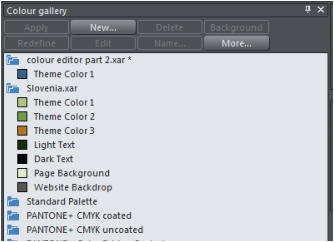


Copyright © 2015 Xara Group Limited, a MAGIX company.
Page created with Xara Designer Pro
EDITING COLORS - PART 2
EDITING COLORS - PART 2
EDITING COLORS - PART 2
EDITING COLORS - PART 2