If you have a website using Google Analytics you have probably received an email warning that your website is not optimized for mobiles. The
emails are rather alarmist, Google are actually only saying that they will favor websites that are designed for mobiles in mobile searches. It's
worth emphasizing that this change will not affect search position for searches done on desktop computers. You might ask why there should
be a penalty for mobile searches - after all aren’t mobile browsers able to view normal desktop websites? The answer is ‘yes they can’, but
usually to view such content requires zooming and panning the page, the text may be difficult to read and the navigation tricky - all of which
Google judge not ‘mobile friendly’.
So the changes that Google are looking for include;
• Narrow pages that do not require horizontal scrolling
• Larger text that is more visible for small screens
• Navigation that works, ideally with one finger. So small buttons and menus are out.
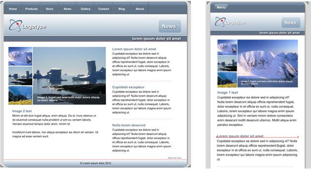
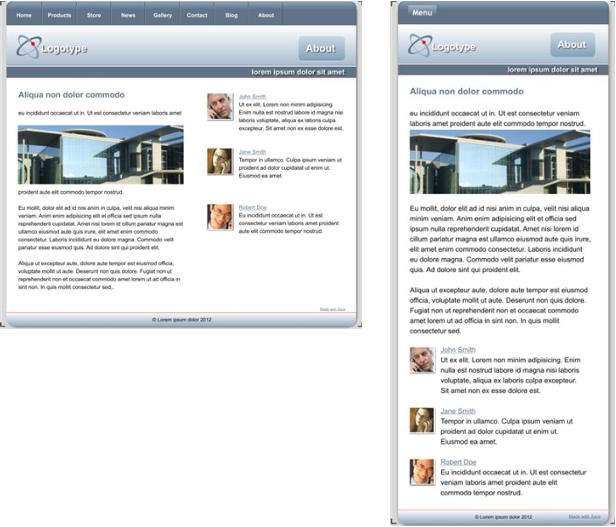
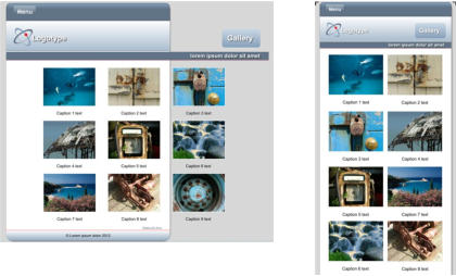
The original website is on the left and a mobile version on the right, which is better suited for mobile devices. It has a larger font size, narrow page,
cropped images and a different, finger-friendly, navigation method.
So what's involved in making your website mobile friendly? In release 10 of Web Designer Premium and Designer Pro we added the ability to
create responsive websites, which are websites that are both mobile and desktop friendly at the same time. In effect, you create two layouts
(variants) of your content, one that suits a narrow mobile screen which is operated by touch, and one that's better suited for wider screens
such as desktops. They are exported as one HTML file, and the correct variant is presented depending on the device of the viewer.
This tutorial will take you through the process of creating a mobile variant for your existing site (we will be using one of our template designs).
If you were creating a new website, then we would recommend using one of the ready made Responsive Website Design (RWD) templates that
are included in the Designs Gallery of Web Designer 10 Premium and Designer Pro X10 - they are marked with an (R) after the name. They
already include a mobile variant.
In summary the process of converting an existing website consists of the following steps:
1.
Create a Mobile Variant:
This creates a copy of your whole website, based on a narrow page design. The key aspect here is that all content is shared by both
variants - so text edited on one is automatically updated in the other - this is not really two websites, but one HTML file that adapts its
display to the device being used.
2.
Adjust the text size for the mobile variant to be larger:
Small screens require bigger font sizes to be readable. Xara supports variant-specific Styles so the same content can appear in a larger
font.
3.
Re-arrange the design and content on the page:
This will involve adjusting graphics (e.g. header and footer widths) and may involve tweaking your graphics to better suit the narrow
screen. Text columns will have to be narrower and most of your content arranged in on long column, rather than side-by-side.
4.
Change the navigation to be a single button drop down menu which is more finger friendly:
There's an easy way to convert Xara NavBars to single button touch friendly menus.
There is no way to avoid the fact that creating mobile friendly versions of websites can be time consuming - this is true no matter how they are
made. (Typically, a web designer would charge almost double for creating a multi-layout RWD website.) Of course, many users may decide
that they only want one version of their website, designed for larger screen computers and tablets, which is fine as it saves time and may be
the best decision if the audience is likely to be mostly desktop or tablet users.
If you don’t have Xara Web Designer 10 Premium or Designer Pro X10 you can download a free trial here.
Website template called ‘Orbit’ that we will convert to be a mobile friendly Responsive Website Design
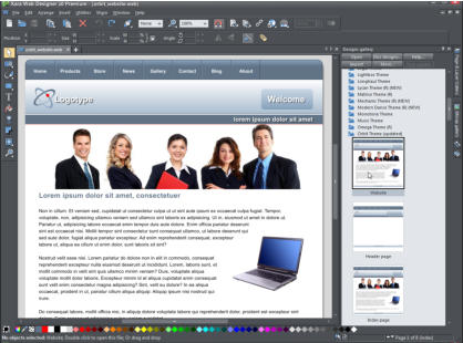
I have used a template called Orbit for this tutorial, you may wish to load the file and follow me through the steps. If you already own Web
Designer or Designer Pro you will find it in the Designs Gallery under Website Themes - General (just load the file called Website). If you are
using the trial you can download the Orbit file here. The template I’ve chosen is not a particularly easy one to create a mobile variant but the
intention is to cover all the issues that might come up when you are creating a variant for your own site (template based or otherwise). I have
used Web Designer Premium.
By default Web Designer opens a new document showing just one page. I prefer to view all my pages as one long scrolling document. To do
this, right click on the page background and choose ‘Multiple Page View’ or select the menu ‘Window > Multiple Page View’.
Creating the Mobile Variant
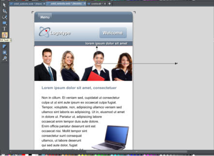
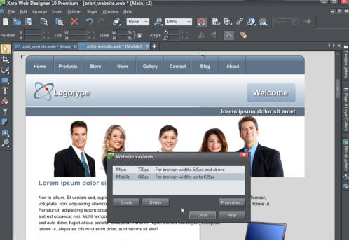
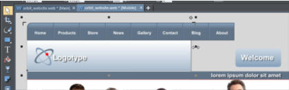
To create a mobile variant, right click on the page background and select ‘Website variants > Website variants…’ or right click on the main page tab and select - ‘Website variants…’, and then select the ‘Create’ option. Web Designer has guessed that I am going to create a mobile version and I’m happy with the name and size so click Create, then close the dialog window. Creating the mobile variant website. Note two blue document tabs give you access to the two versions Immediately, you will see that a second document tab has opened with a new variant with a page size of 480 pixels (the two tabs for the document are colored blue so you know they are linked). It’s important to understand that this has just created a narrow page, but it’s up to you to re-arrange the text and items in a way that you want for this narrow page. Tip: We suggest that you regularly check both normal and mobile variants as you go. Each variant (and you're not limited to two) has its own tab, and it takes just one click to swap between the normal and mobile variants to check your changes work in the various devices.Adjusting The Design For the Mobile Variant
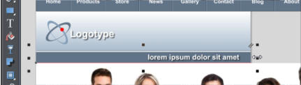
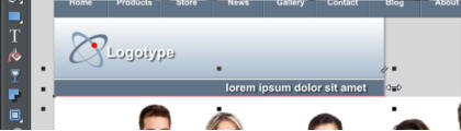
The two variants share content where appropriate but you can edit them separately so you have total control over how they look on different devices. I’ll start by reducing the page header to fit. Select the header background and drag the center right hand resize handle (the square) onto the web page. Notice that it will lock into place when it reaches the left side of the page – that is because the ‘Snap to objects’ is set to ‘on’ (this option is on the top InfoBar .) Also note that, when the object is selected, it has a small star shaped ‘repeating object’ symbol in the top right corner. It’s quite common and very useful to have some objects set to ‘repeating’ so that they appear the same on every web page. Any change made to the object will then automatically update on the other pages. Scroll down to the next page and you’ll see that the header background has been automatically adjusted. It will be the same on all the other pages. Drag the right edge of the header background to reduce its size so that it fits the new width Now select the sub-heading bar under the page header and do the same thing - drag left to be the correct new width. The sub-heading bar is not set to be repeating as it is likely that you will change the text on each of your web pages. Note that, when selected, it has a parallel lines symbol in the top right – that means that it has been set as a ‘shared object’ across different variants. So any changes made, for example, to the text on the bar, will automatically change on the Main full size website, and on the Mobile variant. Both the header background and the smaller sub-heading rectangle have been resized down to the width of the page Now drag the Welcome button onto the header background. Again, notice that it snaps into position within the blue guidelines that appear as you drag it into place. Also notice that it is set as a ‘shared object’. If I change the button text, that change will happen in both variants. Scroll down to the footer bar on the bottom of the page, select it and do the same, reduce its size to that of the page background. This is set to be a ‘repeating object’ so it will change on all the other pages too.Navigation Bar (NavBar)
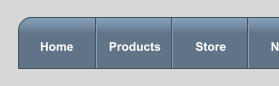
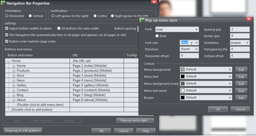
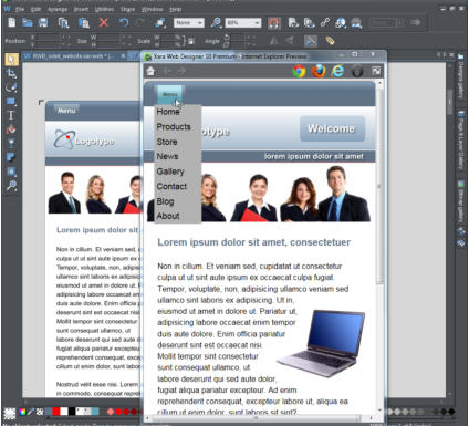
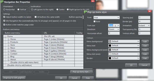
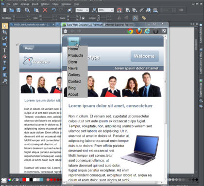
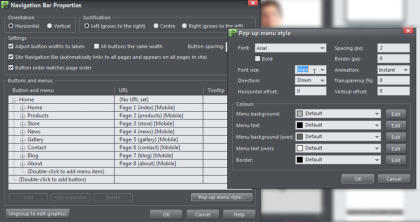
To be mobile friendly and space efficient a common navigation system is to have just a single button with a vertical menu of links to other pages. It is advisable to make the text larger. NavBars in each variant are independent, so you can customize them as required including changing the design of the bar. Assuming you are starting with a multi-button horizontal navigation bar I will show you how to create a single button with a vertical menu of links. On the Orbit template the first button design differs from the design of the other buttons, which makes it unsuitable for a single-button use - the button design is unlikely to look good on its own. So I will replace it with an alternative NavBar design where all the buttons on the bar look the same. The left button of the NavBar does not make a good single ‘Menu’ button, so I will change the design of my NavBar Open the Designs Gallery, close the Orbit Theme and also the Website Themes folders so you are at the top level. Click to open the Page Elements and Widgets folder, then the Free Trial Samples sub-folder to see the selection. Click drag the bar called ‘horizontal navbar 2’ from the Gallery onto the existing button bar and select to ‘Match’ the colors and text styles’. This changes the design of the NavBar. I double click on the NavBar to open the NavBar editor so I can convert this bar to a single button version with a drop-down menu. Double click the NavBar to open the NavBar editor To make a single button NavBar delete all except the Home page button (click on the second entry and keep hitting the Delete button below until they are all removed). Change the text on the remaining button from Home to ‘Menu’ and remove the link from the Menu button by clicking the URL field next to the button and choosing ‘Do nothing’ in the Link dialog. Now you can either start adding menu entries to the button manually in the NavBar dialog, or a menu entry can be added automatically for each page in your site. To add the links automatically, simply uncheck Site Navigation Bar option above the Buttons & Menus and then check them again. You will see that the menu becomes populated with a link to each page of the website. Edit the names of each entry in the menu if you don't want them to be the same as the page names. To change the size of the text of the link buttons select ‘Pop-Up menu style’ and change the text to 18px, and increase the item spacing to something like 5px. You can also adjust the colors as you wish. Then select OK on both dialogs to accept the changes. One last thing to do on the NavBar is to change the text size of the Menu button. Select the Text tool, highlight the word ‘Menu and change the font size to be 16px. The navigation bar is a repeating object so it will appear the same on every page. Editing the Navigation Bar to be a single button with a drop down menu of links with a change of text size To check your menu changes so far, select Page Preview and make the preview window narrower so that it will display the mobile variant. Remember - text that looks over-large on your desktop appears much smaller on the phone screen. Preview the mobile variant to check the operation of the menu A note about how the content is shared between variants: When an object is set as a ‘shared object’ any change in one of the variants will automatically make the change in the other variants, for example if you change the heading text or a photo. Shared objects have two parallel lines, top right corner. This means if you make a change to it, it will be changed in both variants If you don’t want the change copied – for example, if you’re removing some text from a mobile version, just select the Text Tool and select the text you want to delete, then right click on the mouse, go to website variants and select ‘stop sharing with variants’ – now you can delete it in the Mobile version and it won’t be removed from the Main variant. There are exceptions to the sharing. Obviously, if you change the size of a photo or crop it, then that won’t be copied, neither will changes to repeating objects such as NavBars, because these are edits that you’d expect to make only in the mobile variant. Web Designer makes intelligent guesses about what should and shouldn’t be copied, but we would always recommend that you switch between the variants regularly, making sure that you haven’t generated any unexpected changes. Keep an eye on that as you’re going along, and, of course, also when you preview at the end.Updating The Text Styles
With the page structure complete it’s now time to work on the content. Firstly, the main body text needs to be at least 16px, perhaps larger for the mobile variant. With the Text Tool select a paragraph of text (the top InfoBar should show ‘Normal text’ Style) change the font size to be 16px, then click the Style drop-down menu and select ‘Update style in this variant’. Notice how all the text will change on all of the pages into the new style. Do the same for the Heading 2 style – select one of the headings on any page, change the style to be 18px or larger, and do the same ‘Update style in this variant’. Now I need to make layout adjustments to each of the pages.Updating The Page Layouts
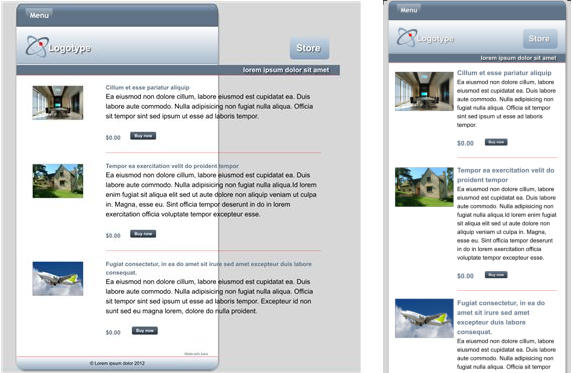
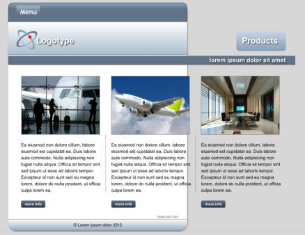
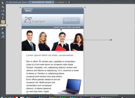
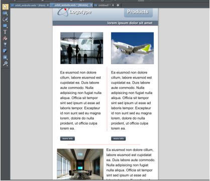
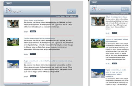
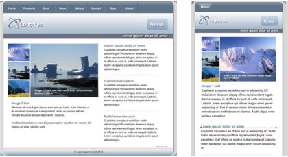
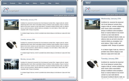
I will go through the various page designs in my Orbit website - they consist of a wide variety of page layouts that are great examples of how to adjust just about any layout from wide to narrow. Home Page: Adjust the text column width: In the Text Tool click in the text and drag the right end of the red column marker to the desired width and the text will adjust to that new width. Using the Selector Tool, drag the computer image onto the page – notice that the text flows around it – that is because the image is set to ‘repel text under’. (If you need to adjust the repel margin, right click on the image and choose the ‘Repelling & Anchoring...’ option.) Repelling images must be in front of the text - type Ctrl+F to bring it to the front if necessary. You’ll notice that the page length has automatically increased to accommodate the extra lines of text using the automatic Push system. Now we need to adjust the image of people at the top, there are two choices for this. Select the image and drag the bottom corner handle to reduce the overall size of the image (this would display all five people) or, better in this case, drag the center right handle to narrow the image so that it fits the width of the page. This crops the image. Then use the Fill Tool to adjust the photo within the image container. Tip: when using the Selector Tool to adjust the size of images use only the corner or side handles to resize. That crops the image rather than squashes it. That’s it, the Home Page completed! Using the Fill Tool to adjust the image on the Home Page. Drag the end of the arrows to rotate and resize. Drag on the image to re-position it. Products Page: The page starts as three columns - much too wide for the 480px wide page. Adjust the sub-heading to fit into the mobile variant by selecting it and dragging the right side handle until it ‘snaps’ into position. Now move the ‘Products’ heading onto the page. You can adjust the content layout in many ways. We wouldn’t ever recommend more than 2 columns on a mobile variant so I shall fit the two products alongside each other on the page, and then fit the third product so that the image is alongside the text. (An alternative would be to have all of the products under each other and increase the text paragraphs to the full width of the page, or to have all the product images with the text alongside.) The magnetic snap makes it easy to align everything on the page. Select and drag on the corner handle to resize the first two images so that they fit neatly on the page alongside each other. Select the divider line and move it to align centrally with the space between the two images. This has been set to stretch with the page which is not needed in the mobile variant so, with it selected, right click and select ‘Position on page’ and uncheck ‘Stretch with page’. Select one of the paragraphs and align it with the left of the image, then with the Text Tool selected reduce the red line that sets the width of the text. Do the same for the other paragraph. You will notice that there is very little room on the page for the 3rd product to fit under the first two products. There are two ways the page can resize. Some items on the page (usually the text) have a ‘Push’ attribute set (Right click menu ‘Position on page’) which causes the page to be pushed down as more text is added. Alternatively you can manually drag the bottom edge of the page - at the bottom of the page you will see a bracket in the two corners and there is a feint blue dashed line that runs horizontally through those corner brackets. Drag the pale blue horizontal line down to increase your page size. For the third product, the image is not set to push, but the text is. So I will drag the text into the column under the second product, which will ‘push’ the page ,and then I drag the image under the first product. If you wish to have a horizontal line between the top two products and the third product then copy the divider on this page, change the angle by 90 degrees (option in the top InfoBar) and then move it into position and resize as required. (A simple alternative is to copy and paste a horizontal divider from another page.) The Products Page re-arranged to be 2 columns with a third product below Store Page: As you can see the text is just too wide, so this is pretty simple change. The original on the left has been re-arranged to be one narrow column with larger photos. Adjust the sub-heading and Store label as before. Now using the Text Tool, resize the column to be more narrow, the usual way. Notice how the other objects on the page automatically move down to accommodate the longer text. Select the red divider lines and drag the side handle to make them smaller to fit the page. For this page, I have also increased the size of the photos to make them more clearly seen on a mobile. News Page: The original version of the News Page and re-arranged narrower version on the right This page contains quite a complex mouse-over photo slideshow on the left. This is a soft group of multiple parts on various layers (when you mouse-over the different photo the main one changes and text description changes). I only need to move this slightly so it’s centered on the new page, but no other change. The column on the right has to be moved to a position below the photo slideshow (and its text). Gallery Page: There are various ways to create photo galleries in Web Designer e.g. using Gallery Widgets. But this page is made up of an array of individual photo thumbnails, with the pop-up attribute set (so you get an enlarged version when you click on it), along with caption text that is Soft Grouped with the photo, so the photo and caption stay together when you drag them around. We wouldn’t ever recommend more than 2 columns on a mobile variant so, using the Selector Tool, I will simply drag to re-arrange the images into 2 columns, and at the same time resize each to be a little larger. If you have the ‘Snap To objects’ (magnet) on, then ensuring they are all aligned is really easy. The original Gallery page on the left, and the re-arranged version on the right. Contact Page: Adjust the sub-heading and Contact button. Very little needs to be done to this page. I simply moved the position of both the text and the image and made the image larger. Blog Page: Adjust the sub-heading and content in a similar way to the Store Page. The original on the left has been re-arranged to be one narrow column with larger, slightly re-positioned images. About Page: This page is a bit more complex, and requires the right column (with anchored images) to be moved below the 1st column. The two sections have been re-arranged to be one below the other - I altered the column width, and tweaked the photo positions a bit The first step is to move the right column off the page temporarily, so I can work on the left. For the left column I just made it wider to cover the full width of the mobile page. The second part of the work is to move the right column (with its anchored photos) below. This has ‘push’ set so just dragging it down and dropping it below the first column will make the page grow. You might want to adjust the column width again, and to move the set of tiny anchored images to be in a more suitable place. And that’s it, the mobile variant is done! Tip to remember - don’t be afraid to delete non-essential things in your mobile versions, often they need to be simpler!Preview
While you’re working through your website it is advisable to check the two variants and preview the website regularly, to check everything is working as you intend. Simply adjust the browser window to be narrower, and you’ll see it automatically switches to the mobile version.Publish
When you’re done, just re-publish your website - select the Publish document as a web page icon on the top Tool Bar or select File>Publish and enter the details of your web space in the normal way. If you have a MAGIX Online world account you just have to enter your account details, otherwise publish to your normal host - you will need your FTP host address, your username and password. If this is an existing site, then just re-publish and you now have a mobile-friendly, Google-friendly, responsive website. You can see the finished website on your computer and mobile device at http://www.nfisher.magix.net/rwdsite/More Info:
An article in our Support Center on creating a mobile variant: http://support.xara.com/index.php?/Knowledgebase/Article/View/819/0/how-do-i-create-additional-variants-for-my-website An article in our Support Center on making your website mobile friendly for search engines: http://support.xara.com/index.php?/Knowledgebase/Article/View/842/0/how-do-i-make-my-website-mobile-friendly-for-search-engines Video tutorials on xara.com, Creating Mobile Variants Pt 1 & 2: http://www.xara.com/web-designer/tutorials-demos/ To check if your website is mobile friendly, enter your website’s URL into this page: https://www.google.co.uk/webmasters/tools/mobile-friendly/Advanced Users:
Some of Xara’s templates might have other complications, and maybe your website too! Some of the things to watch out for include: • Resizing grouped objects, such as headings or footers, using the Selector Tool. If you use the right side handle to resize the group it tries to be smart and retain the relative proportions and positions of the objects, and not squash the contents (as older versions of Xara did). But sometimes you will have no option but to un-group, re-position or edit each of the component elements as required, then group it again. • Objects on locked layers e.g. the background layer. Using the Page & Layer Gallery just unlock those layers, make the required changes, and lock the layer again. • Soft Grouped objects. Soft Groups are a way in which objects, such as photos and captions (see above) stick together. Soft Groups typically have things on other layers in the group. So take care when adjusting these. You may have to remove the Soft Group to make adjustments, but one tip is that holding Ctrl when you do a click will select an item ‘inside a group’ (this applies generally), which is a quick way to make changes to items in groups without having to un-group. Normal groups (as opposed to Soft Groups) can’t be used the same way, partly because you cannot group items on different layers, and secondly because normal groups are converted into a single graphic when you save your web page HTML. • Push: We highly recommend using the automatic Push feature so that as you extend the text, everything else on the page is pushed around, and the page grows, as required. Right click on any object and use the ‘Position on page’ menu to adjust the push. See the Help for more info on this topic. • Responsive 'Retina' or HiDPI Resolution Control. Mobile and tablet devices, and some modern laptops (e.g. Microsoft Surface Pro and Apple MacBook devices) support far higher resolution graphics. Web Designer Premium and Designer Pro cater for this completely automatically, and will produce both normal resolution and Hi-DPI or Retina resolution images for all graphics and photos. The website then intelligently uses the correct version of the image depending on the resolution of the browsing device.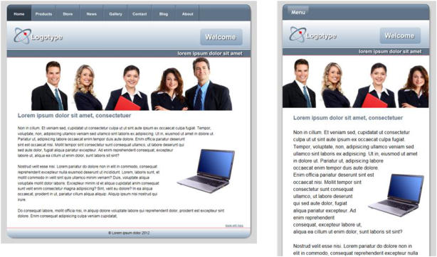


Copyright © 2015 Xara Group Limited.
Page created with Xara Designer Pro

If you have a website using Google Analytics you have probably received an email warning that your
website is not optimized for mobiles. The emails are rather alarmist, Google are actually only saying that
they will favor websites that are designed for mobiles in mobile searches. It's worth emphasizing that this
change will not affect search position for searches done on desktop computers. You might ask why there
should be a penalty for mobile searches - after all aren’t mobile browsers able to view normal desktop
websites? The answer is ‘yes they can’, but usually to view such content requires zooming and panning the
page, the text may be difficult to read and the navigation tricky - all of which Google judge not ‘mobile
friendly’.
So the changes that Google are looking for include;
• Narrow pages that do not require horizontal scrolling
• Larger text that is more visible for small screens
• Navigation that works, ideally with one finger. So small buttons and menus are out.
The original website is on the left and a mobile version on the right, which is better suited for mobile devices. It has a larger font
size, narrow page,
cropped images and a different, finger-friendly, navigation method.
So what's involved in making your website mobile friendly? In release 10 of Web Designer Premium and
Designer Pro we added the ability to create responsive websites, which are websites that are both mobile
and desktop friendly at the same time. In effect, you create two layouts (variants) of your content, one that
suits a narrow mobile screen which is operated by touch, and one that's better suited for wider screens
such as desktops. They are exported as one HTML file, and the correct variant is presented depending on
the device of the viewer.
This tutorial will take you through the process of creating a mobile variant for your existing site (we will be
using one of our template designs). If you were creating a new website, then we would recommend using
one of the ready made Responsive Website Design (RWD) templates that are included in the Designs
Gallery of Web Designer 10 Premium and Designer Pro X10 - they are marked with an (R) after the name.
They already include a mobile variant.
In summary the process of converting an existing website consists of the following steps:
1.
Create a Mobile Variant:
This creates a copy of your whole website, based on a narrow page design. The key aspect here is
that all content is shared by both variants - so text edited on one is automatically updated in the
other - this is not really two websites, but one HTML file that adapts its display to the device being
used.
2.
Adjust the text size for the mobile variant to be larger:
Small screens require bigger font sizes to be readable. Xara supports variant-specific Styles so the
same content can appear in a larger font.
3.
Re-arrange the design and content on the page:
This will involve adjusting graphics (e.g. header and footer widths) and may involve tweaking your
graphics to better suit the narrow screen. Text columns will have to be narrower and most of your
content arranged in on long column, rather than side-by-side.
4.
Change the navigation to be a single button drop down menu which is more finger friendly:
There's an easy way to convert Xara NavBars to single button touch friendly menus.
There is no way to avoid the fact that creating mobile friendly versions of websites can be time consuming
- this is true no matter how they are made. (Typically, a web designer would charge almost double for
creating a multi-layout RWD website.) Of course, many users may decide that they only want one version
of their website, designed for larger screen computers and tablets, which is fine as it saves time and may
be the best decision if the audience is likely to be mostly desktop or tablet users.
If you don’t have Xara Web Designer 10 Premium or Designer Pro X10 you can download a free trial here.
Website template called ‘Orbit’ that we will convert to be a mobile friendly Responsive Website Design
I have used a template called Orbit for this tutorial, you may wish to load the file and follow me through the
steps. If you already own Web Designer or Designer Pro you will find it in the Designs Gallery under
Website Themes - General (just load the file called Website). If you are using the trial you can download the
Orbit file here. The template I’ve chosen is not a particularly easy one to create a mobile variant but the
intention is to cover all the issues that might come up when you are creating a variant for your own site
(template based or otherwise). I have used Web Designer Premium.
By default Web Designer opens a new document showing just one page. I prefer to view all my pages as
one long scrolling document. To do this, right click on the page background and choose ‘Multiple Page
View’ or select the menu ‘Window > Multiple Page View’.
Creating the Mobile Variant
To create a mobile variant, right click on the page background and select ‘Website variants > Website variants…’ or right click on the main page tab and select - ‘Website variants…’, and then select the ‘Create’ option. Web Designer has guessed that I am going to create a mobile version and I’m happy with the name and size so click Create, then close the dialog window. Creating the mobile variant website. Note two blue document tabs give you access to the two versions Immediately, you will see that a second document tab has opened with a new variant with a page size of 480 pixels (the two tabs for the document are colored blue so you know they are linked). It’s important to understand that this has just created a narrow page, but it’s up to you to re-arrange the text and items in a way that you want for this narrow page. Tip: We suggest that you regularly check both normal and mobile variants as you go. Each variant (and you're not limited to two) has its own tab, and it takes just one click to swap between the normal and mobile variants to check your changes work in the various devices.Adjusting The Design For the Mobile Variant
The two variants share content where appropriate but you can edit them separately so you have total control over how they look on different devices. I’ll start by reducing the page header to fit. Select the header background and drag the center right hand resize handle (the square) onto the web page. Notice that it will lock into place when it reaches the left side of the page – that is because the ‘Snap to objects’ is set to ‘on’ (this option is on the top InfoBar .) Also note that, when the object is selected, it has a small star shaped ‘repeating object’ symbol in the top right corner. It’s quite common and very useful to have some objects set to ‘repeating’ so that they appear the same on every web page. Any change made to the object will then automatically update on the other pages. Scroll down to the next page and you’ll see that the header background has been automatically adjusted. It will be the same on all the other pages. Drag the right edge of the header background to reduce its size so that it fits the new width Now select the sub-heading bar under the page header and do the same thing - drag left to be the correct new width. The sub-heading bar is not set to be repeating as it is likely that you will change the text on each of your web pages. Note that, when selected, it has a parallel lines symbol in the top right – that means that it has been set as a ‘shared object’ across different variants. So any changes made, for example, to the text on the bar, will automatically change on the Main full size website, and on the Mobile variant. Both the header background and the smaller sub-heading rectangle have been resized down to the width of the page Now drag the Welcome button onto the header background. Again, notice that it snaps into position within the blue guidelines that appear as you drag it into place. Also notice that it is set as a ‘shared object’. If I change the button text, that change will happen in both variants. Scroll down to the footer bar on the bottom of the page, select it and do the same, reduce its size to that of the page background. This is set to be a ‘repeating object’ so it will change on all the other pages too.Navigation Bar (NavBar)
To be mobile friendly and space efficient a common navigation system is to have just a single button with a vertical menu of links to other pages. It is advisable to make the text larger. NavBars in each variant are independent, so you can customize them as required including changing the design of the bar. Assuming you are starting with a multi-button horizontal navigation bar I will show you how to create a single button with a vertical menu of links. On the Orbit template the first button design differs from the design of the other buttons, which makes it unsuitable for a single-button use - the button design is unlikely to look good on its own. So I will replace it with an alternative NavBar design where all the buttons on the bar look the same. The left button of the NavBar does not make a good single ‘Menu’ button, so I will change the design of my NavBar Open the Designs Gallery, close the Orbit Theme and also the Website Themes folders so you are at the top level. Click to open the Page Elements and Widgets folder, then the Free Trial Samples sub-folder to see the selection. Click drag the bar called ‘horizontal navbar 2’ from the Gallery onto the existing button bar and select to ‘Match’ the colors and text styles’. This changes the design of the NavBar. I double click on the NavBar to open the NavBar editor so I can convert this bar to a single button version with a drop- down menu. Double click the NavBar to open the NavBar editor To make a single button NavBar delete all except the Home page button (click on the second entry and keep hitting the Delete button below until they are all removed). Change the text on the remaining button from Home to ‘Menu’ and remove the link from the Menu button by clicking the URL field next to the button and choosing ‘Do nothing’ in the Link dialog. Now you can either start adding menu entries to the button manually in the NavBar dialog, or a menu entry can be added automatically for each page in your site. To add the links automatically, simply uncheck Site Navigation Bar option above the Buttons & Menus and then check them again. You will see that the menu becomes populated with a link to each page of the website. Edit the names of each entry in the menu if you don't want them to be the same as the page names. To change the size of the text of the link buttons select ‘Pop-Up menu style’ and change the text to 18px, and increase the item spacing to something like 5px. You can also adjust the colors as you wish. Then select OK on both dialogs to accept the changes. One last thing to do on the NavBar is to change the text size of the Menu button. Select the Text tool, highlight the word ‘Menu and change the font size to be 16px. The navigation bar is a repeating object so it will appear the same on every page. Editing the Navigation Bar to be a single button with a drop down menu of links with a change of text size To check your menu changes so far, select Page Preview and make the preview window narrower so that it will display the mobile variant. Remember - text that looks over-large on your desktop appears much smaller on the phone screen. Preview the mobile variant to check the operation of the menu A note about how the content is shared between variants: When an object is set as a ‘shared object’ any change in one of the variants will automatically make the change in the other variants, for example if you change the heading text or a photo. Shared objects have two parallel lines, top right corner. This means if you make a change to it, it will be changed in both variants If you don’t want the change copied – for example, if you’re removing some text from a mobile version, just select the Text Tool and select the text you want to delete, then right click on the mouse, go to website variants and select ‘stop sharing with variants’ – now you can delete it in the Mobile version and it won’t be removed from the Main variant. There are exceptions to the sharing. Obviously, if you change the size of a photo or crop it, then that won’t be copied, neither will changes to repeating objects such as NavBars, because these are edits that you’d expect to make only in the mobile variant. Web Designer makes intelligent guesses about what should and shouldn’t be copied, but we would always recommend that you switch between the variants regularly, making sure that you haven’t generated any unexpected changes. Keep an eye on that as you’re going along, and, of course, also when you preview at the end.Updating The Text Styles
With the page structure complete it’s now time to work on the content. Firstly, the main body text needs to be at least 16px, perhaps larger for the mobile variant. With the Text Tool select a paragraph of text (the top InfoBar should show ‘Normal text’ Style) change the font size to be 16px, then click the Style drop-down menu and select ‘Update style in this variant’. Notice how all the text will change on all of the pages into the new style. Do the same for the Heading 2 style – select one of the headings on any page, change the style to be 18px or larger, and do the same ‘Update style in this variant’. Now I need to make layout adjustments to each of the pages.Updating The Page Layouts
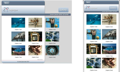
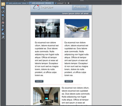
I will go through the various page designs in my Orbit website - they consist of a wide variety of page layouts that are great examples of how to adjust just about any layout from wide to narrow. Home Page: Adjust the text column width: In the Text Tool click in the text and drag the right end of the red column marker to the desired width and the text will adjust to that new width. Using the Selector Tool, drag the computer image onto the page – notice that the text flows around it – that is because the image is set to ‘repel text under’. (If you need to adjust the repel margin, right click on the image and choose the ‘Repelling & Anchoring...’ option.) Repelling images must be in front of the text - type Ctrl+F to bring it to the front if necessary. You’ll notice that the page length has automatically increased to accommodate the extra lines of text using the automatic Push system. Now we need to adjust the image of people at the top, there are two choices for this. Select the image and drag the bottom corner handle to reduce the overall size of the image (this would display all five people) or, better in this case, drag the center right handle to narrow the image so that it fits the width of the page. This crops the image. Then use the Fill Tool to adjust the photo within the image container. Tip: when using the Selector Tool to adjust the size of images use only the corner or side handles to resize. That crops the image rather than squashes it. That’s it, the Home Page completed! Using the Fill Tool to adjust the image on the Home Page. Drag the end of the arrows to rotate and resize. Drag on the image to re-position it. Products Page: The page starts as three columns - much too wide for the 480px wide page. Adjust the sub-heading to fit into the mobile variant by selecting it and dragging the right side handle until it ‘snaps’ into position. Now move the ‘Products’ heading onto the page. You can adjust the content layout in many ways. We wouldn’t ever recommend more than 2 columns on a mobile variant so I shall fit the two products alongside each other on the page, and then fit the third product so that the image is alongside the text. (An alternative would be to have all of the products under each other and increase the text paragraphs to the full width of the page, or to have all the product images with the text alongside.) The magnetic snap makes it easy to align everything on the page. Select and drag on the corner handle to resize the first two images so that they fit neatly on the page alongside each other. Select the divider line and move it to align centrally with the space between the two images. This has been set to stretch with the page which is not needed in the mobile variant so, with it selected, right click and select ‘Position on page’ and uncheck ‘Stretch with page’. Select one of the paragraphs and align it with the left of the image, then with the Text Tool selected reduce the red line that sets the width of the text. Do the same for the other paragraph. You will notice that there is very little room on the page for the 3rd product to fit under the first two products. There are two ways the page can resize. Some items on the page (usually the text) have a ‘Push’ attribute set (Right click menu ‘Position on page’) which causes the page to be pushed down as more text is added. Alternatively you can manually drag the bottom edge of the page - at the bottom of the page you will see a bracket in the two corners and there is a feint blue dashed line that runs horizontally through those corner brackets. Drag the pale blue horizontal line down to increase your page size. For the third product, the image is not set to push, but the text is. So I will drag the text into the column under the second product, which will ‘push’ the page ,and then I drag the image under the first product. If you wish to have a horizontal line between the top two products and the third product then copy the divider on this page, change the angle by 90 degrees (option in the top InfoBar) and then move it into position and resize as required. (A simple alternative is to copy and paste a horizontal divider from another page.) The Products Page re-arranged to be 2 columns with a third product below Store Page: As you can see the text is just too wide, so this is pretty simple change. The original on the left has been re-arranged to be one narrow column with larger photos. Adjust the sub-heading and Store label as before. Now using the Text Tool, resize the column to be more narrow, the usual way. Notice how the other objects on the page automatically move down to accommodate the longer text. Select the red divider lines and drag the side handle to make them smaller to fit the page. For this page, I have also increased the size of the photos to make them more clearly seen on a mobile. News Page: The original version of the News Page and re-arranged narrower version on the right This page contains quite a complex mouse-over photo slideshow on the left. This is a soft group of multiple parts on various layers (when you mouse-over the different photo the main one changes and text description changes). I only need to move this slightly so it’s centered on the new page, but no other change. The column on the right has to be moved to a position below the photo slideshow (and its text). Gallery Page: There are various ways to create photo galleries in Web Designer e.g. using Gallery Widgets. But this page is made up of an array of individual photo thumbnails, with the pop-up attribute set (so you get an enlarged version when you click on it), along with caption text that is Soft Grouped with the photo, so the photo and caption stay together when you drag them around. We wouldn’t ever recommend more than 2 columns on a mobile variant so, using the Selector Tool, I will simply drag to re-arrange the images into 2 columns, and at the same time resize each to be a little larger. If you have the ‘Snap To objects’ (magnet) on, then ensuring they are all aligned is really easy. The original Gallery page on the left, and the re-arranged version on the right. Contact Page: Adjust the sub-heading and Contact button. Very little needs to be done to this page. I simply moved the position of both the text and the image and made the image larger. Blog Page: Adjust the sub-heading and content in a similar way to the Store Page. The original on the left has been re-arranged to be one narrow column with larger, slightly re-positioned images. About Page: This page is a bit more complex, and requires the right column (with anchored images) to be moved below the 1st column. The two sections have been re-arranged to be one below the other - I altered the column width, and tweaked the photo positions a bit The first step is to move the right column off the page temporarily, so I can work on the left. For the left column I just made it wider to cover the full width of the mobile page. The second part of the work is to move the right column (with its anchored photos) below. This has ‘push’ set so just dragging it down and dropping it below the first column will make the page grow. You might want to adjust the column width again, and to move the set of tiny anchored images to be in a more suitable place. And that’s it, the mobile variant is done! Tip to remember - don’t be afraid to delete non-essential things in your mobile versions, often they need to be simpler!Preview
While you’re working through your website it is advisable to check the two variants and preview the website regularly, to check everything is working as you intend. Simply adjust the browser window to be narrower, and you’ll see it automatically switches to the mobile version.Publish
When you’re done, just re-publish your website - select the Publish document as a web page icon on the top Tool Bar or select File>Publish and enter the details of your web space in the normal way. If you have a MAGIX Online world account you just have to enter your account details, otherwise publish to your normal host - you will need your FTP host address, your username and password. If this is an existing site, then just re-publish and you now have a mobile-friendly, Google-friendly, responsive website. You can see the finished website on your computer and mobile device at http://www.nfisher.magix.net/rwdsite/More Info:
An article in our Support Center on creating a mobile variant: http://support.xara.com/index.php?/Knowledgebase/Article/View/819/0/how-do-i-create-additional- variants-for-my-website An article in our Support Center on making your website mobile friendly for search engines: http://support.xara.com/index.php?/Knowledgebase/Article/View/842/0/how-do-i-make-my-website- mobile-friendly-for-search-engines Video tutorials on xara.com, Creating Mobile Variants Pt 1 & 2: http://www.xara.com/web-designer/tutorials-demos/ To check if your website is mobile friendly, enter your website’s URL into this page: https://www.google.co.uk/webmasters/tools/mobile-friendly/Advanced Users:
Some of Xara’s templates might have other complications, and maybe your website too! Some of the things to watch out for include: • Resizing grouped objects, such as headings or footers, using the Selector Tool. If you use the right side handle to resize the group it tries to be smart and retain the relative proportions and positions of the objects, and not squash the contents (as older versions of Xara did). But sometimes you will have no option but to un-group, re-position or edit each of the component elements as required, then group it again. • Objects on locked layers e.g. the background layer. Using the Page & Layer Gallery just unlock those layers, make the required changes, and lock the layer again. • Soft Grouped objects. Soft Groups are a way in which objects, such as photos and captions (see above) stick together. Soft Groups typically have things on other layers in the group. So take care when adjusting these. You may have to remove the Soft Group to make adjustments, but one tip is that holding Ctrl when you do a click will select an item ‘inside a group’ (this applies generally), which is a quick way to make changes to items in groups without having to un-group. Normal groups (as opposed to Soft Groups) can’t be used the same way, partly because you cannot group items on different layers, and secondly because normal groups are converted into a single graphic when you save your web page HTML. • Push: We highly recommend using the automatic Push feature so that as you extend the text, everything else on the page is pushed around, and the page grows, as required. Right click on any object and use the ‘Position on page’ menu to adjust the push. See the Help for more info on this topic. • Responsive 'Retina' or HiDPI Resolution Control. Mobile and tablet devices, and some modern laptops (e.g. Microsoft Surface Pro and Apple MacBook devices) support far higher resolution graphics. Web Designer Premium and Designer Pro cater for this completely automatically, and will produce both normal resolution and Hi-DPI or Retina resolution images for all graphics and photos. The website then intelligently uses the correct version of the image depending on the resolution of the browsing device.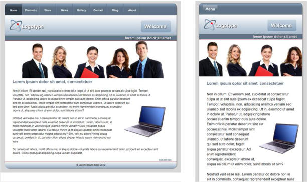


Copyright © 2015 Xara Group Limited.
Page created with Xara Designer Pro
If you have a website using Google Analytics you have probably
received an email warning that your website is not optimized for
mobiles. The emails are rather alarmist, Google are actually only
saying that they will favor websites that are designed for mobiles in
mobile searches. It's worth emphasizing that this change will not
affect search position for searches done on desktop computers. You
might ask why there should be a penalty for mobile searches - after
all aren’t mobile browsers able to view normal desktop websites?
The answer is ‘yes they can’, but usually to view such content
requires zooming and panning the page, the text may be difficult to
read and the navigation tricky - all of which Google judge not ‘mobile
friendly’.
So the changes that Google are looking for include;
• Narrow pages that do not require horizontal scrolling
• Larger text that is more visible for small screens
• Navigation that works, ideally with one finger. So small buttons and
menus are out.
The original website is on the left and a mobile version on the right, which is better
suited for mobile devices. It has a larger font size, narrow page,
cropped images and a different, finger-friendly, navigation method.
So what's involved in making your website mobile friendly? In
release 10 of Web Designer Premium and Designer Pro we added
the ability to create responsive websites, which are websites that are
both mobile and desktop friendly at the same time. In effect, you
create two layouts (variants) of your content, one that suits a narrow
mobile screen which is operated by touch, and one that's better
suited for wider screens such as desktops. They are exported as one
HTML file, and the correct variant is presented depending on the
device of the viewer.
This tutorial will take you through the process of creating a mobile
variant for your existing site (we will be using one of our template
designs). If you were creating a new website, then we would
recommend using one of the ready made Responsive Website
Design (RWD) templates that are included in the Designs Gallery of
Web Designer 10 Premium and Designer Pro X10 - they are marked
with an (R) after the name. They already include a mobile variant.
In summary the process of converting an existing website consists
of the following steps:
1.
Create a Mobile Variant:
This creates a copy of your whole website, based on a narrow
page design. The key aspect here is that all content is shared
by both variants - so text edited on one is automatically
updated in the other - this is not really two websites, but one
HTML file that adapts its display to the device being used.
2.
Adjust the text size for the mobile variant to be larger:
Small screens require bigger font sizes to be readable. Xara
supports variant-specific Styles so the same content can
appear in a larger font.
3.
Re-arrange the design and content on the page:
This will involve adjusting graphics (e.g. header and footer
widths) and may involve tweaking your graphics to better suit
the narrow screen. Text columns will have to be narrower and
most of your content arranged in on long column, rather than
side-by-side.
4.
Change the navigation to be a single button drop down menu
which is more finger friendly:
There's an easy way to convert Xara NavBars to single button
touch friendly menus.
There is no way to avoid the fact that creating mobile friendly
versions of websites can be time consuming - this is true no matter
how they are made. (Typically, a web designer would charge almost
double for creating a multi-layout RWD website.) Of course, many
users may decide that they only want one version of their website,
designed for larger screen computers and tablets, which is fine as it
saves time and may be the best decision if the audience is likely to
be mostly desktop or tablet users.
If you don’t have Xara Web Designer 10 Premium or Designer Pro
X10 you can download a free trial here.
Website template called ‘Orbit’ that we will convert to be a mobile friendly
Responsive Website Design
I have used a template called Orbit for this tutorial, you may wish to
load the file and follow me through the steps. If you already own
Web Designer or Designer Pro you will find it in the Designs Gallery
under Website Themes - General (just load the file called Website). If
you are using the trial you can download the Orbit file here. The
template I’ve chosen is not a particularly easy one to create a mobile
variant but the intention is to cover all the issues that might come up
when you are creating a variant for your own site (template based or
otherwise). I have used Web Designer Premium.
By default Web Designer opens a new document showing just one
page. I prefer to view all my pages as one long scrolling document.
To do this, right click on the page background and choose ‘Multiple
Page View’ or select the menu ‘Window > Multiple Page View’.
Creating the Mobile Variant
To create a mobile variant, right click on the page background and select ‘Website variants > Website variants…’ or right click on the main page tab and select - ‘Website variants…’, and then select the ‘Create’ option. Web Designer has guessed that I am going to create a mobile version and I’m happy with the name and size so click Create, then close the dialog window. Creating the mobile variant website. Note two blue document tabs give you access to the two versions Immediately, you will see that a second document tab has opened with a new variant with a page size of 480 pixels (the two tabs for the document are colored blue so you know they are linked). It’s important to understand that this has just created a narrow page, but it’s up to you to re-arrange the text and items in a way that you want for this narrow page. Tip: We suggest that you regularly check both normal and mobile variants as you go. Each variant (and you're not limited to two) has its own tab, and it takes just one click to swap between the normal and mobile variants to check your changes work in the various devices.Adjusting The Design For the Mobile Variant
The two variants share content where appropriate but you can edit them separately so you have total control over how they look on different devices. I’ll start by reducing the page header to fit. Select the header background and drag the center right hand resize handle (the square) onto the web page. Notice that it will lock into place when it reaches the left side of the page – that is because the ‘Snap to objects’ is set to ‘on’ (this option is on the top InfoBar .) Also note that, when the object is selected, it has a small star shaped ‘repeating object’ symbol in the top right corner. It’s quite common and very useful to have some objects set to ‘repeating’ so that they appear the same on every web page. Any change made to the object will then automatically update on the other pages. Scroll down to the next page and you’ll see that the header background has been automatically adjusted. It will be the same on all the other pages. Drag the right edge of the header background to reduce its size so that it fits the new width Now select the sub-heading bar under the page header and do the same thing - drag left to be the correct new width. The sub-heading bar is not set to be repeating as it is likely that you will change the text on each of your web pages. Note that, when selected, it has a parallel lines symbol in the top right – that means that it has been set as a ‘shared object’ across different variants. So any changes made, for example, to the text on the bar, will automatically change on the Main full size website, and on the Mobile variant. Both the header background and the smaller sub-heading rectangle have been resized down to the width of the page Now drag the Welcome button onto the header background. Again, notice that it snaps into position within the blue guidelines that appear as you drag it into place. Also notice that it is set as a ‘shared object’. If I change the button text, that change will happen in both variants. Scroll down to the footer bar on the bottom of the page, select it and do the same, reduce its size to that of the page background. This is set to be a ‘repeating object’ so it will change on all the other pages too.Navigation Bar (NavBar)
To be mobile friendly and space efficient a common navigation system is to have just a single button with a vertical menu of links to other pages. It is advisable to make the text larger. NavBars in each variant are independent, so you can customize them as required including changing the design of the bar. Assuming you are starting with a multi-button horizontal navigation bar I will show you how to create a single button with a vertical menu of links. On the Orbit template the first button design differs from the design of the other buttons, which makes it unsuitable for a single-button use - the button design is unlikely to look good on its own. So I will replace it with an alternative NavBar design where all the buttons on the bar look the same. The left button of the NavBar does not make a good single ‘Menu’ button, so I will change the design of my NavBar Open the Designs Gallery, close the Orbit Theme and also the Website Themes folders so you are at the top level. Click to open the Page Elements and Widgets folder, then the Free Trial Samples sub- folder to see the selection. Click drag the bar called ‘horizontal navbar 2’ from the Gallery onto the existing button bar and select to ‘Match’ the colors and text styles’. This changes the design of the NavBar. I double click on the NavBar to open the NavBar editor so I can convert this bar to a single button version with a drop-down menu. Double click the NavBar to open the NavBar editor To make a single button NavBar delete all except the Home page button (click on the second entry and keep hitting the Delete button below until they are all removed). Change the text on the remaining button from Home to ‘Menu’ and remove the link from the Menu button by clicking the URL field next to the button and choosing ‘Do nothing’ in the Link dialog. Now you can either start adding menu entries to the button manually in the NavBar dialog, or a menu entry can be added automatically for each page in your site. To add the links automatically, simply uncheck Site Navigation Bar option above the Buttons & Menus and then check them again. You will see that the menu becomes populated with a link to each page of the website. Edit the names of each entry in the menu if you don't want them to be the same as the page names. To change the size of the text of the link buttons select ‘Pop-Up menu style’ and change the text to 18px, and increase the item spacing to something like 5px. You can also adjust the colors as you wish. Then select OK on both dialogs to accept the changes. One last thing to do on the NavBar is to change the text size of the Menu button. Select the Text tool, highlight the word ‘Menu and change the font size to be 16px. The navigation bar is a repeating object so it will appear the same on every page. Editing the Navigation Bar to be a single button with a drop down menu of links with a change of text size To check your menu changes so far, select Page Preview and make the preview window narrower so that it will display the mobile variant. Remember - text that looks over-large on your desktop appears much smaller on the phone screen. Preview the mobile variant to check the operation of the menu A note about how the content is shared between variants: When an object is set as a ‘shared object’ any change in one of the variants will automatically make the change in the other variants, for example if you change the heading text or a photo. Shared objects have two parallel lines, top right corner. This means if you make a change to it, it will be changed in both variants If you don’t want the change copied – for example, if you’re removing some text from a mobile version, just select the Text Tool and select the text you want to delete, then right click on the mouse, go to website variants and select ‘stop sharing with variants’ – now you can delete it in the Mobile version and it won’t be removed from the Main variant. There are exceptions to the sharing. Obviously, if you change the size of a photo or crop it, then that won’t be copied, neither will changes to repeating objects such as NavBars, because these are edits that you’d expect to make only in the mobile variant. Web Designer makes intelligent guesses about what should and shouldn’t be copied, but we would always recommend that you switch between the variants regularly, making sure that you haven’t generated any unexpected changes. Keep an eye on that as you’re going along, and, of course, also when you preview at the end.Updating The Text Styles
With the page structure complete it’s now time to work on the content. Firstly, the main body text needs to be at least 16px, perhaps larger for the mobile variant. With the Text Tool select a paragraph of text (the top InfoBar should show ‘Normal text’ Style) change the font size to be 16px, then click the Style drop-down menu and select ‘Update style in this variant’. Notice how all the text will change on all of the pages into the new style. Do the same for the Heading 2 style – select one of the headings on any page, change the style to be 18px or larger, and do the same ‘Update style in this variant’. Now I need to make layout adjustments to each of the pages.Updating The Page Layouts
I will go through the various page designs in my Orbit website - they consist of a wide variety of page layouts that are great examples of how to adjust just about any layout from wide to narrow. Home Page: Adjust the text column width: In the Text Tool click in the text and drag the right end of the red column marker to the desired width and the text will adjust to that new width. Using the Selector Tool, drag the computer image onto the page – notice that the text flows around it – that is because the image is set to ‘repel text under’. (If you need to adjust the repel margin, right click on the image and choose the ‘Repelling & Anchoring...’ option.) Repelling images must be in front of the text - type Ctrl+F to bring it to the front if necessary. You’ll notice that the page length has automatically increased to accommodate the extra lines of text using the automatic Push system. Now we need to adjust the image of people at the top, there are two choices for this. Select the image and drag the bottom corner handle to reduce the overall size of the image (this would display all five people) or, better in this case, drag the center right handle to narrow the image so that it fits the width of the page. This crops the image. Then use the Fill Tool to adjust the photo within the image container. Tip: when using the Selector Tool to adjust the size of images use only the corner or side handles to resize. That crops the image rather than squashes it. That’s it, the Home Page completed! Using the Fill Tool to adjust the image on the Home Page. Drag the end of the arrows to rotate and resize. Drag on the image to re-position it. Products Page: The page starts as three columns - much too wide for the 480px wide page. Adjust the sub-heading to fit into the mobile variant by selecting it and dragging the right side handle until it ‘snaps’ into position. Now move the ‘Products’ heading onto the page. You can adjust the content layout in many ways. We wouldn’t ever recommend more than 2 columns on a mobile variant so I shall fit the two products alongside each other on the page, and then fit the third product so that the image is alongside the text. (An alternative would be to have all of the products under each other and increase the text paragraphs to the full width of the page, or to have all the product images with the text alongside.) The magnetic snap makes it easy to align everything on the page. Select and drag on the corner handle to resize the first two images so that they fit neatly on the page alongside each other. Select the divider line and move it to align centrally with the space between the two images. This has been set to stretch with the page which is not needed in the mobile variant so, with it selected, right click and select ‘Position on page’ and uncheck ‘Stretch with page’. Select one of the paragraphs and align it with the left of the image, then with the Text Tool selected reduce the red line that sets the width of the text. Do the same for the other paragraph. You will notice that there is very little room on the page for the 3rd product to fit under the first two products. There are two ways the page can resize. Some items on the page (usually the text) have a ‘Push’ attribute set (Right click menu ‘Position on page’) which causes the page to be pushed down as more text is added. Alternatively you can manually drag the bottom edge of the page - at the bottom of the page you will see a bracket in the two corners and there is a feint blue dashed line that runs horizontally through those corner brackets. Drag the pale blue horizontal line down to increase your page size. For the third product, the image is not set to push, but the text is. So I will drag the text into the column under the second product, which will ‘push’ the page ,and then I drag the image under the first product. If you wish to have a horizontal line between the top two products and the third product then copy the divider on this page, change the angle by 90 degrees (option in the top InfoBar) and then move it into position and resize as required. (A simple alternative is to copy and paste a horizontal divider from another page.) The Products Page re-arranged to be 2 columns with a third product below Store Page: As you can see the text is just too wide, so this is pretty simple change. The original on the left has been re-arranged to be one narrow column with larger photos. Adjust the sub-heading and Store label as before. Now using the Text Tool, resize the column to be more narrow, the usual way. Notice how the other objects on the page automatically move down to accommodate the longer text. Select the red divider lines and drag the side handle to make them smaller to fit the page. For this page, I have also increased the size of the photos to make them more clearly seen on a mobile. News Page: The original version of the News Page and re-arranged narrower version on the right This page contains quite a complex mouse-over photo slideshow on the left. This is a soft group of multiple parts on various layers (when you mouse-over the different photo the main one changes and text description changes). I only need to move this slightly so it’s centered on the new page, but no other change. The column on the right has to be moved to a position below the photo slideshow (and its text). Gallery Page: There are various ways to create photo galleries in Web Designer e.g. using Gallery Widgets. But this page is made up of an array of individual photo thumbnails, with the pop-up attribute set (so you get an enlarged version when you click on it), along with caption text that is Soft Grouped with the photo, so the photo and caption stay together when you drag them around. We wouldn’t ever recommend more than 2 columns on a mobile variant so, using the Selector Tool, I will simply drag to re-arrange the images into 2 columns, and at the same time resize each to be a little larger. If you have the ‘Snap To objects’ (magnet) on, then ensuring they are all aligned is really easy. The original Gallery page on the left, and the re-arranged version on the right. Contact Page: Adjust the sub-heading and Contact button. Very little needs to be done to this page. I simply moved the position of both the text and the image and made the image larger. Blog Page: Adjust the sub-heading and content in a similar way to the Store Page. The original on the left has been re-arranged to be one narrow column with larger, slightly re-positioned images. About Page: This page is a bit more complex, and requires the right column (with anchored images) to be moved below the 1st column. The two sections have been re-arranged to be one below the other - I altered the column width, and tweaked the photo positions a bit The first step is to move the right column off the page temporarily, so I can work on the left. For the left column I just made it wider to cover the full width of the mobile page. The second part of the work is to move the right column (with its anchored photos) below. This has ‘push’ set so just dragging it down and dropping it below the first column will make the page grow. You might want to adjust the column width again, and to move the set of tiny anchored images to be in a more suitable place. And that’s it, the mobile variant is done! Tip to remember - don’t be afraid to delete non-essential things in your mobile versions, often they need to be simpler!Preview
While you’re working through your website it is advisable to check the two variants and preview the website regularly, to check everything is working as you intend. Simply adjust the browser window to be narrower, and you’ll see it automatically switches to the mobile version.Publish
When you’re done, just re-publish your website - select the Publish document as a web page icon on the top Tool Bar or select File>Publish and enter the details of your web space in the normal way. If you have a MAGIX Online world account you just have to enter your account details, otherwise publish to your normal host - you will need your FTP host address, your username and password. If this is an existing site, then just re-publish and you now have a mobile-friendly, Google-friendly, responsive website. You can see the finished website on your computer and mobile device at http://www.nfisher.magix.net/rwdsite/More Info:
An article in our Support Center on creating a mobile variant: http://support.xara.com/index.php?/Knowledgebase/Article/View/81 9/0/how-do-i-create-additional-variants-for-my-website An article in our Support Center on making your website mobile friendly for search engines: http://support.xara.com/index.php?/Knowledgebase/Article/View/84 2/0/how-do-i-make-my-website-mobile-friendly-for-search-engines Video tutorials on xara.com, Creating Mobile Variants Pt 1 & 2: http://www.xara.com/web-designer/tutorials-demos/ To check if your website is mobile friendly, enter your website’s URL into this page: https://www.google.co.uk/webmasters/tools/mobile-friendly/Advanced Users:
Some of Xara’s templates might have other complications, and maybe your website too! Some of the things to watch out for include: • Resizing grouped objects, such as headings or footers, using the Selector Tool. If you use the right side handle to resize the group it tries to be smart and retain the relative proportions and positions of the objects, and not squash the contents (as older versions of Xara did). But sometimes you will have no option but to un-group, re- position or edit each of the component elements as required, then group it again. • Objects on locked layers e.g. the background layer. Using the Page & Layer Gallery just unlock those layers, make the required changes, and lock the layer again. • Soft Grouped objects. Soft Groups are a way in which objects, such as photos and captions (see above) stick together. Soft Groups typically have things on other layers in the group. So take care when adjusting these. You may have to remove the Soft Group to make adjustments, but one tip is that holding Ctrl when you do a click will select an item ‘inside a group’ (this applies generally), which is a quick way to make changes to items in groups without having to un- group. Normal groups (as opposed to Soft Groups) can’t be used the same way, partly because you cannot group items on different layers, and secondly because normal groups are converted into a single graphic when you save your web page HTML. • Push: We highly recommend using the automatic Push feature so that as you extend the text, everything else on the page is pushed around, and the page grows, as required. Right click on any object and use the ‘Position on page’ menu to adjust the push. See the Help for more info on this topic. • Responsive 'Retina' or HiDPI Resolution Control. Mobile and tablet devices, and some modern laptops (e.g. Microsoft Surface Pro and Apple MacBook devices) support far higher resolution graphics. Web Designer Premium and Designer Pro cater for this completely automatically, and will produce both normal resolution and Hi-DPI or Retina resolution images for all graphics and photos. The website then intelligently uses the correct version of the image depending on the resolution of the browsing device.


Copyright © 2015 Xara Group Limited.
Page created with Xara Designer Pro
MAKING YOUR WEBSITE MOBILE FRIENDLY
MAKING YOUR WEBSITE MOBILE FRIENDLY
MAKING YOUR WEBSITE MOBILE FRIENDLY