
Xara provides a range of ready-made customizable SmartShapes that you can add to your document or web page. But they are more than
simple static shapes. What’s cool about SmartShapes is that the editing functions are built into the shape - you just click on the shape and a
set of control handles appear that can be dragged to adjust and customize the shape.
Although SmartShapes include a range of everyday shapes that you can drop into your documents and websites, the system also supports
objects that are much more complex than simple shapes. Choose from Arrows, Flowlines, Text panels, Photo text panels, Speech Bubbles,
Spirals, charts, Timelines and many other shapes.
The other innovative aspect of SmartShapes is that most are available and work exactly the same way in the web-based Xara Online Designer.
This SmartShapes tutorial, Part 3, will show you how to easily create a column chart and a percentage ring.
To try it, download the trial version of Xara Photo & Graphic Designer or Xara Web Designer Premium or Designer Pro X.
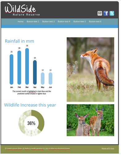
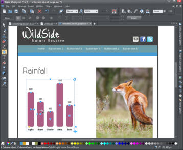
Finished page showing a column chart of rainfall and percentage ring of wildlife increase
Creating your chart
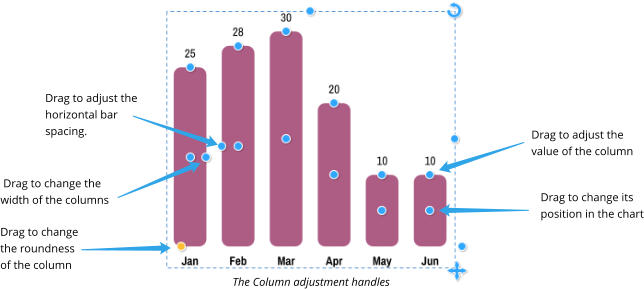
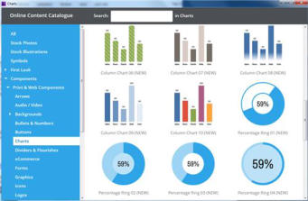
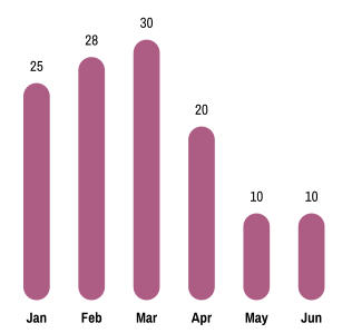
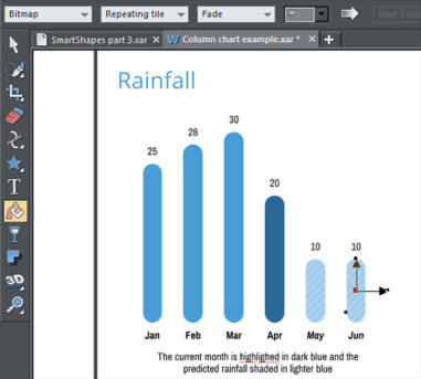
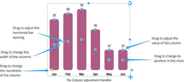
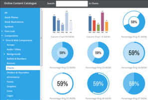
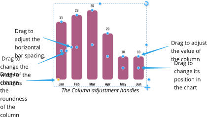
To quickly insert a bar chart SmartShape into your document or website , select the menu option, Insert > Charts… This will open up the Online Content Catalog that contains a wide range of Bar charts, Column charts and Percentage rings. Click import, or double click and the chart will download into your document and also into the Local Designs Gallery. I selected Column chart 5 for my page and I intend to create a chart of the rainfall. You will be asked if you want to match the theme colors of your page and if so then it will adopt the Theme color 1. It will be inserted onto the page with the Shape tool selected so the edit handles are active. Note: Horizontal bar charts are customized in exactly the same way as the vertical column charts. Bar chart inserted on the page, showing the edit handles The column chart has been added to the page with the Shape tool selected, so the edit handles are active. As you move the mouse pointer over the handles a small pop up will tell you what each one does. I added a column as I would like to have 6 bars for 6 months of rainfall. I’m going to assume that we are in April and that the columns for May and June are predictions based on last year. To label the bars, select the Text Tool and then click on each of the labels in turn to make the changes. You can use all the usual Text Tool attributes such as bold, italic, etc. When you change the appearance of a chart label, such as changing the font, font size or color, that change is immediately replicated across the other labels for each bar. However, this only happens if those other labels have the same text style applied (in this case, ‘Col chart labels’). If you want one of the labels to be different, perhaps to highlight one of the bars, simply give it a different style or use the No style option in the styles menu to remove the style. To change the bar value, you can either drag the handle on the top of the column to the required height (zoom in for more accuracy) or you can use the Text Tool to enter the value, which can be any precise numeric value, including decimal places. As with the chart label you can change the text style of an individual bar to highlight it. Rainfall chart with months and values entered I will use the edit handle on the center right of the first column to change the width of my columns to be slightly narrower and I will increase the horizontal spacing using the edit handle on the center left of the second column. I will also increase the roundness of the column using the yellow handle. Chart with narrower columns, increased spacing between the columns and the roundness increasedCustomizing the colors
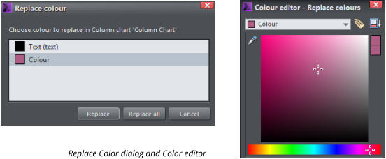
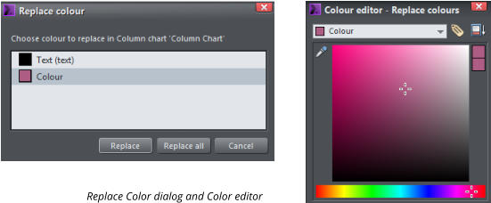
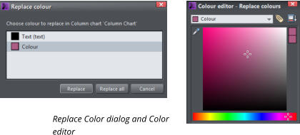
You can change the colors of the charts easily by selecting the whole chart (using the Selector Tool ) and clicking on a color on the Color line. The Replace Colors dialog will appear to let you choose which of the colors in the chart you would like to replace with your chosen new color. Similarly, you can use the Color Editor to edit the colors - the list of replaceable colors will be in the drop down menu at the top of the color editor - simply select the color you want to edit from that list. I will change my columns to be blue. But I would like the current month to be in a different color. To change an individual column, select the Selector Tool then press the Ctrl key and click on the relevant column. Then click on the required color on the color line and just that one column will change. I have changed my April column to be a darker shade of the blue. You can also change the outline or type of fill using the Fill Tool . I changed the last two columns to use a ‘bitmap’, repeating fill - select the Fill tool, select bitmap from the drop down list of fill types and then select repeating tile. This will give you a shaded fill in your Theme color 1 so you can change it using the color line, if you wish. Chart with one column highlighted in a darker shade of blue and two columns use a bitmap fill If you have made several changes to a column and you want to copy the style of that column onto another column, first select the column to be copied (Ctrl and click as above) then copy, (Ctrl+C) the selected bar to the clipboard. Then select the designated bar and use Edit > Paste > Paste format/attributes.Percentage Rings
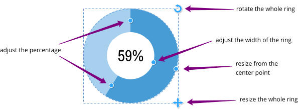
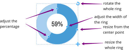
Percentage rings are a common infographic object that would be difficult and time consuming to create manually from scratch, but Xara have made this ultra quick and easy with the SmartShape. As with the column chart, select the menu option Insert > Charts… to open up the Online Content Catalog. Select your design and click import, or double click and the percentage chart will download into your document and also to the Local Designs Gallery. I selected percentage ring 5 for my page. Choose a percentage ring from the Content Catalog You will be asked if you want to match the theme colors of your page and if so then it will adopt the Theme color 1. It will be inserted onto the page with the Shape Tool selected so the edit handles are active. The adjustment handles of the percentage ring You can change the percentage value in three ways - with the Text Tool selected simply click on the % number and enter the value on your keyboard, or drag either of the two handles on the segment separating line. You can change your text style - font, size, bold, italic, etc. Note: It is normal that the percentage is measured from the top going clockwise, so it is best to change the percentage by dragging the second handle. In a similar way to the Column chart, you can change the colors of the ring easily by selecting it and clicking a color on the Color line or use the Color editor. To change an individual segment, whilst in the Selector Tool, press the Ctrl key and then click on the relevant segment then select your color. Again, you can also change the outline or type of fill using the Fill Tool. Percentage ring customized with percentage value, change of color and one segment with a fractal cloud fill You have seen how easy it is to create stunning graphics quickly and easily using the fully customizable SmartShapes. Now see how to customize some of the other SmartShapes: See SmartShapes Part 1 to learn how to quickly create great looking Arrows, Rectangles, Ovals, Pie Shapes and Spirals. See SmartShapes Part 2 for shapes that incorporate text and photos, ie text panels, photo text panels and speech bubbles. It’s so easy to make your document or website look as if it has been created by a professional designer! Try it now - download the latest trial version of Xara Photo & Graphic Designer or Xara Web Designer or Designer Pro X. For more tutorials by Xara and third parties, check out our Resource index, which offers a searchable and browsable list of movies and tutorials created by Xara and third parties.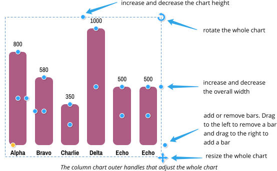

Copyright © 2017 Xara Group Limited.
Page created with Xara Designer Pro


Xara provides a range of ready-made customizable SmartShapes that you can add to your document or
web page. But they are more than simple static shapes. What’s cool about SmartShapes is that the editing
functions are built into the shape - you just click on the shape and a set of control handles appear that can
be dragged to adjust and customize the shape.
Although SmartShapes include a range of everyday shapes that you can drop into your documents and
websites, the system also supports objects that are much more complex than simple shapes. Choose
from Arrows, Flowlines, Text panels, Photo text panels, Speech Bubbles, Spirals, charts, Timelines and
many other shapes.
The other innovative aspect of SmartShapes is that most are available and work exactly the same way in
the web-based Xara Online Designer.
This SmartShapes tutorial, Part 3, will show you how to easily create a column chart and a percentage ring.
To try it, download the trial version of Xara Photo & Graphic Designer or Xara Web Designer Premium or
Designer Pro X.
Finished page showing a column chart of rainfall and percentage ring of wildlife increase
Creating your chart
To quickly insert a bar chart SmartShape into your document or website , select the menu option, Insert > Charts… This will open up the Online Content Catalog that contains a wide range of Bar charts, Column charts and Percentage rings. Click import, or double click and the chart will download into your document and also into the Local Designs Gallery. I selected Column chart 5 for my page and I intend to create a chart of the rainfall. You will be asked if you want to match the theme colors of your page and if so then it will adopt the Theme color 1. It will be inserted onto the page with the Shape tool selected so the edit handles are active. Note: Horizontal bar charts are customized in exactly the same way as the vertical column charts. Bar chart inserted on the page, showing the edit handles The column chart has been added to the page with the Shape tool selected, so the edit handles are active. As you move the mouse pointer over the handles a small pop up will tell you what each one does. I added a column as I would like to have 6 bars for 6 months of rainfall. I’m going to assume that we are in April and that the columns for May and June are predictions based on last year. To label the bars, select the Text Tool and then click on each of the labels in turn to make the changes. You can use all the usual Text Tool attributes such as bold, italic, etc. When you change the appearance of a chart label, such as changing the font, font size or color, that change is immediately replicated across the other labels for each bar. However, this only happens if those other labels have the same text style applied (in this case, ‘Col chart labels’). If you want one of the labels to be different, perhaps to highlight one of the bars, simply give it a different style or use the No style option in the styles menu to remove the style. To change the bar value, you can either drag the handle on the top of the column to the required height (zoom in for more accuracy) or you can use the Text Tool to enter the value, which can be any precise numeric value, including decimal places. As with the chart label you can change the text style of an individual bar to highlight it. Rainfall chart with months and values entered I will use the edit handle on the center right of the first column to change the width of my columns to be slightly narrower and I will increase the horizontal spacing using the edit handle on the center left of the second column. I will also increase the roundness of the column using the yellow handle. Chart with narrower columns, increased spacing between the columns and the roundness increasedCustomizing the colors
You can change the colors of the charts easily by selecting the whole chart (using the Selector Tool ) and clicking on a color on the Color line. The Replace Colors dialog will appear to let you choose which of the colors in the chart you would like to replace with your chosen new color. Similarly, you can use the Color Editor to edit the colors - the list of replaceable colors will be in the drop down menu at the top of the color editor - simply select the color you want to edit from that list. I will change my columns to be blue. But I would like the current month to be in a different color. To change an individual column, select the Selector Tool then press the Ctrl key and click on the relevant column. Then click on the required color on the color line and just that one column will change. I have changed my April column to be a darker shade of the blue. You can also change the outline or type of fill using the Fill Tool . I changed the last two columns to use a ‘bitmap’, repeating fill - select the Fill tool, select bitmap from the drop down list of fill types and then select repeating tile. This will give you a shaded fill in your Theme color 1 so you can change it using the color line, if you wish. Chart with one column highlighted in a darker shade of blue and two columns use a bitmap fill If you have made several changes to a column and you want to copy the style of that column onto another column, first select the column to be copied (Ctrl and click as above) then copy, (Ctrl+C) the selected bar to the clipboard. Then select the designated bar and use Edit > Paste > Paste format/attributes.Percentage Rings
Percentage rings are a common infographic object that would be difficult and time consuming to create manually from scratch, but Xara have made this ultra quick and easy with the SmartShape. As with the column chart, select the menu option Insert > Charts… to open up the Online Content Catalog. Select your design and click import, or double click and the percentage chart will download into your document and also to the Local Designs Gallery. I selected percentage ring 5 for my page. Choose a percentage ring from the Content Catalog You will be asked if you want to match the theme colors of your page and if so then it will adopt the Theme color 1. It will be inserted onto the page with the Shape Tool selected so the edit handles are active. The adjustment handles of the percentage ring You can change the percentage value in three ways - with the Text Tool selected simply click on the % number and enter the value on your keyboard, or drag either of the two handles on the segment separating line. You can change your text style - font, size, bold, italic, etc. Note: It is normal that the percentage is measured from the top going clockwise, so it is best to change the percentage by dragging the second handle. In a similar way to the Column chart, you can change the colors of the ring easily by selecting it and clicking a color on the Color line or use the Color editor. To change an individual segment, whilst in the Selector Tool, press the Ctrl key and then click on the relevant segment then select your color. Again, you can also change the outline or type of fill using the Fill Tool. Percentage ring customized with percentage value, change of color and one segment with a fractal cloud fill You have seen how easy it is to create stunning graphics quickly and easily using the fully customizable SmartShapes. Now see how to customize some of the other SmartShapes: See SmartShapes Part 1 to learn how to quickly create great looking Arrows, Rectangles, Ovals, Pie Shapes and Spirals. See SmartShapes Part 2 for shapes that incorporate text and photos, ie text panels, photo text panels and speech bubbles. It’s so easy to make your document or website look as if it has been created by a professional designer! Try it now - download the latest trial version of Xara Photo & Graphic Designer or Xara Web Designer or Designer Pro X. For more tutorials by Xara and third parties, check out our Resource index, which offers a searchable and browsable list of movies and tutorials created by Xara and third parties.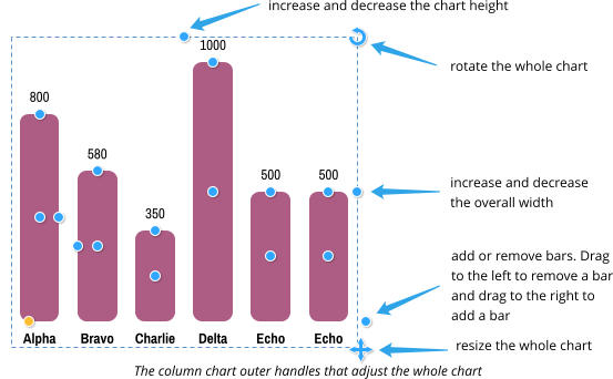

Copyright © 2017 Xara Group Limited.
Page created with Xara Designer Pro

Xara provides a range of ready-made customizable SmartShapes
that you can add to your document or web page. But they are more
than simple static shapes. What’s cool about SmartShapes is that
the editing functions are built into the shape - you just click on the
shape and a set of control handles appear that can be dragged to
adjust and customize the shape.
Although SmartShapes include a range of everyday shapes that you
can drop into your documents and websites, the system also
supports objects that are much more complex than simple shapes.
Choose from Arrows, Flowlines, Text panels, Photo text panels,
Speech Bubbles, Spirals, charts, Timelines and many other shapes.
The other innovative aspect of SmartShapes is that most are
available and work exactly the same way in the web-based Xara
Online Designer.
This SmartShapes tutorial, Part 3, will show you how to easily create
a column chart and a percentage ring.
To try it, download the trial version of Xara Photo & Graphic Designer
or Xara Web Designer Premium or Designer Pro X.
Finished page showing a column chart of rainfall and percentage ring
of wildlife increase
Creating your chart
To quickly insert a bar chart SmartShape into your document or website , select the menu option, Insert > Charts… This will open up the Online Content Catalog that contains a wide range of Bar charts, Column charts and Percentage rings. Click import, or double click and the chart will download into your document and also into the Local Designs Gallery. I selected Column chart 5 for my page and I intend to create a chart of the rainfall. You will be asked if you want to match the theme colors of your page and if so then it will adopt the Theme color 1. It will be inserted onto the page with the Shape tool selected so the edit handles are active. Note: Horizontal bar charts are customized in exactly the same way as the vertical column charts. Bar chart inserted on the page, showing the edit handles The column chart has been added to the page with the Shape tool selected, so the edit handles are active. As you move the mouse pointer over the handles a small pop up will tell you what each one does. I added a column as I would like to have 6 bars for 6 months of rainfall. I’m going to assume that we are in April and that the columns for May and June are predictions based on last year. To label the bars, select the Text Tool and then click on each of the labels in turn to make the changes. You can use all the usual Text Tool attributes such as bold, italic, etc. When you change the appearance of a chart label, such as changing the font, font size or color, that change is immediately replicated across the other labels for each bar. However, this only happens if those other labels have the same text style applied (in this case, ‘Col chart labels’). If you want one of the labels to be different, perhaps to highlight one of the bars, simply give it a different style or use the No style option in the styles menu to remove the style. To change the bar value, you can either drag the handle on the top of the column to the required height (zoom in for more accuracy) or you can use the Text Tool to enter the value, which can be any precise numeric value, including decimal places. As with the chart label you can change the text style of an individual bar to highlight it. Rainfall chart with months and values entered I will use the edit handle on the center right of the first column to change the width of my columns to be slightly narrower and I will increase the horizontal spacing using the edit handle on the center left of the second column. I will also increase the roundness of the column using the yellow handle. Chart with narrower columns, increased spacing between the columns and the roundness increasedCustomizing the colors
You can change the colors of the charts easily by selecting the whole chart (using the Selector Tool ) and clicking on a color on the Color line. The Replace Colors dialog will appear to let you choose which of the colors in the chart you would like to replace with your chosen new color. Similarly, you can use the Color Editor to edit the colors - the list of replaceable colors will be in the drop down menu at the top of the color editor - simply select the color you want to edit from that list. I will change my columns to be blue. But I would like the current month to be in a different color. To change an individual column, select the Selector Tool then press the Ctrl key and click on the relevant column. Then click on the required color on the color line and just that one column will change. I have changed my April column to be a darker shade of the blue. You can also change the outline or type of fill using the Fill Tool . I changed the last two columns to use a ‘bitmap’, repeating fill - select the Fill tool, select bitmap from the drop down list of fill types and then select repeating tile. This will give you a shaded fill in your Theme color 1 so you can change it using the color line, if you wish. Chart with one column highlighted in a darker shade of blue and two columns use a bitmap fill If you have made several changes to a column and you want to copy the style of that column onto another column, first select the column to be copied (Ctrl and click as above) then copy, (Ctrl+C) the selected bar to the clipboard. Then select the designated bar and use Edit > Paste > Paste format/attributes.Percentage Rings
Percentage rings are a common infographic object that would be difficult and time consuming to create manually from scratch, but Xara have made this ultra quick and easy with the SmartShape. As with the column chart, select the menu option Insert > Charts… to open up the Online Content Catalog. Select your design and click import, or double click and the percentage chart will download into your document and also to the Local Designs Gallery. I selected percentage ring 5 for my page. Choose a percentage ring from the Content Catalog You will be asked if you want to match the theme colors of your page and if so then it will adopt the Theme color 1. It will be inserted onto the page with the Shape Tool selected so the edit handles are active. The adjustment handles of the percentage ring You can change the percentage value in three ways - with the Text Tool selected simply click on the % number and enter the value on your keyboard, or drag either of the two handles on the segment separating line. You can change your text style - font, size, bold, italic, etc. Note: It is normal that the percentage is measured from the top going clockwise, so it is best to change the percentage by dragging the second handle. In a similar way to the Column chart, you can change the colors of the ring easily by selecting it and clicking a color on the Color line or use the Color editor. To change an individual segment, whilst in the Selector Tool, press the Ctrl key and then click on the relevant segment then select your color. Again, you can also change the outline or type of fill using the Fill Tool. Percentage ring customized with percentage value, change of color and one segment with a fractal cloud fill You have seen how easy it is to create stunning graphics quickly and easily using the fully customizable SmartShapes. Now see how to customize some of the other SmartShapes: See SmartShapes Part 1 to learn how to quickly create great looking Arrows, Rectangles, Ovals, Pie Shapes and Spirals. See SmartShapes Part 2 for shapes that incorporate text and photos, ie text panels, photo text panels and speech bubbles. It’s so easy to make your document or website look as if it has been created by a professional designer! Try it now - download the latest trial version of Xara Photo & Graphic Designer or Xara Web Designer or Designer Pro X. For more tutorials by Xara and third parties, check out our Resource index, which offers a searchable and browsable list of movies and tutorials created by Xara and third parties.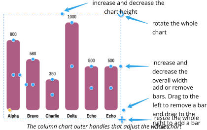


Copyright © 2017 Xara Group Limited.
Page created with Xara Designer Pro
WORK SMARTER WITH THE XARA SMARTSHAPES
WORK SMARTER WITH THE XARA SMARTSHAPES
WORK SMARTER WITH THE XARA
SMARTSHAPES